Example: Creating a Graph of Block Data Using an Analysis Output Spreadsheet as Input
This example demonstrates how to create a Graph of Block Data using analysis spreadsheets. For a detailed discussion of the characteristics of Graphs of Block Data, see the Graphs of Block Data overview topic.
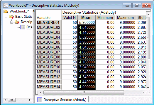
This example uses the Adstudy.sta data file. Adstudy.sta contains the results of a (hypothetical) survey given by a hotel to its customers. In addition to polling customers on their preferred cola soft drinks, the surveyors asked them to rate the hotel's performance on a number of items such as room service, cleanliness, front desk service, etc.
Producing the Graph
Ribbon bar. Select the Home tab. In the File group, click the Open arrow and from the menu, select Open Examples. The Open a Statistica Data File dialog box is displayed. Adstudy.sta is located in the Datasets folder. Next, select the Statistics tab. In the Base group, click Basic Statistics to display the Basic Statistics and Tables Startup Panel.
Classic menus. From the File menu, select Open Examples to display the Open a Statistica Data File dialog box; Adstudy.sta is located in the Datasets folder. Then, from the Statistics menu, select Basic Statistics/Tables to display the Basic Statistics and Tables Startup Panel.
On the Quick tab, double-click Descriptive statistics to display the Descriptive Statistics dialog box.
On the Quick tab, click the Variables button to display the variable selection dialog box. We want to produce a summary of descriptive statistics for the 23 measures of hotel performance. To do this, select Measure01 through Measure23 in the Select the variables for the analysis dialog box (or enter 3-25 in the Select variables box), and click the OK button to return to the Descriptive Statistics dialog box.
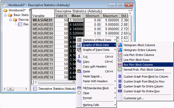
On the Quick tab, click the Summary: Statistics button to produce the spreadsheet. Then, click on the Mean column header to select the entire column of means.
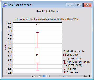
Right-click on any highlighted cell and select Graphs of Block Data - Box Plot: Block Columns (as shown below)
to create a box plot summarizing the distribution of mean values.
To see the distribution of means displayed as a histogram, right-click any cell in the Mean column and select Graphs of Block Data - Histogram: Entire Columns.
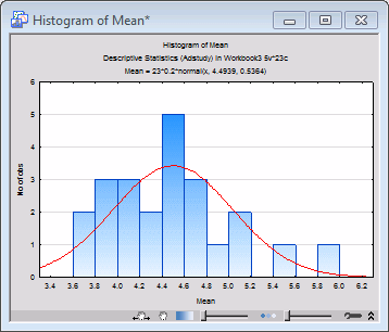
Statistica creates a histogram of the mean values with a normal fit applied (as shown above).