The EventFlow Editor's Metadata tab provides three optional features for the current EventFlow module:
- Module Description
-
Add an optional description to document the purpose of the current module or the StreamBase solution that uses this module. Unlike the descriptions for notes, groups, operators, and data constructs, the module-level description, if present, appears in the operator tooltip when you hover on the operator in the EventFlow canvas. Module descriptions are saved as an element in the EventFlow XML, and remain with the
.sbappfile if you extract the application's layout to an.sblayoutfile. - EventFlow Package
-
The read-only EventFlow Package field shows the Maven package name for this EventFlow module file. The package name is determined by the file's location in the Maven project structure. If you copy this file to another project, the package name changes accordingly.
The package name is stored as part of the underlying EventFlow XML, and is managed automatically by Studio.
- Version
-
Enter any number or string to characterize the version of this module. The version number or string is preserved in the underlying EventFlow XML, and can be used to manually track module versions delivered to other departments or to end-users. There is no automatic incrementing of numbers placed in this field and no validation of the field's contents.
- Icons
-
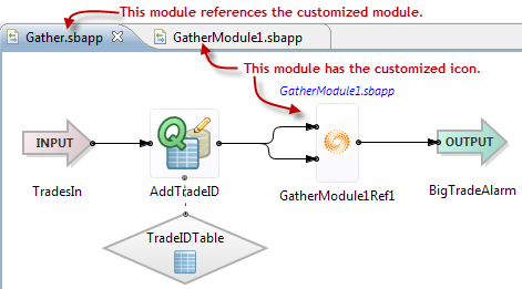
Configure a custom icon for this module to distinguish it graphically in the EventFlow canvas when this module is referenced. You specify the icon in the module itself, but the icon only shows in an associated Module Reference in a containing module. The following example (based on the example used in Extracting a Module) shows a module customized with a logo overlay icon:
To customize icons:
-
Create a bitmap image in PNG, GIF, BMP, or JPEG format, with the following exact required dimensions:
-
Large Palette Icon: 32x32 pixels
-
Small Palette Icon: 16x16 pixels
-
Canvas Overlay Icon: create either a 48x48 pixel icon or smaller. If you specify a smaller icon, it is overlaid in the center of the default Module Reference icon, as shown in the picture above. If you specify a 48x48 pixel icon, it replaces the default Module Reference icon.
Tip
The standard Studio Palette icons and custom icons generally have a solid white background. Also consider using a transparent background, which can be added to the PNG and GIF formats using any modern image editor.
-
-
Import the images into your project and place them in the
src/main/resourcesfolder of your Studio project. -
Click each button in the Metadata tab to select the appropriate image for each icon field.
You may need to close and reopen the EventFlow module that references the icon-customized module to see the new icons in place.
-