Profiling Data
Data Profiling analysis generates insights about the technical characteristics of the input data for each of the variables selected by the user.
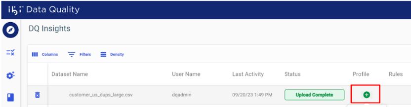
Create a Data Profile
Click Add under the Profile column, as shown in the following image.
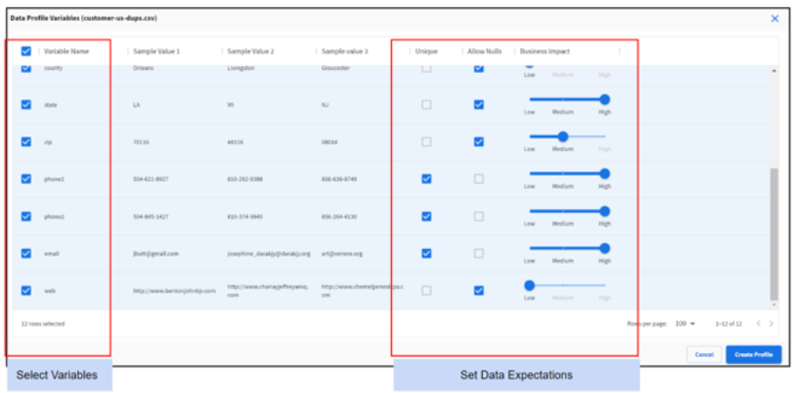
Select Variables
Select the variables to include in the data profile.
Tip: Selecting the checkbox in the upper-left corner selects all variables.
Set Data Expectations
For each variable, configure the following three data expectations:
- Select Unique if the values in that column are always expected to be unique.
- Deselect Allow Nulls if values in that column can never be Null.
- Use the slider to indicate if the variable has HIGH, MEDIUM, or LOW impact on business outcomes.
Tip: These three settings are used to calculate the Profile Scores.
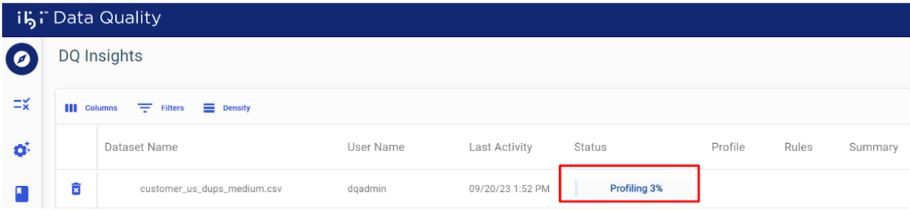
Track Profiling Progress
The profile progress bar displays the current processing status, as shown in the following image.
Viewing and Downloading a Profile
Overview
This report provides a high-level overview of the overall data profile.
Click the Overview tab in the View Profile dialog, as shown in the following image.
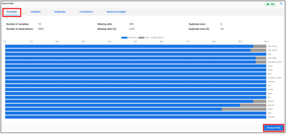
Click Download Profile in the lower-right corner of the Overview tab to download the profiling results in JSON format. This profile output is also available in the results .zip file.
|
Data Facts |
Description |
|---|---|
|
Number of variables |
Number of columns in the data set. |
|
Number of observations |
Total number of data values in the data set, row times columns. |
|
Missing Cells |
Number of values that are empty or missing. |
|
Missing Cells (%) |
Percentage of values that are empty or missing. |
|
Duplicate Rows |
Total number of duplicate rows. |
|
Duplicate rows (%) |
Percentage of rows that are duplicate. |
|
Overall Profile Score |
Profile score for the data set in the range 0 to 100 (100 is the best). |
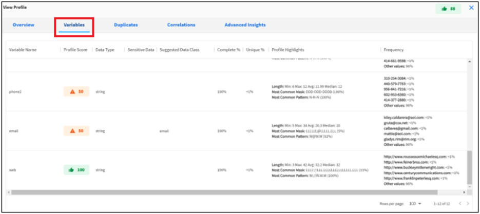
Variables
This report provides a detailed view of each variable included in the profile.
Click the Variables tab in the View Profile dialog, as shown in the following image.
|
Variable Facts |
Description |
|---|---|
|
Variable Name |
Name of the column. |
|
Profile Score |
Profile score for the variable in the range 0 to 100 (100 is the best). |
|
Data Type |
Data type identified by the profiler. |
|
Sensitive Data |
A flag to suggest if the variable contains sensitive data. |
|
Data Class |
The data class identifier by the profiler. |
|
Complete % |
Percentage of values that are not null. |
|
Unique % |
Percentage of values that are unique. |
|
Highlights - Length |
Min, max, average and median length of values in the variable. |
|
Highlights - Mask |
Most common mask discovered by the profiler.
|
|
Highlights - Pattern |
Most common pattern discovered by the profiler.
|
|
Frequency |
Most common values and their frequency. |
Note: Users can create definitions for classifying custom data using the masks and patterns discovered during profiling. For more information, see Managing Data Classes.
Duplicates
This report shows all the duplicate rows in the data. These are true duplicate rows where a row of data values exactly matches with another row in the input data.
Click the Duplicates tab in the View Profile dialog, as shown in the following image.
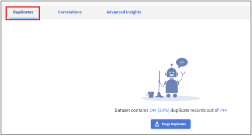
Purge Duplicates
Click Purge Duplicates to remove duplicate rows from input data.
![]()
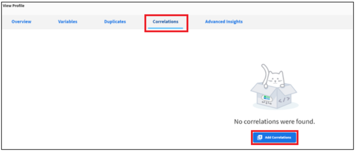
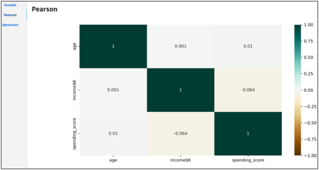
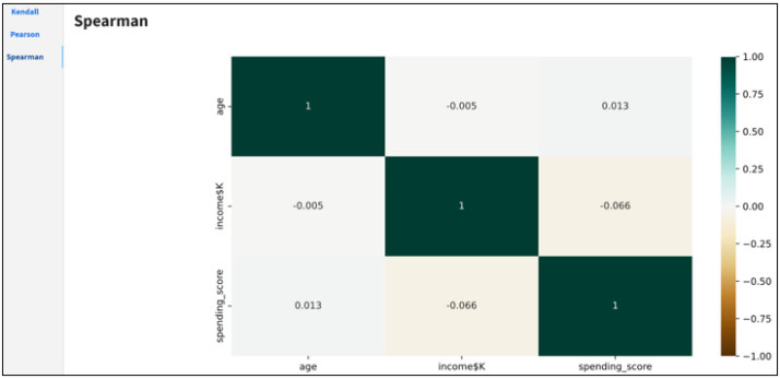
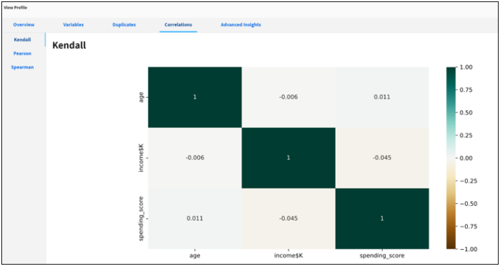
Correlations
This is an optional profiling feature to perform bivariate analysis that measures the strength of association between two variables and the direction of the relationship.
In terms of the strength of the relationship, the value of the correlation coefficient varies between +1 and -1. A value of ± 1 indicates a perfect degree of association between the two variables. As the correlation coefficient value goes towards 0, the relationship between the two variables will be weaker. The direction of the relationship is indicated by the sign of the coefficient. A plus (+) sign indicates a positive relationship and a minus (-) sign indicates a negative relationship.
|
Value |
Correlation Between x and y |
|---|---|
|
equal to 1 |
Perfect positive linear relationship. |
|
greater than 0 |
Positive correlation. |
|
equal to 0 |
No linear relationship. |
|
less than 0 |
Negative correlation. |
|
equal to -1 |
Perfect negative linear relationship. |
Adding Correlations
To add correlations:
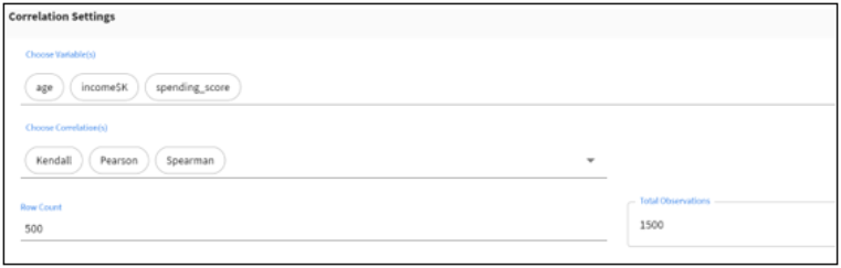
- Click the Correlations tab in the View Profile dialog, and then click Add Correlations as shown in the following image.
- Choose correlation settings.
- Select variables for correlation analysis.
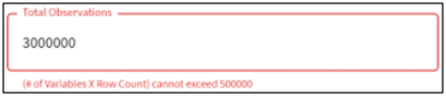
Note: Correlations can be generated for variables with numeric, date or categorical values. If the selected variables do not meet this criteria, an error message displays in the upper-right corner of the screen, as shown in the following image.

- Select one or more correlation types.
For more information, see Supported Types.
- Select the row count.
Note: The max number of observations that can be uploaded for correlations is 500,000. Adjust the number of variables and the row count to reduce the total number of observations if it exceeds the max limit.
- Select variables for correlation analysis.
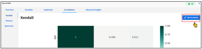
- Click Edit Correlations to change the correlation settings and to rerun the correlation analysis, as shown in the following image.
Supported Types
This section describes the supported correlations that are available.
Pearson Correlation
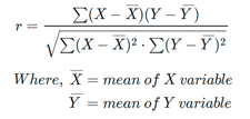
The Pearson (product-moment) correlation coefficient is a measure of the linear relationship between two features. It is the ratio of the covariance of x and y to the product of their standard deviations. It is often denoted with the letter r and called Pearson’s r.
This value is mathematically expressed by the following equation:
Assumptions:
- Each observation should have a pair of values.
- Each variable should be continuous.
- It should be the absence of outliers.
- It assumes linearity and homoscedasticity.
Spearman Correlation
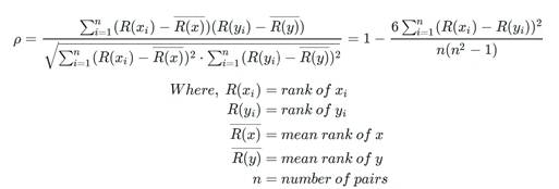
The Spearman correlation coefficient between two features is the Pearson correlation coefficient between their rank values. It is calculated the same way as the Pearson correlation coefficient, but takes into account their ranks instead of their values. It is often denoted with the Greek letter rh (ρ) and called Spearman’s rho.
This value is mathematically expressed by the following equation:
Assumptions:
- Pairs of observations are independent.
- Two variables should be measured on an ordinal, interval, or ratio scale.
- It assumes that there is a monotonic relationship between the two variables.
Kendall Correlation
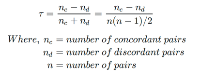
The Kendall correlation coefficient compares the number of concordant and discordant pairs of data. This coefficient is based on the difference in the counts of concordant and discordant pairs relative to the number of x-y pairs. It is often denoted with the Greek letter tau (τ) and called Kendall’s tau.
This value is mathematically expressed by the following equation:
Assumptions:
- Pairs of observations are independent.
- Two variables should be measured on an ordinal, interval, or ratio scale.
- It assumes that there is a monotonic relationship between the two variables.
Comparison
This section provides a comparison of Pearson correlation vs. Spearman and Kendall correlations.
- Non-parametric correlations are less powerful because they use less information in their calculations. In the case of Pearson's correlation uses information about the mean and deviation from the mean, while non-parametric correlations use only the ordinal information and scores of pairs.
- In the case of non-parametric correlation, it is possible that the X and Y values can be continuous or ordinal, and approximate normal distributions for X and Y are not required. But in the case of Pearson's correlation, it assumes the distributions of X and Y should have normal distribution and also be continuous.
- Correlation coefficients only measure linear (Pearson) or monotonic (Spearman and Kendall) relationships.
Spearman correlation vs. Kendall correlation:
- In the normal case, Kendall correlation is more robust and efficient than Spearman correlation. It means that Kendall correlation is preferred when there are small samples or some outliers.
- Spearman’s rho usually is larger than Kendall’s tau.
- The interpretation of Kendall’s tau in terms of the probabilities of observing the agreeable (concordant) and non-agreeable (discordant) pairs is very direct.
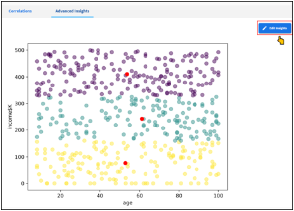
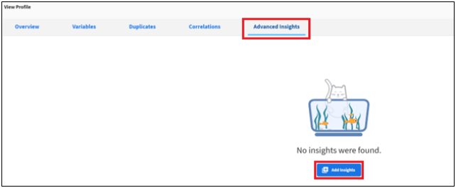
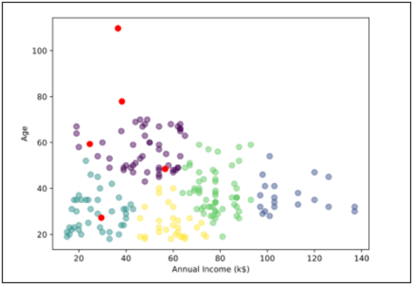
Advanced Insights
This is an optional profiling feature to generate advanced insights on data such as Cluster Analysis, Cohort Analysis, Time Series Analysis, etc. The current release only provides K-Means clustering analysis. Future versions will enable other insights.
Click the Advanced Insights tab in the View Profile dialog, and then click Add Insights as shown in the following image.
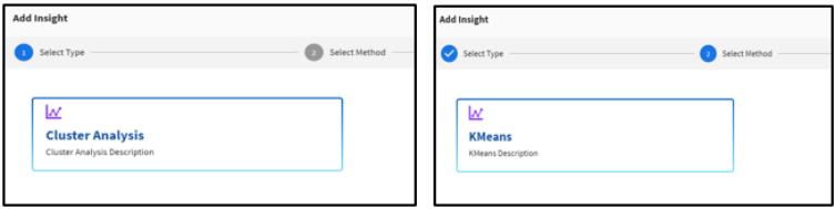
Cluster Analysis
Cluster analysis is a statistical method for organizing items into groups or clusters on the basis of how closely associated they are.
K-Means Clustering
K-means clustering is an unsupervised learning algorithm to partition N observations into K clusters in which each observation belongs to the cluster with the nearest mean (cluster centers or cluster centroid). The algorithm clusters data points based on feature similarity and works iteratively to assign each data point to one of K groups based on the features that are provided.
- From the Add Insight dialog, click Cluster Analysis and select the KMeans method, as shown in the following image.
The Set Parameters pane opens, as shown in the following image.
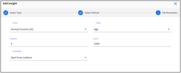
- Set the following parameters:
- Select variables for the X-axis and Y-axis.
- Select the number of expected clusters in your data set (default is set to 3, min is 1, and max is 25).
- Select number of rows (max is 4000).
- Select sampling order (Top or Bottom).
Note: If your data set has more than 4000 rows, this order determines the top or bottom 4000 rows sampled for analysis.
The analysis is generated based on the specified parameters, as shown in the following image.
- Click Edit Insights to change the parameters and to rerun the analysis, as shown in the following image.