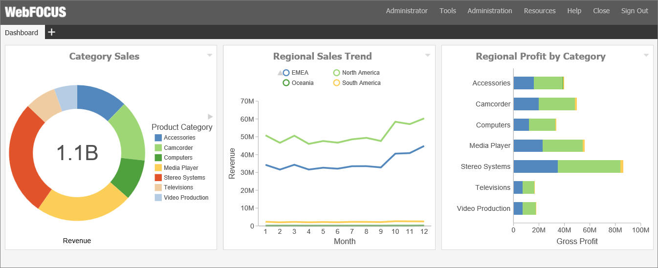
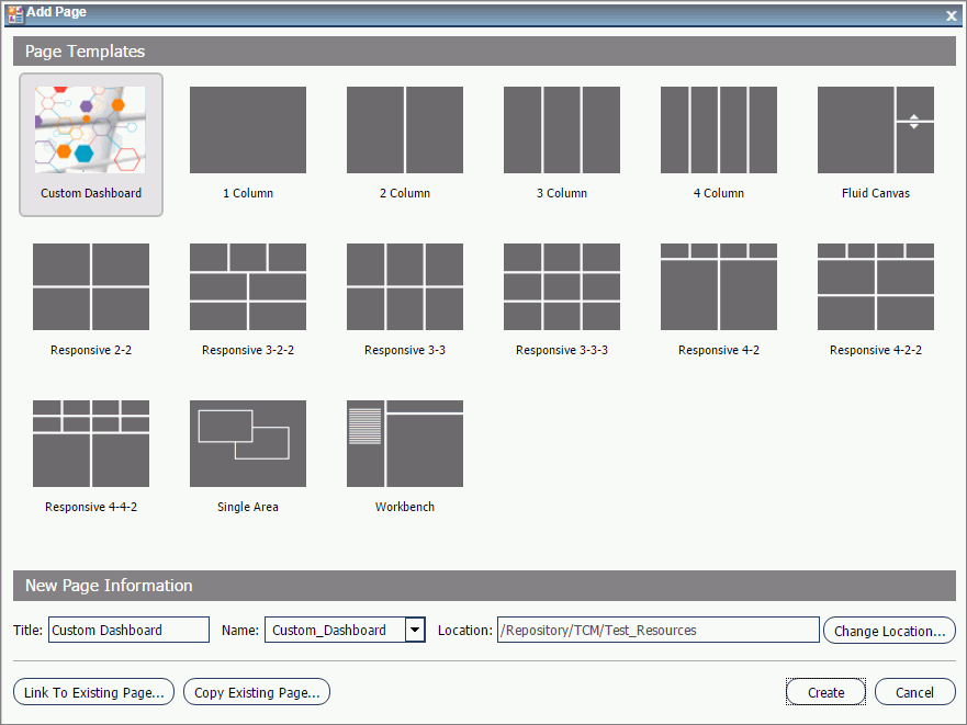
Creating a Portal
|
How to: |
You can create a portal in one of the following ways:
- By using the New Portal option from the Portals node, in the Resources tree.
- By adding a portal to a domain template while creating a new domain.
- By using the Collaborative Portal option from a folder in the Domains node, in the Resources tree.
Procedure: How to Create a Portal from the Portals Node
- On the WebFOCUS Home page, sign in to WebFOCUS.
- On the
left side of the page, right-click the
Portals node, and click
New Portal.
The New Portal dialog box opens.
- Supply the
requested information on the dialog box, as follows.
- Title. Value displayed in the tree that users use to identify the portal.
- Name. Type a descriptive name for your portal. The name will be used throughout the WebFOCUS application.
- URL. The URL is generated based on the portal name. Another user can enter this URL to access your portal without going to the WebFOCUS Home page.
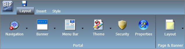
- Security. Select the Give others access check box to bring up the security dialog box when the Portal Designer opens.
- Once you
have completed the fields, click
Create.
The portal is created for you. If you did not select the Give others access check box, the Portal Designer opens.
If you did select the Give others access check box, the Security Rules dialog box opens. Use it to set the access rules for the portal. For more information, see Security.
Procedure: How to Create a Portal While Creating a Domain
- On the WebFOCUS Home page, sign in to WebFOCUS.
- Right
click the
Domains node, point to
New, and then click either
Enterprise Domain or
Tenant Domain, depending on which type of domain you
want to create.
The New Domain dialog box opens.
- Type the
title of the domain in the Title field.
The Name field is filled automatically to match the value in the Title field. You can edit it.
- Select the
Create Portal check box, as shown in the following
image.
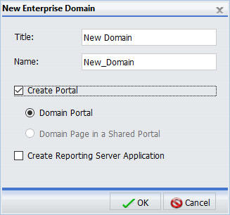
Note: If the basic portal is disabled in your environment, the Create Portal check box is unchecked and disabled by default.
- Click
OK.
A message appears and confirms that the template processing is complete.
- Click
OK.
A new domain and a portal with the same name appear in the Resources tree.
- To
customize your new portal, under the Portals node, right-click the portal and
click
Edit.
The Portal Designer opens.
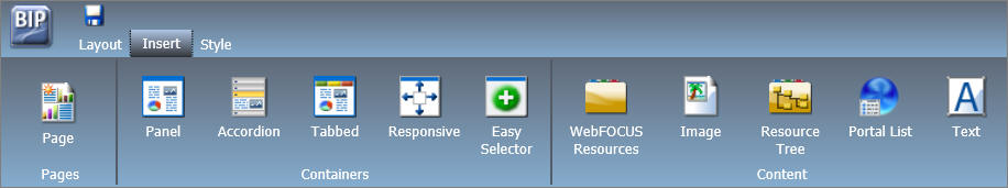
When you create a portal as part of a domain, it comes with the following pre-configured pages:
- Workbench
- My Page
The Workbench page can be used to work with domain content. It displays the Resources tree on the left and the Report Output area in the middle. When you run a content item, it appears in the Report Output area. Multiple content items appear as tabs.
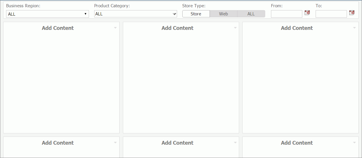
My Page presents you with series of empty containers that you can fill with the content of your choice. You can maximize any of these containers to get a better view of your content.
For more information about domain templates, see the WebFOCUS Security and Administration technical content.
Procedure: How to Create a Collaborative Portal
- On the WebFOCUS Home page, sign in to WebFOCUS.
- Right
click a domain or folder, point to
New, and then click
Collaborative Portal.
The New Collaborative Portal dialog box opens.
- Supply
the requested information on the dialog box, as follows.
- Title. Value displayed in the tree that users use to identify the portal.
- Name. Type a descriptive name for your portal. The name will be used throughout the WebFOCUS application.
- Path. The path of the portal in the WebFOCUS repository.
- URL. The URL is generated based on the portal name. Another user can enter this URL to access your portal without going to the WebFOCUS Home page.
- Once you
have completed the fields, click
Create.
The portal is created for you, and the Resources folder for the collaborative portal is added to the repository. The Portal Designer opens.
Reference: Resources Folder
You can change a default Resources folder at any time. You can also reference pages in a portal from other locations.

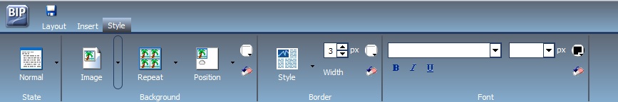
 launches the color selection dialog box for setting a page background color.
The same icon is used in the Border and Font groups to set the border and font
colors, respectively.
launches the color selection dialog box for setting a page background color.
The same icon is used in the Border and Font groups to set the border and font
colors, respectively.
 in the Background group resets the background styling to the theme settings for
the currently selected state. The same icon is used in the Border and Font
groups to reset those groups.
in the Background group resets the background styling to the theme settings for
the currently selected state. The same icon is used in the Border and Font
groups to reset those groups.
 launches the color selection dialog box for setting the font color.