Adding Filters to Pages in WebFOCUS Designer
|
How to: |
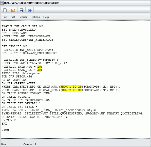
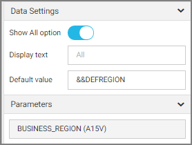
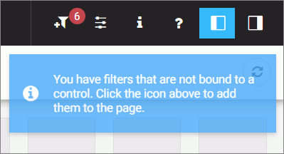
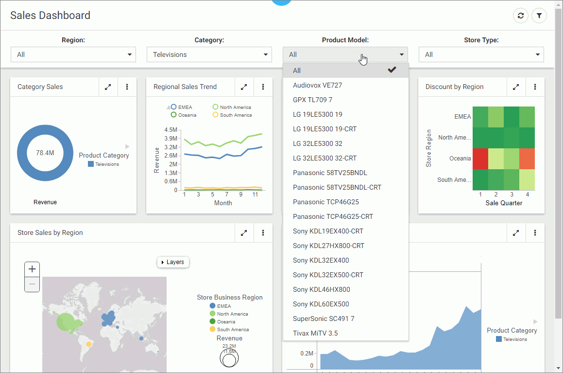
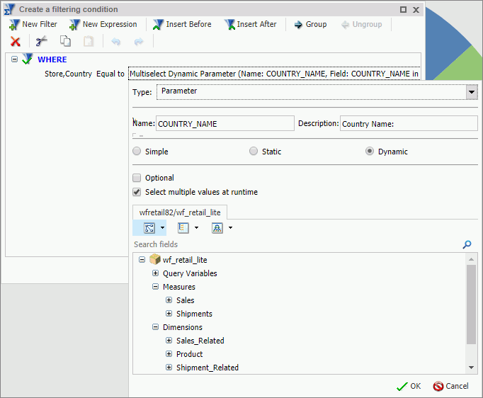
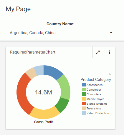
Creating a page filter in WebFOCUS Designer is a quick and intuitive process. Whenever you add parameterized content item to the canvas, such as a report with parameters or chart with parameters, Designer recognizes the parameters and creates filters for them automatically. The tool then notifies you of any available filters with a notification, and a badge count is overlaid on the Quick Filter button, as shown in the following image.
After you add filters to a page, you can edit filter parameters, customize your filter grid, and change the types of your filter controls.
There are three ways to add filters to a page in WebFOCUS Designer:
- Automatically, by clicking the Quick Filter button.
- Manually, by creating an empty filter bar or filter modal window and populating it with select filters.
- Manually, inside a Grid container.
Procedure: How to Automatically Add Filters to a Page Using the Quick Filter Button
- In the Resource selector, drag a parameterized item of your choice from the Resources tree to the canvas.
The Quick Filter button appears on the toolbar with the badge icon showing the number of unbound filters.
- Optionally, add more content.
Note: The quickest way to create parameterized content featuring the same set of parameters is to start by creating a Reporting Object with desired parameters, and then using the Reporting Object to create content. To do so, right-click your Reporting Object, point to New, and then click Chart or Report.
- Click the Quick Filter button.
The filter bar with all available filters appears above your content.
- Optionally, customize your filter bar as described below.
- Right-click a cell to access shortcut menu options, as shown in the following image.
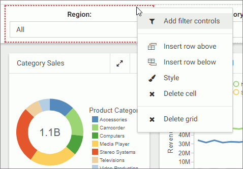 The available options are:
- Add filter controls. Opens the Add Filter Controls dialog box, where you can choose from the list of available controls and add them to the filter
grid.
Note: If all available filters display on the page, the Add Filter Controls setting is inactive.
- Insert row above. Inserts an empty row above the current row in the filter grid.
- Insert row below. Inserts an empty row below the current row in the filter grid.
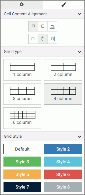
- Style. Opens the Properties panel, where you can customize the grid style and cell alignment.
- Delete cell. Deletes the current cell.
- Delete grid. Deletes the entire filter bar.
- Add filter controls. Opens the Add Filter Controls dialog box, where you can choose from the list of available controls and add them to the filter
grid.
- Right-click a control to access shortcut menu options, as shown in the following image.
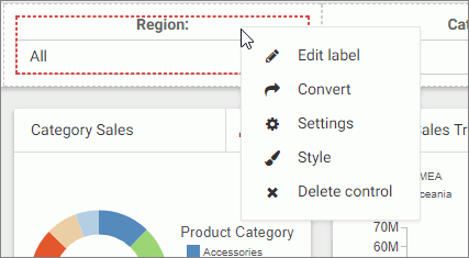 The available options are:
- Edit label. Makes the label of the control an editable text.
Note: Another way to edit a control label is to double-click the field, type the new text, and press Enter.
- Convert. Opens the Convert Control To dialog box, where you can choose between various control types.
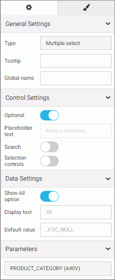
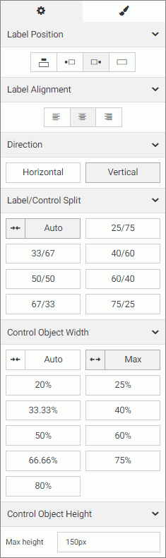
- Settings. Opens the Properties panel, where you can customize label position, label alignment, and control object width.
- Style. Opens the Properties panel, where you can customize cell styling options.
- Delete control. Deletes the current control.
- Edit label. Makes the label of the control an editable text.
- Drag any filter cell to a new location in the grid.
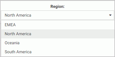
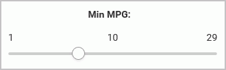
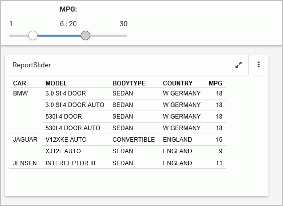
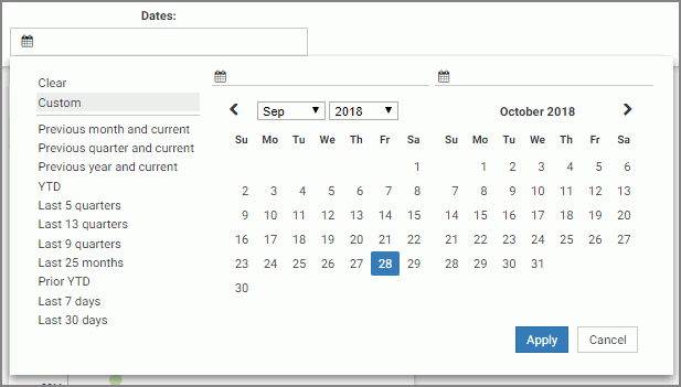
- Multi-select two controls, right-click one of them, and then click Combine to combine the two controls into one. An example of two combined controls is shown in the following image.

The Combine option only applies to dates and sliders.
- Drag a control into a cell with other controls. This action puts two separate controls into one cell. The drag marker is shown allowing you to position one controls in front or behind another control. You can separate the controls again by dragging one control out of the cell.
- Right-click a cell to access shortcut menu options, as shown in the following image.
- Save your changes.
Procedure: How to Add Filters to a Page Manually
- In the Resource selector, drag a parameterized item of your choice from the Resources tree to the canvas.
The Filter button appears on the toolbar, with the badge icon showing the number of available filters.
- Optionally, add more content with the same set of parameters.
- Click the Page filter configuration button
 .
.The Page Filter Configuration dialog box opens.
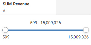
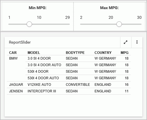
- Click Create empty filter bar, as shown in the following image.
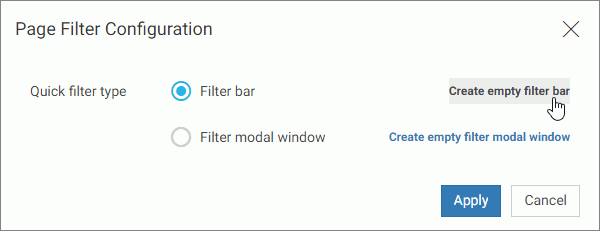
Note: If you prefer a floating modal window instead of a filter bar, click Create empty filter modal window.
- Right-click inside any filter cell, and then click Add filter controls.
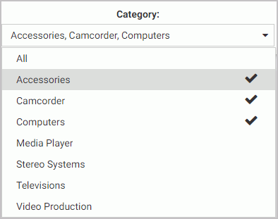
The Add Filter Controls dialog box opens, and lists all available controls selected by default, as shown in the following image.
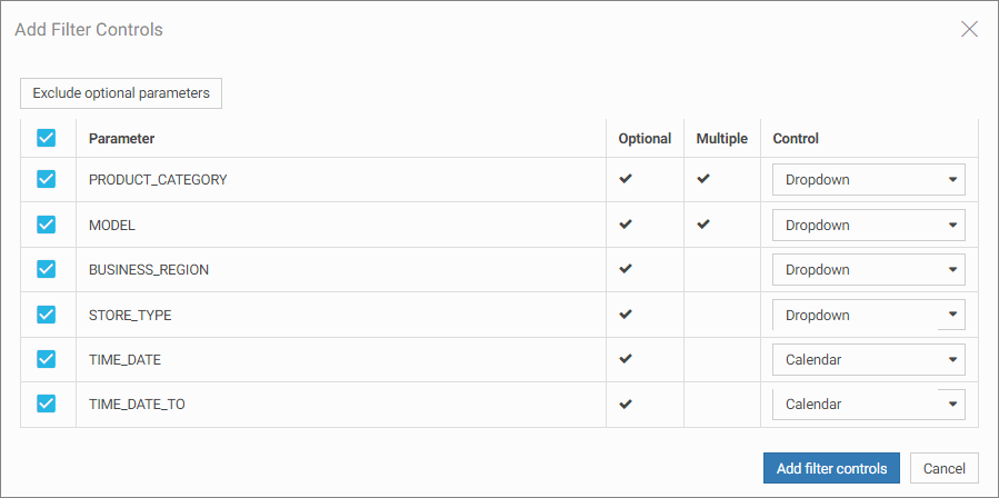
- Clear the controls that you want to exclude.
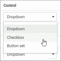
- Optionally, change types of your controls where applicable by selecting a desired option in the Control column, as shown in
the following image.
Note: When working with button sets, keep in mind that they look best when positioned in a single line.
- Click Add filter controls.
The controls are added to the filter bar.
- Save your changes.
Procedure: How to Add Filters to Page Using a Grid Container
- In the Resource selector, drag a parameterized item of your choice from the Resources tree to the canvas.
The Filter button appears on the toolbar, with the badge icon showing the number of available filters.
- Optionally, add more content with the same set of parameters.
- In the Resource selector, click the Containers button.
- Drag the Grid container onto the canvas.
- Right-click inside the grid container, and then click Add filter controls.
The Add Filter Controls dialog box opens, and lists all available controls selected by default.
- Clear the controls that you want to exclude.
- Click Add filter controls.
The controls are added to the grid container.
Note: You can also drag a control from the filter bar to a grid container directly, if the filter bar is open and populated with controls.
- Optionally, move and resize your grid container and content to achieve the desired alignment.
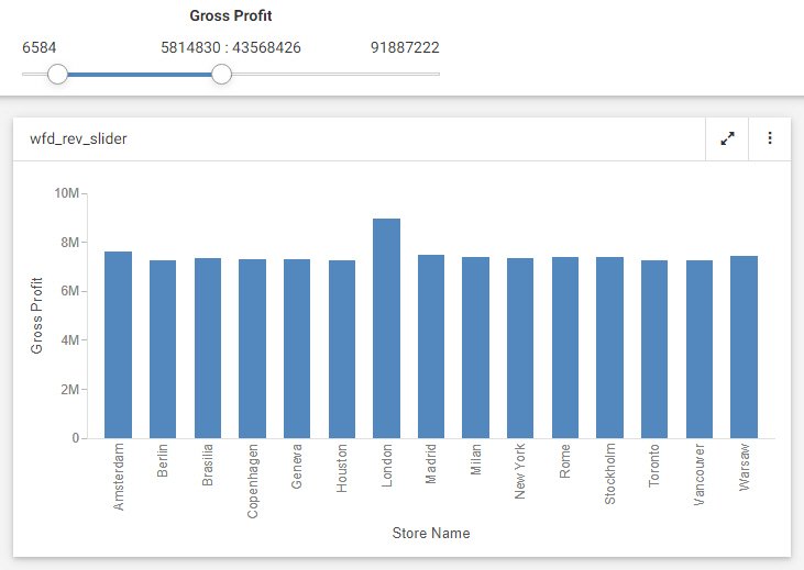
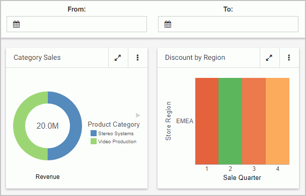
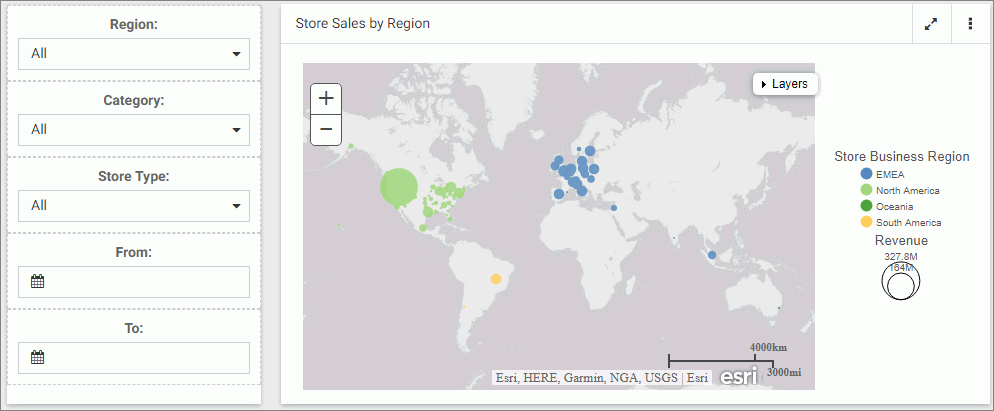
An example of a simple layout featuring a grid container with filter controls is shown in the following image.
- Save your changes.
 .
.