Applying Custom CSS and JavaScript to a Page

In this section:

You can apply custom cascading style sheet (CSS) properties and JavaScript code to a page, allowing you to significantly enhance the page with countless styling options and run-time behaviors.

This feature is intended for content developers with CSS and JavaScript coding experience. The CSS and JavaScript options are available to developers, administrators, and users with text editor access.

You can add custom CSS and JavaScript to a page by typing code into the CSS and Javascript tabs, respectively. To enable these tabs, select the entire page and, in the Properties panel, enable the CSS and Javascript options. The CSS and Javascript tabs appear below the canvas. Select one of these tabs to access a text editor where you can add your code.

Note: Custom CSS and JavaScript is not displayed in the page canvas or in preview mode. You must save and then run the page from the WebFOCUS Home Page to see the results of your custom code.

Applying Custom CSS to a Page

How to:

Custom CSS can be applied to specific objects on a page by specifying a CSS class for the object, and then using a class selector in your CSS code.

To specify a CSS class for an object on a page, select the object and, on the Properties panel, type a class name into the text box for the Classes property. You can specify multiple classes for an object by separating the class names with spaces, and you are encouraged to use the same class names for multiple items on the page. When you assign attributes to a class in the CSS tab, they will affect all elements on the page that are assigned to that class.

Procedure: How to Change the Color of a Panel Using CSS

You can change the background color of a panel by assigning a class to the panel and then adding the background-color attribute to the class using CSS.

  1. Create a page using WebFOCUS Designer.

    On the WebFOCUS Home Page, on the Common or Designer tab of the Action bar, click Page.

    WebFOCUS Designer opens.

  2. Select a template for the page.
  3. If you are using the blank template, add a panel to the page.

    Click the Containers tab and drag a panel container onto the page.

  4. With the panel selected, open the Properties panel.
  5. In the text box for the Classes property, type a class name of your choice, as shown in the following image.
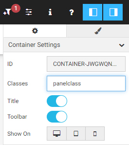
    Properties panel showing panelclass as the Class
  6. Click the title bar or a blank area on the canvas to select the entire page.
  7. In the Properties panel, enable the CSS property.

    The CSS tab appears below the canvas.

  8. Select the CSS tab.

    The CSS tab text editor opens.

  9. Add a CSS declaration to change the background-color attribute for the class used by the panel.
    1. Reference the class name that you specified in the Classes property.

      Type a period (.) followed immediately by the class name, then an opening curly bracket ({), and press the Enter key.

      The closing bracket is added automatically.

    2. Within the brackets, type background-color, followed by a colon and then a color string.

      For example, to make the color of a panel, for which panelclass is the value of the Classes property, to a bright blue, you could use the following CSS declaration.

      .panelclass {
          background-color: rgb(0,180,240);
      }
  10. Save the page and close WebFOCUS Designer.
  11. Run the page from the WebFOCUS Home Page.

    The custom CSS is applied.

Applying Custom JavaScript to a Page

In this section:

How to:

You can use custom JavaScript to enhance the functionality of components on a page. Any component created on the page using the Designer canvas can be modified in the Javascript tab by referencing a CSS class name specified in the Classes field of the Properties panel for the object, or using the Designer JavaScript API, to standardized classes that correspond to different component types in a page or portal. Each component class can utilize a set of predefined methods in addition to custom JavaScript. You can even use JavaScript to add objects to a page entirely through code, without using the canvas at all.

Procedure: How to Add a Button and a Menu Item to a Panel Container Using Custom JavaScript

You can use custom JavaScript code to add a button and a menu item to a panel that you have added to a page. You can configure the button and menu item to execute a command of your choice, such as a URL call.

For information about different JavaScript object classes, see the Designer JavaScript API Classes reference information below.

  1. Create a page using WebFOCUS Designer.

    On the WebFOCUS Home Page, on the Common or Designer tab of the Action bar, click Page.

    WebFOCUS Designer opens.

  2. Select a template for the page.
  3. If you are using the blank template, add a panel to the page.

    Click the Containers tab and drag a panel container onto the page.

  4. With the panel selected, open the Properties panel.
  5. In the text box for the Classes property, type a class name of your choice.
  6. Click the title bar or a blank area on the canvas to select the entire page.
  7. In the Properties panel, enable the Javascript property.

    The Javascript tab appears below the canvas.

  8. Select the Javascript tab.

    The Javascript tab text editor opens.

  9. To have the button and menu item appear when the page loads, use the iba_pageloading event listener by adding the following syntax:
    window.addEventListener("iba_pageloading", function (e){
    });

    The code to add a button and menu item will go within this event listener command.

  10. Add a button to the panel using JavaScript.
    1. First, within the iba_pageloading event listener, create a variable to represent the panel, such as the following:
      var panel = document.querySelector(".class").ibaObject;

      where:

      panel

      Is the name of the variable that you define to represent the panel.

      class

      Is the name you previously typed in the Classes property for the panel on the page.

    2. After the panel variable, define the style and appearance of the button and add it to the panel, such as in the following syntax example. This example uses a home icon and places the button before the default resize button:
      var button = panel.addButton(
          {"glyphClasses": "fa fa-home", "class": "buttonClass", 
              "tooltip": "tooltip text"}, 
          ".pd-container-title-button-resize", true);

      where:

      button

      Is the name of the variable that you define to represent the button.

      panel

      Is the variable representing the panel, defined in step 10a.

      fa fa-home

      Is a glyph class for a Font Awesome icon that looks like a house.

      buttonClass

      Is a CSS class assigned to the button itself. You can use this to apply CSS styling to the button, or reference the button elsewhere in your JavaScript code.

      tooltip text

      Is the text that you want to appear in the tooltip when you point to the button.

      .pd-container-title-button-resize

      Is the class of the resize button on the panel. This is the sibling of the button you are currently adding.

      true

      When the value of the before property is set to true, the button is placed before the sibling. Otherwise, it is placed after the sibling. If no sibling is specified, it is ordered last.

    3. After defining the panel button, create an event listener that allows the button to execute a specified action. The following example causes the button to open the Information Builders website in a new window when it is clicked.
      button.addEventListener("click", function(){
          window.open("http://www.informationbuilders.com");
          });

      where:

      button
      Is the variable name that you assigned to the button in step 10b.
  11. Add a menu item to the panel's run-time menu using JavaScript.
    1. Create a variable to define the menu item, such as in the following example.
      var menu = panel.addMenuItem({
          "text": "Menu text", "glyphClasses": "fa fa-globe","class": "menu-class"}, 
          ".class>.ibx_menu_item", true);

      where:

      menu

      Is a variable name that you want to use to represent the menu item.

      panel
      Is the name of the variable representing the panel to which the menu is added.
      Menu text

      Is the text of the menu item.

      fa fa-globe
      Is a glyph class for a Font Awesome icon that looks like the Earth.
      menu-class

      Is a CSS class assigned to the menu item itself. You can use this to apply CSS styling to the menu item, or reference the menu item elsewhere in your JavaScript code.

      ".class>.ibx_menu_item"

      Is a selector for the Refresh button in the panel menu, where class is the CSS class assigned to the panel using the Classes property.

      true

      When the value of the before property is set to true, the menu item is placed before the sibling, which in this case is the Refresh option. Otherwise, it is placed after the sibling. If no sibling is specified, it is ordered last in the menu.

    2. After defining the menu item, create an event listener that allows the button to execute a specified action. The following example causes the menu item to run an HTML page in a new window through a URL call when it is clicked.
      menu.addEventListener("click", function(){
          window.open(
             "http://localhost:8080/ibi_apps/run.bip?BIP_REQUEST_TYPE=BIP_LAUNCH&BIP_folder=IBFS%253A%252FWFC%252FRepository%252FPublic%252F2019%252FHTML%252F&BIP_item=html_page.htm"
          );
      });

      where:

      menu
      Is the variable name that you assigned to the menu item in step 11a.

    The complete custom JavaScript may resemble the following.

    window.addEventListener("iba_pageloading", function (e){        
        var panel = document.querySelector(".map-panel").ibaObject;        
        var ibsite = panel.addButton({
                "glyphClasses": "fa fa-home", "class": "ibButton", "tooltip": "Click to display help."}, 
            ".pd-container-title-button-resize", true);    
        ibsite.addEventListener("click", function(){        
            window.open("http://www.informationbuilders.com");});        
        var runReport = panel.addMenuItem({
                "text": "Country Report", "glyphClasses": "fa fa-globe","class": "globemenu"}, 
            ".map-panel>.ibx_menu_item",  true);        
        runReport.addEventListener("click", function(){        
            window.open(
                "http://localhost:8080/ibi_apps/run.bip?BIP_REQUEST_TYPE=BIP_LAUNCH&BIP_folder=IBFS%253A%252FWFC%252FRepository%252FPublic%252F2019%252FHTML%252F&BIP_item=Basic_2_ctrl_page.htm");
        });
    });
  12. Save the page.

    Changes made using custom CSS and JavaScript do not appear on the page at design time. To see the impact of your custom code, you must run the page from the WebFOCUS Home Page.

  13. On the WebFOCUS Home Page, right-click the page that you just created and click Run in new window.

    The page opens in a new browser tab or window, and the customized button and menu item are available. When clicked, they open the links you specified for them in a new tab or window.

Designer JavaScript API Classes

In this section:

As part of the Designer JavaScript API, you can use the following predefined classes.
  • ibaObject. The base automation object.
  • ibaAccordionContainer. Accordion container automation object.
  • ibaCarouselContainer. Carousel container automation object.
  • ibaContent. Content panel automation object.
  • ibaPage. Page automation object. The event iba_pageloading will be triggered on the global window object. event.data will be the ibaPage object.
  • ibaPanelContainer. Panel container automation object.
  • ibaPortal. Portal automation object.
  • ibaSection. Page section automation object.
  • ibaTabContainer. Tab container automation object.

A help plug-in with information about each class is packaged with your WebFOCUS installation. It is available through a URL at the following address:

http[s]://hostname:port/context/web_resource/doc/automation/index.html

where:

hostname

Is the name of the machine on which the WebFOCUS Client is installed.

port

Is the port number on which the server is listening.

context
Is the context root of the WebFOCUS application. For example, ibi_apps.

Class: ibaObject

new ibaObject(element)

Is the base automation object. Automation objects are created internally by the system. You never directly instantiate an automation object.

where:

element
Is the node that is being automated.

Available methods include the following:

  • classId()

    Returns a string, which is the unique, automatically generated class ID of the object being automated. It can be used to filter enumerations.

  • customClasses(classes, remove)

    Returns a string. Sets or gets custom classes.

    where:

    classes

    String.

    Optional. A space-separated list of classes to be added or removed.

    remove

    Boolean.

    Optional. If true, remove the classes specified in classes, otherwise add them.

  • element()

    Returns an element, the DOM node that is being automated by this object.

Class: ibaPage

new ibaPage(element)

Is the page automation object. Automation objects are created internally by the system. You never directly instantiate an automation object. The event iba_pageloading will be triggered on the global window object. event.data will be the ibaPage object.

where:

element
Is the node that is being automated.

The following triggers can be used with the page object:

  • event:iba_pageloaded. The page is loaded in the running state.
  • event:iba_beforecontentdescribe. Before the page content filtering information has been retrieved.
  • event:iba_contentdescribed. After the page content filtering information has been retrieved, but before it has been processed.
  • event:iba_beforecontentload. Before the content of a panel is about to load.

These are used in the following JavaScript syntax example:

window.addEventListener("iba_pageloading", function (e){
    var page = e.data;
    page.element().addEventListener("iba_pageloaded", function(e){
        var page = e.data;
    });
    page.element().addEventListener("iba_beforecontentdescribe", function (e){
        var describeInfo = e.data;
        var path = describeInfo.path; // The path to the content being described
        // e.preventDefault() will stop the describe from happening
    });
    page.element().addEventListener("iba_contentdescribed", function (e){
        var describeInfo = e.data;
        var path = describeInfo.path; // The path to the content being described
        var wfDescribe = describeInfo.wfDescribe; // The filtering information of the content being described
    });
    page.element().addEventListener("iba_beforecontentload", function (e){
        var loadInfo = e.data;
        var path = loadInfo.path; // The path to the content being described
        var defaultValues = loadInfo.defaultValues; // If default values are used to run the content
        // e.preventDefault() will stop the page from retrieving the content
    });
});

You can use the context member object to supply the context information for the page.

Available methods include the following:

  • addButton(options, sibling, before)

    Returns an element, adding a button to the title bar of the page.

    where:

    options

    Object.

    One or more button options, which can include the following:

    • icon. A URL to an image file in .jpeg, .png, or .gif format.
    • glyph. A glyph or ligature, such as a Material icon.
    • glyphClasses. Glyph classes. For example, 'material-icons'.
    • class. Additional CSS classes.
    • tooltip. A tooltip for the button.
    sibling

    Selector, element, or jQuery.

    Optional. A sibling to add before or after. The default is Last.

    before

    Boolean.

    Add button before or after the specified sibling.

  • addSection(options, sibling, before)

    Returns an element, adding a section to the page.

    where:

    options

    Object.

    One or more section options, which can include the following:

    • collapsible. A Boolean value. When true, the section is collapsible.
    • collapsed. A Boolean value. When true, the section is created in a collapsed state.
    sibling

    Selector, element, or jQuery.

    Optional. A sibling to add before or after. The default is Last.

    before

    Boolean.

    Add the section before or after the specified sibling.

  • buttons(selector)

    Returns the page title bar buttons as an array.

    where:

    selector

    Selector, element, or jQuery.

    Is the buttons selector. All is the default.

  • classId()

    Returns a string, which is the unique, automatically generated class ID of the object being automated. It can be used to filter enumerations.

  • containers(selector)

    Returns the page containers as an array.

    where:

    selector

    Selector, element, or jQuery.

    Is the containers selector. All is the default.

  • customClasses(classes, remove)

    Returns a string. Sets or gets custom classes.

    where:

    classes

    String.

    Optional. A space-separated list of classes to be added or removed.

    remove

    Boolean.

    Optional. If true, remove the classes specified in classes, otherwise add them.

  • element()

    Returns an element, the DOM node that is being automated by this object.

  • refreshFilters()

    Use to redescribe the existing content and recreate filter panels.

  • removeButton(button)

    Removes one or more buttons from the title bar of the page.

    where:

    button
    Selector, element, or jQuery.
    Optional. Is a button selector. All is the default.
  • removeSection(selector)

    Removes one or more sections from the page.

    where:

    selector
    Selector, element, or jQuery.
    Optional. Is a section selector. All is the default.
  • sections(selector)

    Returns the page sections as an array.

    where:

    selector

    Selector, element, or jQuery.

    Is the section selector. All is the default.

  • title(title)

    Sets the title of the page. If title is not passed, the title of the container is returned as a string or jQuery.

    where:

    title
    String.
    Optional. Is the new title of the page.

Class: ibaSection

The ibaSection class extends ibaObject.

new ibaSection(element)

Is the page section automation object. Automation objects are created internally by the system. You never directly instantiate an automation object.

where:

element
Is the DOM node that is being automated.

Available methods include the following:

  • addContainer(type, title, col, row, colSpan, rowSpan)

    Adds a new container to the section.

    where:

    type

    String.

    Is one of the following container types:

    • 'pane'
    • 'tab'
    • 'accordion'
    • 'carousel'
    title

    String.

    Is the container title.

    col

    Integer.

    Optional. The column of the section to insert to. By default, the container is added to the first available column.

    row

    Integer.

    Optional. The row of the section to insert to. By default, the container is added to the first available row.

    colSpan

    Integer.

    Optional. The width of the container in columns. 3 is the default.

    rowSpan

    Integer.

    Optional. The height of the container in rows. 5 is the default.

  • classId()

    Returns a string, which is the unique, automatically generated class ID of the object being automated. It can be used to filter enumerations.

  • collapsed(collapsed)

    Makes the section collapsed, or returns the current collapsed state or a chainable automation object.

    where:

    collapsed

    Boolean.

    Optional. If true, collapse the section. Otherwise, expand.

  • collapsible(collapsible)

    Makes the section collapsible, or returns the current collapsible state or a chainable automation object.

    where:

    collapsible

    Boolean.

    Optional. If true, make the section collapsible.

  • containers(selector)

    Returns the containers in the section as an array.

    where:

    selector

    Selector, element, or jQuery.

    An optional containers selector. All is the default.

  • customClasses(classes, remove)

    Returns a string. Sets or gets custom classes.

    where:

    classes

    String.

    Optional. A space-separated list of classes to be added or removed.

    remove

    Boolean.

    Optional. If true, remove the classes specified in classes, otherwise add them.

  • element()

    Returns an element, the DOM node that is being automated by this object.

Class: ibaContainer

new ibaContainer(element)

Is the container automation object. Automation objects are created internally by the system. You never directly instantiate an automation object.

where:

element
Is the DOM node that is being automated.

Available methods include the following:

  • addButton(options, sibling, before)

    Returns an element, adding a button to the title bar of the container.

    where:

    options

    Object.

    One or more button options, which can include the following:

    • icon. A URL to an image file in .jpeg, .png, or .gif format.
    • glyph. A glyph or ligature, such as a Material icon.
    • glyphClasses. Glyph classes. For example, 'material-icons'.
    • class. Additional CSS classes.
    • tooltip. A tooltip for the button.
    sibling

    Selector, element, or jQuery.

    Optional. A sibling to add before or after. The default is Last.

    before

    Boolean.

    Add button before or after the specified sibling.

  • addContent(path, description, replaceExisting)

    Returns elements. Adds new content by replacing the content in the current content panel or adding a sub-panel.

    where:

    path

    String.

    Path of the content being added.

    description

    String.

    Description of the content being added.

    replaceExisting

    Boolean.

    Optional. When true, replace the existing content. When false, which is the default, add new content.

  • addMenuItem(options, sibling, before)

    Returns an element, adding a menu item to the container menu.

    where:

    options

    Object.

    One or more menu item options, which can include the following:

    • text. The menu item text.
    • icon. A URL to an image file in .jpeg, .png, or .gif format.
    • glyph. A glyph or ligature, such as a Material icon.
    • glyphClasses. Glyph classes. For example, 'material-icons'.
    • class. Additional CSS classes.
    sibling

    Selector, element, or jQuery.

    Optional. A sibling to add before or after. The default is Last.

    before

    Boolean.

    Add the menu item before or after the specified sibling.

  • addMenuSeparator(options, sibling, before)

    Returns an element, adding a separator to the container menu.

    where:

    options

    Object.

    Menu separator options. You can use the class property to specify additional CSS classes.

    sibling

    Selector, element, or jQuery.

    Optional. A sibling to add before or after. The default is Last.

    before

    Boolean.

    Add menu separator before or after the specified sibling.

  • buttons(selector)

    Returns the container title bar buttons as an array.

    where:

    selector

    Selector, element, or jQuery.

    Is the buttons selector. All is the default.

  • classId()

    Returns a string, which is the unique, automatically generated class ID of the object being automated. It can be used to filter enumerations.

  • contents(selector)

    Returns the content panels in the container as an array.

    where:

    selector

    Selector, element, or jQuery.

    Is the content selector. All is the default.

  • customClasses(classes, remove)

    Returns a string. Sets or gets custom classes.

    where:

    classes

    String.

    Optional. A space-separated list of classes to be added or removed.

    remove

    Boolean.

    Optional. If true, remove the classes specified in classes, otherwise add them.

  • element()

    Returns an element, the DOM node that is being automated by this object.

  • removeButton(button)

    Removes one or more buttons from the title bar of the container.

    where:

    button
    Selector, element, or jQuery.
    Optional. Is a button selector. All is the default.
  • removeContent(selector)

    Removes content from the container.

    where:

    selector
    Selector, element, or jQuery.
    Optional. Is a content selector. All is the default.
  • removeMenuItem(selector)

    Removes one or more menu items from the container menu.

    where:

    selector
    Selector, element, or jQuery.
    Optional. Is a menu item selector. All is the default.
  • removeMenuSeparator(selector)

    Removes one or more separators from the container.

    where:

    selector
    Selector, element, or jQuery.
    Optional. Is a menu separator selector. All is the default.
  • title(title)

    Sets the title of the container. If title is not passed, the title of the container is returned as a string or jQuery.

    where:

    title
    String.
    Optional. Is the new title of the container.

Class: ibaAccordionContainer

The ibaAccordionContainer class extends ibaContainer.

new ibaAccordionContainer(element)

Is the accordion container automation object. Automation objects are created internally by the system. You never directly instantiate an automation object.

where:

element
Is the DOM node that is being automated.

Available methods include the following:

  • addButton(options, sibling, before)

    Returns an element, adding a button to the title bar of the accordion container.

    where:

    options

    Object.

    One or more button options, which can include the following:

    • icon. A URL to an image file in .jpeg, .png, or .gif format.
    • glyph. A glyph or ligature, such as a Material icon.
    • glyphClasses. Glyph classes. For example, 'material-icons'.
    • class. Additional CSS classes.
    • tooltip. A tooltip for the button.
    sibling

    Selector, element, or jQuery.

    Optional. A sibling to add before or after. The default is Last.

    before

    Boolean.

    Add button before or after the specified sibling.

  • addContent(path, description, replaceExisting)

    Returns elements. Adds new content by replacing the content in the current content panel or adding a new accordion tab.

    where:

    path

    String.

    Path of the content being added.

    description

    String.

    Description of the content being added.

    replaceExisting

    Boolean.

    Optional. When true, replace the existing content. When false, which is the default, add new content.

  • addMenuItem(options, sibling, before)

    Returns an element, adding a menu item to the accordion container menu.

    where:

    options

    Object.

    One or more menu item options, which can include the following:

    • text. The menu item text.
    • icon. A URL to an image file in .jpeg, .png, or .gif format.
    • glyph. A glyph or ligature, such as a Material icon.
    • glyphClasses. Glyph classes. For example, 'material-icons'.
    • class. Additional CSS classes.
    sibling

    Selector, element, or jQuery.

    Optional. A sibling to add before or after. The default is Last.

    before

    Boolean.

    Add the menu item before or after the specified sibling.

  • addMenuSeparator(options, sibling, before)

    Returns an element, adding a separator to the accordion container menu.

    where:

    options

    Object.

    Menu separator options. You can use the class property to specify additional CSS classes.

    sibling

    Selector, element, or jQuery.

    Optional. A sibling to add before or after. The default is Last.

    before

    Boolean.

    Add menu separator before or after the specified sibling.

  • buttons(selector)

    Returns the container title bar buttons as an array.

    where:

    selector

    Selector, element, or jQuery.

    Is the buttons selector. All is the default.

  • classId()

    Returns a string, which is the unique, automatically generated class ID of the object being automated. It can be used to filter enumerations.

  • contents(selector)

    Returns the content panels in the container as an array.

    where:

    selector

    Selector, element, or jQuery.

    Is the content selector. All is the default.

  • customClasses(classes, remove)

    Returns a string. Sets or gets custom classes.

    where:

    classes

    String.

    Optional. A space-separated list of classes to be added or removed.

    remove

    Boolean.

    Optional. If true, remove the classes specified in classes, otherwise add them.

  • element()

    Returns an element, the DOM node that is being automated by this object.

  • removeButton(button)

    Removes one or more buttons from the title bar of the container.

    where:

    button
    Selector, element, or jQuery.
    Optional. Is a button selector. All is the default.
  • removeContent(selector)

    Removes content from the container.

    where:

    selector
    Selector, element, or jQuery.
    Optional. Is a content selector. All is the default.
  • removeMenuItem(selector)

    Removes one or more menu items from the container menu.

    where:

    selector
    Selector, element, or jQuery.
    Optional. Is a menu item selector. All is the default.
  • removeMenuSeparator(selector)

    Removes one or more separators from the container.

    where:

    selector
    Selector, element, or jQuery.
    Optional. Is a menu separator selector. All is the default.
  • selectContent(selector)

    Returns an element. Selects a content pane in the accordion container.

    where:

    selector
    Selector, element, or jQuery.
    Optional. Is a content selector. All is the default.
  • title(title)

    Sets the title of the container. If title is not passed, the title of the container is returned as a string or jQuery.

    where:

    title
    String.
    Optional. Is the new title of the container.

Class: ibaCarouselContainer

The ibaCarouselContainer class extends ibaContainer.

new ibaCarouselContainer(element)

Is the carousel container automation object. Automation objects are created internally by the system. You never directly instantiate an automation object.

where:

element
Is the DOM node that is being automated.

Available methods include the following:

  • addButton(options, sibling, before)

    Returns an element, adding a button to the title bar of the carousel container.

    where:

    options

    Object.

    One or more button options, which can include the following:

    • icon. A URL to an image file in .jpeg, .png, or .gif format.
    • glyph. A glyph or ligature, such as a Material icon.
    • glyphClasses. Glyph classes. For example, 'material-icons'.
    • class. Additional CSS classes.
    • tooltip. A tooltip for the button.
    sibling

    Selector, element, or jQuery.

    Optional. A sibling to add before or after. The default is Last.

    before

    Boolean.

    Add button before or after the specified sibling.

  • addContent(path, description, replaceExisting)

    Returns elements. Adds new content by replacing the content in the current content panel or adding a new carousel slide.

    where:

    path

    String.

    Path of the content being added.

    description

    String.

    Description of the content being added.

    replaceExisting

    Boolean.

    Optional. When true, replace the existing content. When false, which is the default, add new content.

  • addMenuItem(options, sibling, before)

    Returns an element, adding a menu item to the carousel container menu.

    where:

    options

    Object.

    One or more menu item options, which can include the following:

    • text. The menu item text.
    • icon. A URL to an image file in .jpeg, .png, or .gif format.
    • glyph. A glyph or ligature, such as a Material icon.
    • glyphClasses. Glyph classes. For example, 'material-icons'.
    • class. Additional CSS classes.
    sibling

    Selector, element, or jQuery.

    Optional. A sibling to add before or after. The default is Last.

    before

    Boolean.

    Add the menu item before or after the specified sibling.

  • addMenuSeparator(options, sibling, before)

    Returns an element, adding a separator to the carousel container menu.

    where:

    options

    Object.

    Menu separator options. You can use the class property to specify additional CSS classes.

    sibling

    Selector, element, or jQuery.

    Optional. A sibling to add before or after. The default is Last.

    before

    Boolean.

    Add menu separator before or after the specified sibling.

  • buttons(selector)

    Returns the container title bar buttons as an array.

    where:

    selector

    Selector, element, or jQuery.

    Is the buttons selector. All is the default.

  • classId()

    Returns a string, which is the unique, automatically generated class ID of the object being automated. It can be used to filter enumerations.

  • contents(selector)

    Returns the content panels in the container as an array.

    where:

    selector

    Selector, element, or jQuery.

    Is the content selector. All is the default.

  • customClasses(classes, remove)

    Returns a string. Sets or gets custom classes.

    where:

    classes

    String.

    Optional. A space-separated list of classes to be added or removed.

    remove

    Boolean.

    Optional. If true, remove the classes specified in classes, otherwise add them.

  • element()

    Returns an element, the DOM node that is being automated by this object.

  • removeButton(button)

    Removes one or more buttons from the title bar of the container.

    where:

    button
    Selector, element, or jQuery.
    Optional. Is a button selector. All is the default.
  • removeContent(selector)

    Removes content from the container.

    where:

    selector
    Selector, element, or jQuery.
    Optional. Is a content selector. All is the default.
  • removeMenuItem(selector)

    Removes one or more menu items from the container menu.

    where:

    selector
    Selector, element, or jQuery.
    Optional. Is a menu item selector. All is the default.
  • removeMenuSeparator(selector)

    Removes one or more separators from the container.

    where:

    selector
    Selector, element, or jQuery.
    Optional. Is a menu separator selector. All is the default.
  • selectContent(selector)

    Returns an element. Selects a content pane in the carousel container.

    where:

    selector
    Selector, element, or jQuery.
    Optional. Is a content selector. All is the default.
  • title(title)

    Sets the title of the container. If title is not passed, the title of the container is returned as a string or jQuery.

    where:

    title
    String.
    Optional. Is the new title of the container.

Class: ibaPanelContainer

The ibaPanelContainer class extends ibaContainer.

new ibaPanelContainer(element)

Is the panel container automation object. Automation objects are created internally by the system. You never directly instantiate an automation object.

where:

element
Is the DOM node that is being automated.

Available methods include the following:

  • addButton(options, sibling, before)

    Returns an element, adding a button to the title bar of the panel container.

    where:

    options

    Object.

    One or more button options, which can include the following:

    • icon. A URL to an image file in .jpeg, .png, or .gif format.
    • glyph. A glyph or ligature, such as a Material icon.
    • glyphClasses. Glyph classes. For example, 'material-icons'.
    • class. Additional CSS classes.
    • tooltip. A tooltip for the button.
    sibling

    Selector, element, or jQuery.

    Optional. A sibling to add before or after. The default is Last.

    before

    Boolean.

    Add button before or after the specified sibling.

  • addContent(path, description, replaceExisting)

    Returns elements. Adds new content by replacing the content in the current content panel or adding a new panel.

    where:

    path

    String.

    Path of the content being added.

    description

    String.

    Description of the content being added.

    replaceExisting

    Boolean.

    Optional. When true, replace the existing content. When false, which is the default, add new content.

  • addMenuItem(options, sibling, before)

    Returns an element, adding a menu item to the container menu.

    where:

    options

    Object.

    One or more menu item options, which can include the following:

    • text. The menu item text.
    • icon. A URL to an image file in .jpeg, .png, or .gif format.
    • glyph. A glyph or ligature, such as a Material icon.
    • glyphClasses. Glyph classes. For example, 'material-icons'.
    • class. Additional CSS classes.
    sibling

    Selector, element, or jQuery.

    Optional. A sibling to add before or after. The default is Last.

    before

    Boolean.

    Add the menu item before or after the specified sibling.

  • addMenuSeparator(options, sibling, before)

    Returns an element, adding a separator to the container menu.

    where:

    options

    Object.

    Menu separator options. You can use the class property to specify additional CSS classes.

    sibling

    Selector, element, or jQuery.

    Optional. A sibling to add before or after. The default is Last.

    before

    Boolean.

    Add menu separator before or after the specified sibling.

  • buttons(selector)

    Returns the container title bar buttons as an array.

    where:

    selector

    Selector, element, or jQuery.

    Is the buttons selector. All is the default.

  • classId()

    Returns a string, which is the unique, automatically generated class ID of the object being automated. It can be used to filter enumerations.

  • contents(selector)

    Returns the content panels in the container as an array.

    where:

    selector

    Selector, element, or jQuery.

    Is the content selector. All is the default.

  • customClasses(classes, remove)

    Returns a string. Sets or gets custom classes.

    where:

    classes

    String.

    Optional. A space-separated list of classes to be added or removed.

    remove

    Boolean.

    Optional. If true, remove the classes specified in classes, otherwise add them.

  • element()

    Returns an element, the DOM node that is being automated by this object.

  • removeButton(button)

    Removes one or more buttons from the title bar of the container.

    where:

    button
    Selector, element, or jQuery.
    Optional. Is a button selector. All is the default.
  • removeContent(selector)

    Removes content from the container.

    where:

    selector
    Selector, element, or jQuery.
    Optional. Is a content selector. All is the default.
  • removeMenuItem(selector)

    Removes one or more menu items from the container menu.

    where:

    selector
    Selector, element, or jQuery.
    Optional. Is a menu item selector. All is the default.
  • removeMenuSeparator(selector)

    Removes one or more separators from the container.

    where:

    selector
    Selector, element, or jQuery.
    Optional. Is a menu separator selector. All is the default.
  • title(title)

    Sets the title of the container. If title is not passed, the title of the container is returned as a string or jQuery.

    where:

    title
    String.
    Optional. Is the new title of the container.

Class: ibaTabContainer

The ibaTabContainer class extends ibaContainer.

new ibaTabContainer(element)

Is the carousel container automation object. Automation objects are created internally by the system. You never directly instantiate an automation object.

where:

element
Is the DOM node that is being automated.

Available methods include the following:

  • addButton(options, sibling, before)

    Returns an element, adding a button to the title bar of the tab container.

    where:

    options

    Object.

    One or more button options, which can include the following:

    • icon. A URL to an image file in .jpeg, .png, or .gif format.
    • glyph. A glyph or ligature, such as a Material icon.
    • glyphClasses. Glyph classes. For example, 'material-icons'.
    • class. Additional CSS classes.
    • tooltip. A tooltip for the button.
    sibling

    Selector, element, or jQuery.

    Optional. A sibling to add before or after. The default is Last.

    before

    Boolean.

    Add button before or after the specified sibling.

  • addContent(path, description, replaceExisting)

    Returns elements. Adds new content by replacing the content in the current content panel or adding a new tab.

    where:

    path

    String.

    Path of the content being added.

    description

    String.

    Description of the content being added.

    replaceExisting

    Boolean.

    Optional. When true, replace the existing content. When false, which is the default, add new content.

  • addMenuItem(options, sibling, before)

    Returns an element, adding a menu item to the tab container menu.

    where:

    options

    Object.

    One or more menu item options, which can include the following:

    • text. The menu item text.
    • icon. A URL to an image file in .jpeg, .png, or .gif format.
    • glyph. A glyph or ligature, such as a Material icon.
    • glyphClasses. Glyph classes. For example, 'material-icons'.
    • class. Additional CSS classes.
    sibling

    Selector, element, or jQuery.

    Optional. A sibling to add before or after. The default is Last.

    before

    Boolean.

    Add the menu item before or after the specified sibling.

  • addMenuSeparator(options, sibling, before)

    Returns an element, adding a separator to the tab container menu.

    where:

    options

    Object.

    Menu separator options. You can use the class property to specify additional CSS classes.

    sibling

    Selector, element, or jQuery.

    Optional. A sibling to add before or after. The default is Last.

    before

    Boolean.

    Add menu separator before or after the specified sibling.

  • buttons(selector)

    Returns the container title bar buttons as an array.

    where:

    selector

    Selector, element, or jQuery.

    Is the buttons selector. All is the default.

  • classId()

    Returns a string, which is the unique, automatically generated class ID of the object being automated. It can be used to filter enumerations.

  • contents(selector)

    Returns the content panels in the container as an array.

    where:

    selector

    Selector, element, or jQuery.

    Is the content selector. All is the default.

  • customClasses(classes, remove)

    Returns a string. Sets or gets custom classes.

    where:

    classes

    String.

    Optional. A space-separated list of classes to be added or removed.

    remove

    Boolean.

    Optional. If true, remove the classes specified in classes, otherwise add them.

  • element()

    Returns an element, the DOM node that is being automated by this object.

  • removeButton(button)

    Removes one or more buttons from the title bar of the container.

    where:

    button
    Selector, element, or jQuery.
    Optional. Is a button selector. All is the default.
  • removeContent(selector)

    Removes content from the container.

    where:

    selector
    Selector, element, or jQuery.
    Optional. Is a content selector. All is the default.
  • removeMenuItem(selector)

    Removes one or more menu items from the container menu.

    where:

    selector
    Selector, element, or jQuery.
    Optional. Is a menu item selector. All is the default.
  • removeMenuSeparator(selector)

    Removes one or more separators from the container.

    where:

    selector
    Selector, element, or jQuery.
    Optional. Is a menu separator selector. All is the default.
  • selectContent(selector)

    Returns an element. Selects a content pane in the tab container.

    where:

    selector
    Selector, element, or jQuery.
    Optional. Is a content selector. All is the default.
  • title(title)

    Sets the title of the container. If title is not passed, the title of the container is returned as a string or jQuery.

    where:

    title
    String.
    Optional. Is the new title of the container.

Class: ibaContent

The ibaContent class extends ibaObject.

new ibaContent(element)

Is the content panel automation object. Automation objects are created internally by the system. You never directly instantiate an automation object.

where:

element
Is the DOM node that is being automated.

Available methods include the following:

  • classId()

    Returns a string, which is the unique, automatically generated class ID of the object being automated. It can be used to filter enumerations.

  • customClasses(classes, remove)

    Returns a string. Sets or gets custom classes.

    where:

    classes

    String.

    Optional. A space-separated list of classes to be added or removed.

    remove

    Boolean.

    Optional. If true, remove the classes specified in classes, otherwise add them.

  • element()

    Returns an element, which is the DOM node that is being automated by this object.

  • path()

    Returns the path of the content as a string.


WebFOCUS