Using Live Preview
In Live Preview, the canvas on the right of the window provides a preview of the report or chart content that you can interact with. Live Preview enables you to see your changes as you make them. You can access more detail by running your report or chart.
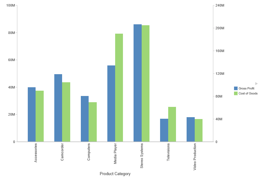
In the following image, the legend displays on the right side of the canvas.

In Live Preview, when you select a graph element (for example, legend, axis label, title), the bounding area is highlighted with a solid line.
Once you select a chart element, you can access all available design options on the ribbon, or you can right-click an element to open a shortcut menu of frequently-used design options. Once you have selected your design option from the ribbon or the menu, InfoAssist instantly applies it to the chart element, so that you see the result immediately.
Shortcut menus are enabled for charts that are generated with either sample data, or live data from your data source.
Note: Shortcut menus are not available in InfoAssist Basic.
The following sections describe the chart elements and the ribbon options that you can work with to design your charts in Live Preview.
Related Information: