Working With Interactive Content

In this section:

How to:

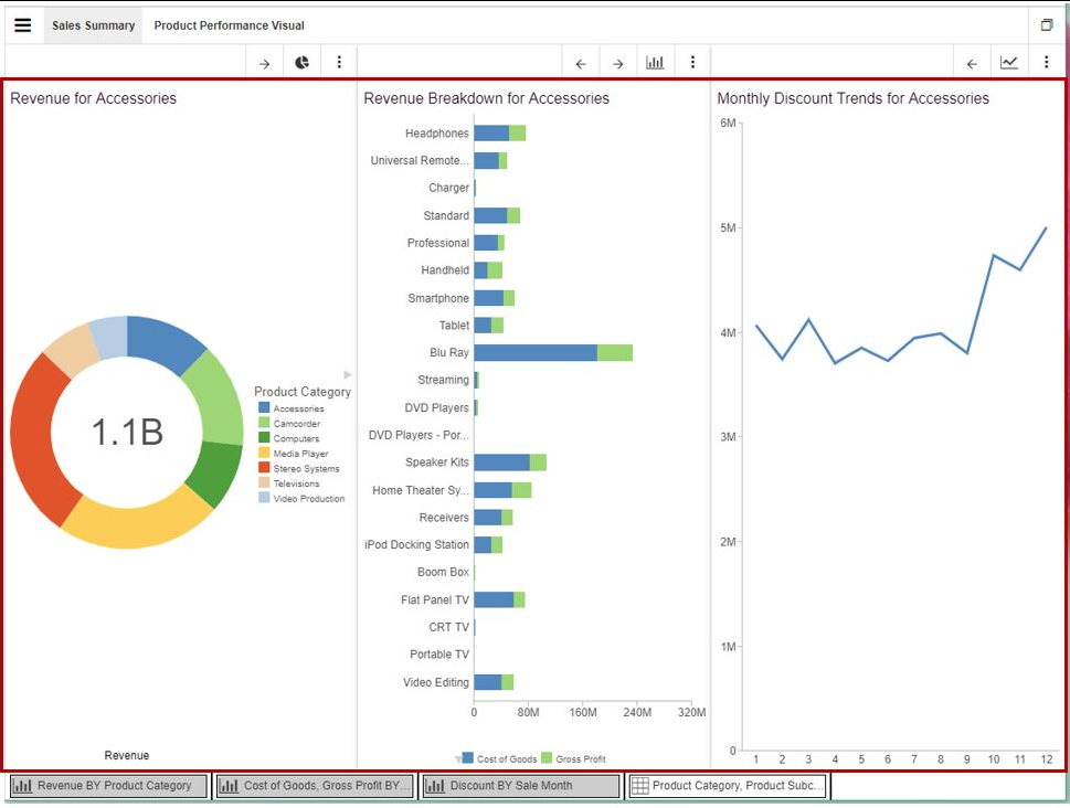
Using the power and flexibility of In-Document Analytics, you can work with interactive content online or offline (disconnected from any servers) in a unique browser session within your environment. Reports, charts, and dashboards, which are comprised of one or more interactive reports or charts, can be distributed or emailed to you, or accessed from the WebFOCUS start page. You can interact with these items in an environment that supports discovery and exploration, giving you customized content, delivered right to your desktop or mobile device.

Interactive content is created and distributed in your environment by developers. When this content is saved by the developer with an analytic output format, you can leverage the functionality of In-Document Analytics by creating new reports and charts that show aspects of your data that you otherwise might not notice. For example, you can access interactive content and add reports and charts to maximize your analysis. You can drill through to other reports and charts or utilize the Auto Drill functionality to navigate the hierarchy of your data. You can change the chart type or access other formatting options that are available to you. This gives you the flexibility of analyzing your data in different ways, including the ability to export data right from the interactive component to continue your analysis using tools such as Microsoft Excel and HTML.

Developers share these interactive reports, charts, and dashboards with users for the purpose of analyzing and reviewing data and informational trends. For example, you may receive a report or chart that shows a pattern in your data. You can dive deeper into your analysis by creating new reports or charts from this content, enabling you to view different scenarios as you navigate your interactive content.

The interactivity of the content is supported by standard Graphical User Interface (GUI) options that enable you to perform tasks quickly. For example, the Ellipsis menu offers options for creating new items, as well as printing and exporting. The hamburger menu allows you to return from maximized view. The following tools will enable you to effectively navigate In-Document Analytics interactive content.

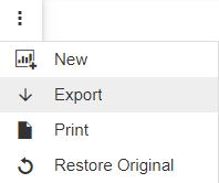
You can use the options on the vertical Ellipsis menu to perform some of the basic commands, including Export, as well as other options shown in the following image.
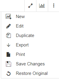
You can use the following options on the Ellipsis menu to alter the component:

New. Creates a new report or chart that is based on the fields that you had selected for the original artifact. If your component is a report, a new report will be created. Similarly, if your component is a chart, a new chart will be added.

Edit. Edits the contents of the existing report or chart. Brings up the Chart tool where you can make alternate selections.

Duplicate. Creates a copy of the existing component, which you can use as a template for creating a contrasting artifact. This item is placed in the Analysis panel where it can be viewed and modified.

Export. Exports the underlying data or image for the current component. For reports, you can export in Excel, CSV (comma delimited), and HTML format. For charts, you can export to Excel, CSV (comma delimited), and PNG (image) format.

Print. Prints your report or chart through your browser.

Save Changes. Saves a copy of your chart output, in its current state, to the Downloads folder on your machine. The default name of the output file is ARhtml.html, and includes a Coordinated Universal Time (UTC) date/time stamp.

Restore Original. Returns your report or chart back to its original status.

When you create a new report or chart from an interactive component, it displays in the Analysis panel, where you can interact separately with the new component. This panel appears to the right of the screen. The Analysis panel is shown in the following image.
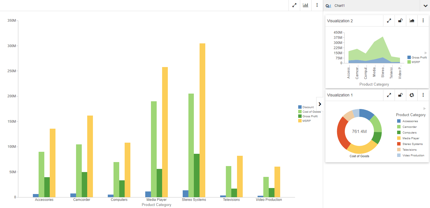
Using the Analysis panel, you can review unique scenarios as you build them, giving you a broader view of your data by allowing you to compare different outcomes. You can also change chart types and lock and unlock results. This is used in cases where you want to avoid manipulating the result in any way. You can duplicate any of the artifacts in the Analysis panel by clicking Duplicate on the Ellipsis menu. This allows you to perform comparative analyses of a specific component by copying an existing artifact. You can also edit artifacts in the Analysis panel by clicking Edit on the Ellipsis menu. This opens the Chart tool, where you can modify your selections for the current component.

You can also change the chart type for the original chart or on any new charts that you create, as shown in the following image.
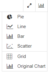
You can develop something progressive for your enterprise using these tools and functionality.

For primary components, as well as those in the Analysis panel, you can maximize your content by clicking the maximize button, as shown in the following image.
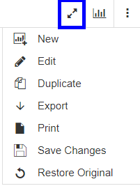
When your interface is maximized, you can return to the original view or exit full screen by clicking the hamburger menu, as shown in the following image.
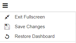
When your interface is not in maximized mode (default), the toolbar has a maximize button, as well as a button to quickly change the chart type, which applies only to a chart component. There is also a vertical Ellipsis menu that allows you to navigate to additional options. These options are shown in the following image.

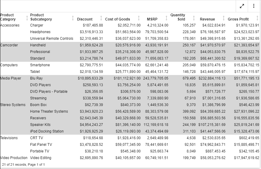
You can also use sort column indicators when you want to sort data in a report component. You can sort a column in ascending and descending order. When you sort a column, a corresponding indicator appears within the column title, as shown in the following image.

In this example, the Gross Profit data is sorted in ascending order, from lowest to highest. If you click the arrow again, the column sorts in descending order, from highest to lowest. If you click the arrow again, it returns to the default arrow that points in both directions, indicating that no sort has been applied, as shown in the following image.
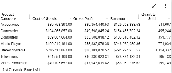
You can hide and show columns at run time. Once a column is hidden by clicking Hide column in the menu on the column level, the Show columns option displays in the report toolbar, allowing you to unhide it, as shown in the following images.
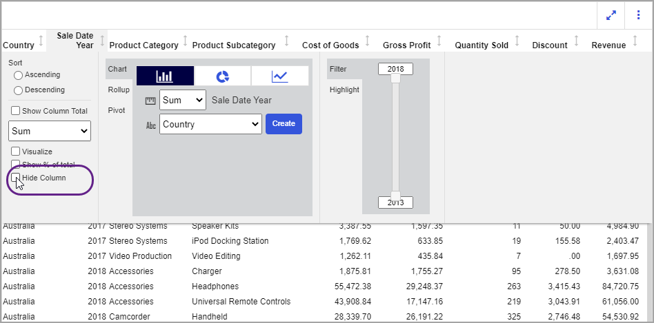
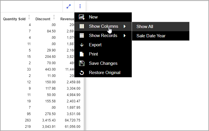
Note: If the column is hidden with the use of the NOPRINT request, the Show Columns menu does not appear. You must hide another column at run time to display the menu, then use it to unhide both hidden and NOPRINT columns.

When working with charts, you can change the chart type to see your data differently. For reports, you can use the Column menu to create Chart Rollups or Pivot tables and you can use the Cell menu to highlight items. You can use these options on the initial report, chart, or dashboard that is distributed to you, or from any of the new components in the Analysis panel. If your report developer has enabled the following features, you can also navigate different levels of your data (for example, a hierarchy or another report) using Multi Drill, Auto Drill or Auto Linking. These links appear as blue, underlined hyperlinks when you hover over an area of a chart or select an option from a list, as in the case of a report. These links can be clicked as you are navigating the hierarchy of your data or drilling through to a different item in your interactive content.

The Multi Drill functionality enables the interactive content developer to create multiple drill down links on a data field in a report or chart. This is useful when custom links are beneficial, such as a link to a website, other visualizations, or additional reports. If your interactive content developer has enabled it, Auto Drill lets you navigate through different levels within the dimension hierarchy of your data source. This allows you to review the underlying data for a particular area, and move through the structure of your data source based on your information needs. When working with interactive content, the basic functionality of Auto Drill produces different results. For example, you can use Auto Drill functionality in interactive content to drill up or down within the hierarchies of your data for additional analysis. However, because the interactive content refreshes to display a new report or chart when you drill up or down, any content you create from the Chart Rollup menu will disappear. This also applies to any new content that you create using the New option on the Ellipsis menu in an existing report or chart.

If enabled, Auto Linking makes it easy to connect reports and charts in your development environment, expanding the reporting capabilities of your organization. Using Auto Linking, you can dynamically link HTML reports, interactive reports, and HTML5 charts with a single chart of any format, based on their common sort (BY) fields and parameters referenced in any filters.

When you create new reports and charts from interactive content in a browser session, each new piece of content will be given a unique, sequential identification number that enables you to view and manage what you create. This identification number that displays at the top left of the new report or chart, is incremental, and automatically assigned. However, it may not be consecutive.

In addition, when you are adding new information, for example, multiple reports and charts, into the Analysis panel, you cannot save each instance of your analysis as an end-user. Each session is dedicated to the current analysis only. If any of your artifacts contain multi drill or auto drill links, for example, you can interact with these at run time.
Procedure: How to Create a New Report or Chart (as an end user)

  1. Click the link or distributed attachment to open the interactive content. Optionally, open the interactive content from the WebFOCUS start page.
    The interactive content displays.
  2. Click the Ellipsis menu and then click New.
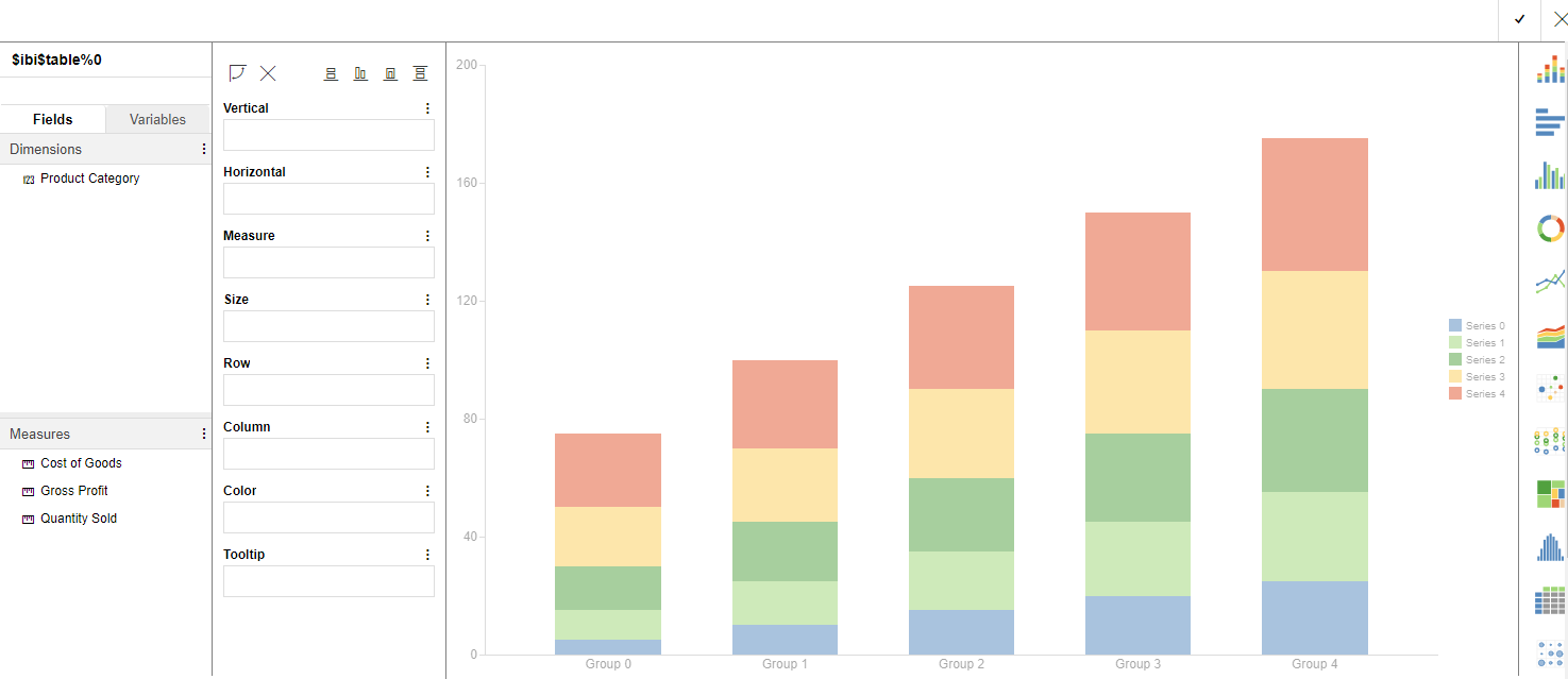
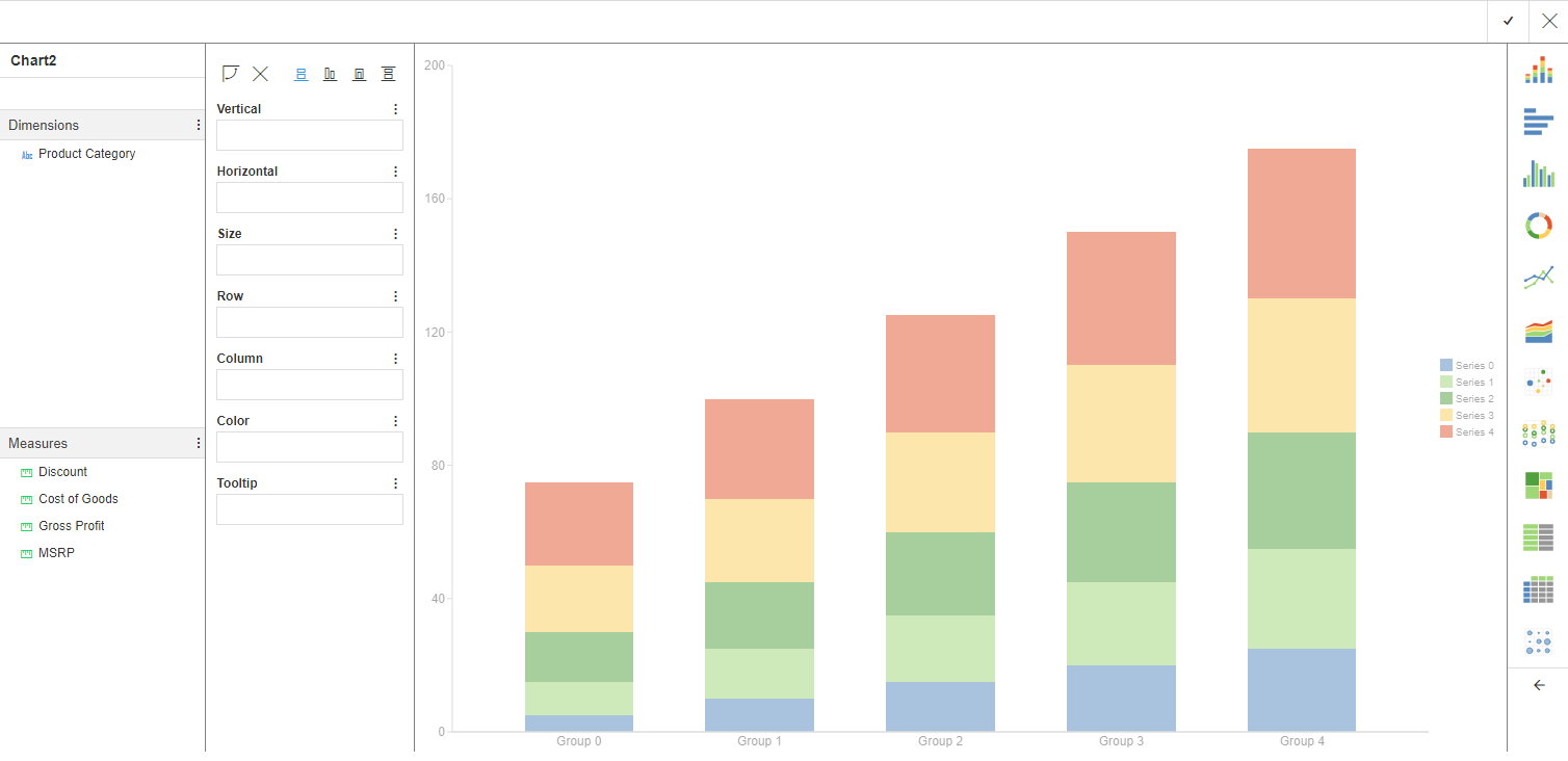
    The Chart Tool opens, as shown in the following image.
  3. From the left pane, select the data values that you want to include in the new report by placing them in the relevant field container.
  4. Click the check mark, , to close the report or chart to accept the selections and add it to the Analysis panel.
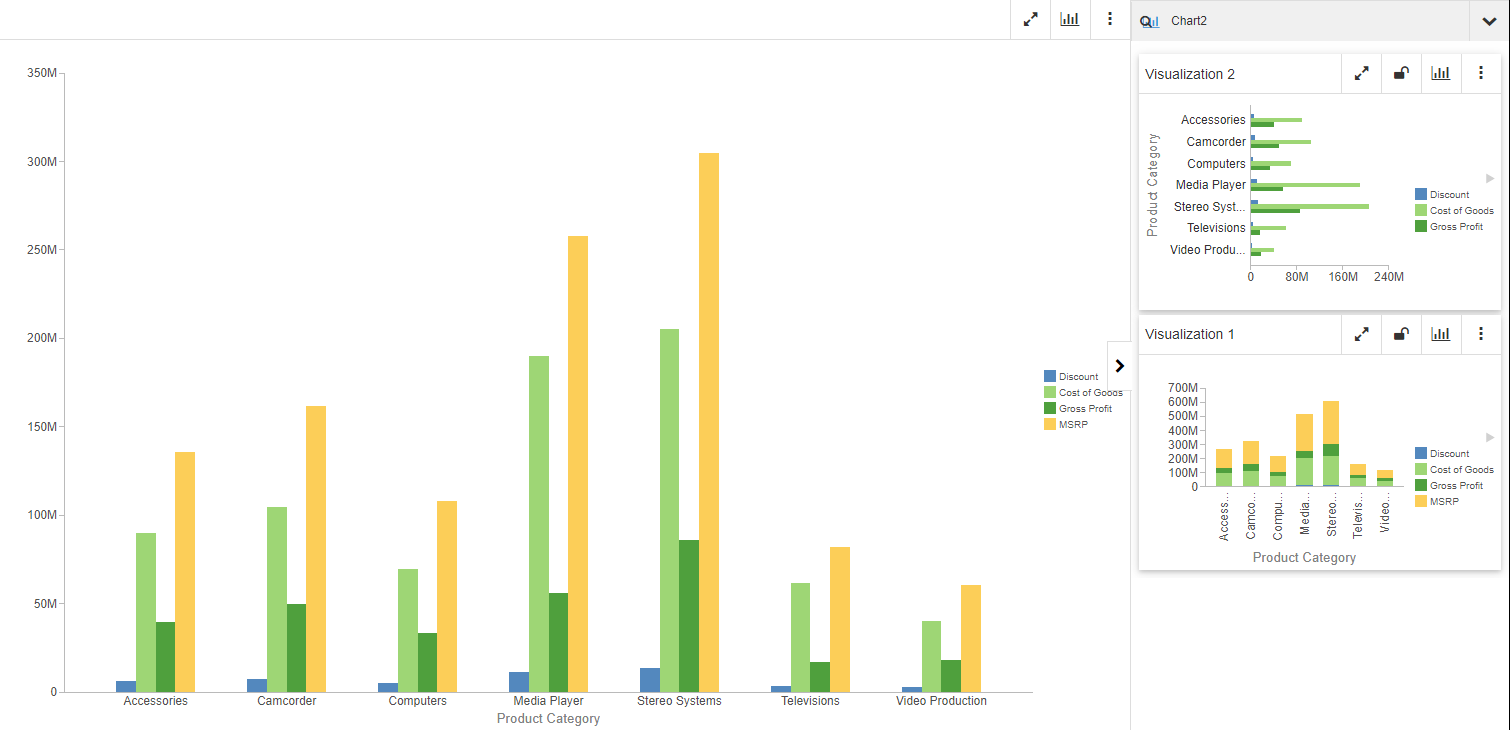
    Your new component now appears in the Analysis panel, as shown in the following image.

    Note: This works the same way for new reports, with a label of Report1, Report2, etc.

Procedure: How to Export the Underlying Data (or Image) for a Report or Chart

  1. Click the link or distributed attachment to open the interactive content. Optionally, open the interactive content from the WebFOCUS start page.
    The interactive content displays.
  2. On the Ellipsis menu, click Export, as shown in the following image.
  3. From the left pane, select an output type for the export, as shown in the following image.
  4. Click Export to export the data from the component.
  5. In your local drive, open the Downloads folder to locate the downloaded file.
  6. Open the file in the relevant application (for example, Microsoft Excel or a browser).

Interactive Content Usage Considerations

As you develop or interact with content that uses In-Document Analytics, you should reference the following usage considerations.

The following notes apply to browser support.

The following notes apply to interactive reports.

The following notes apply to interactive charts.

The following note applies to exporting from content using In-Document Analytics.
  • If you create a report that contains ACROSS sort fields, and you attempt to export the data using the Excel, CSV, and XML(Excel) options, the ACROSS column titles and field values are not included in the exported content. The same is true for the report headings and footings.

The following note applies to tools available from your interactive content.

The following note applies when using the Cache option.
  • Date-time format fields are not supported.

The following notes apply when using the Export to Excel functionality.

The following note applies when using mobile devices.

Running Content in Full-Screen Mode

When you run interactive content in maximized (full-screen) mode, there are a number of navigational features that you can use. For example, you can change the position of report and chart components in full-screen mode using drag and drop. To drag and drop, simply click the toolbar of any component and, holding the mouse, drag the object to the desired position.

In this mode, output is responsive and automatically adjusts when the width of the window is wider than its height. This is particularly useful when you have a number of components in view. In addition, full-screen mode displays a taskbar at the bottom of the screen, with an item for each report or chart component. The component currently selected on the screen is highlighted in the taskbar.

When switching from one dashboard tab to another, each page reflects the correct components that are currently available on that page. You can use the page taskbar at the bottom of the screen to review the report and chart components on the page.

You can also hide a component in full-screen mode. This enables you to hide a component from display, particularly in cases where that object is not currently needed or is irrelevant. If you wish to bring a hidden component back into view, you can click the corresponding item in the taskbar, as shown in the following image.

In cases where you have spawned components (for example, items created using the chart, pivot, rollup, or duplicate options) in full-screen mode, they are numbered in the page taskbar that corresponds to the table/chart component. The number is shown in the right corner, and an item is appended to the right of it for the spawned component. The number indicates how many components have been spawned from that component item. When you click an item in the taskbar, the window is split to display the spawned components along with the currently displayed components.

You can also drag and drop a component to the left or right of another component (in landscape mode) or above or below another component when working in portrait mode. You can reposition a table/chart component using the left or right arrows in the toolbar. This makes it easy to move just one component to the left or right in a single motion.

Another feature of full-screen mode is the ability to display report and chart components side by side while in full-screen mode. You can click on a component button while holding the Ctrl key to display multiple components at a time on the screen. The screen splits evenly to fit all selected component. If you click an item in the taskbar, the corresponding component is displayed in maximized (full-screen) mode and will occupy the full screen, as shown in the following image.

Using the Options Menu to Perform Common Tasks

How to:

Each interactive report or chart that uses In-Document Analytics contains an Options menu that you can use to modify the component further for advanced data analysis. In addition to minimizing and maximizing the component, you can also change the type of chart used, and access other options, such as Edit, Duplicate, and Print.

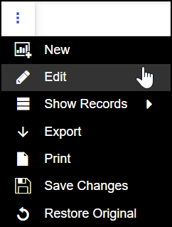
The following image shows the Options menu, expanded to show the options that are available for an interactive chart component.

The Options menu includes the following:

New. Launches a WebFOCUS Designer canvas, where you can place the data into corresponding buckets to create a new component.

Edit. Opens the component in a modified WebFOCUS Designer canvas so you can edit it.

Duplicate. Creates a copy of the component that you can modify.

Export. Exports the data for your report, table or chart to your Downloads folder. The supported export options for charts include Data to Excel, CSV, and PNG. The supported export options for reports include Excel, CSV, and HTML. In addition, when you filter an interactive component during run time, you can choose to export all records or only the filtered records. You can also multi-select different export options.

Print. Launches a window, with options that enable you to print the component. When you filter interactive components during run time, you have the option to print the entire component or only the filtered records. The Print button launches your browsers Print dialog box where, you can set up your page for printing.

Save Changes. Saves your current chart output in its current state to the Downloads folder of your machine with a default name of ARsave.html and a Coordinated Universal Time (UTC) date time stamp.

Restore Original. Returns the component to its original state.

To close the Options menu, click it a second time.

When you have duplicated or created a new report or chart from another one, the Options menu on the duplicated item displays an option to close your component, as shown in the following image.

Procedure: How to Create a New Component

  1. Select New from the Options menu on an interactive component.
  2. Drag a measure to one of the corresponding buckets for your component type, for example, the Vertical bucket.
  3. Drag a dimension to one of the corresponding buckets for your component type, for example, the Horizontal bucket.
  4. Continue to add the available measures and dimensions to your component. You can also customize the component in the following ways:
    • Create a new calculation, and add the field to your component.
    • Use the corresponding options above the buckets to modify a chart.
    • Lasso data on the canvas to create a filter.
  5. Click the check mark button to save your component, and return to the original report or chart.

    Your new component now appears in the Analysis panel.
Procedure: How to Edit a Chart Component

  1. Choose a chart component that you want to modify.
  2. Click the Options menu, and then select Edit. This returns you to the design canvas, where you can modify your field selections, change your chart type, and more.
  3. Click the check mark button to save the changes.

Procedure: How to Edit a Report Component

  1. Choose a report component that you want to modify.
  2. Click the Options menu, and then select Edit. This opens the Edit tool, where you can reorganize and enhance the information in the default display of your report. For more information see, Using the Edit Tool for Reports.
  3. Click the check mark button to save the changes.

Procedure: How to Duplicate a Component

  1. Choose a component that you want to duplicate.
  2. Click the Options menu, and then select Duplicate. A duplicate version of the original component now appears in the Analysis Panel.
  3. Optionally, lock the duplicate component, modify it by changing the chart type, exporting the data, or printing the component.

Procedure: How to Export the Data from an Interactive Component

  1. Choose the component from which you want to export data.
  2. Click the Options menu, and then select Export. The component opens in a new window that contains options for your export.
  3. Select the options that you want to use for the exported file. For example, you can select Filtered only, which only exports the filtered data. You can also choose the output format. For charts, select Data to Excel, CSV, or PNG. For reports, select Excel, CSV, or HTML.
  4. Once you have selected your export options, click Export.

    Note: All exported data is automatically sent to the Downloads folder.

Procedure: How to Save the Changes You Make to an Interactive Component

Click Save Changes from the Options menu to save the most recent changes to the interactive component.

Note: Any saved changes are automatically saved to the Downloads folder, where you can access the data that is stored with a file name of ARsave.html and a Coordinated Universal Time (UTC) date time stamp. If you are working with a chart and you edit it or change the chart type, the changes are automatically saved in the output file.

Procedure: How to Print an Interactive Component

  1. Choose a component that you want to print.
  2. Click the Options menu, and then select Print. The components opens in a new window.
  3. Click the Print button, which opens the standard Print dialog box for your browser.
  4. Select the print destination, page detail, copies, and other settings that you want to configure, and then click Print.

    The options available to you, as well as the format of your output are determined by the browser you are using to access your content. In addition, results may vary depending on whether you print in color or in black and white. This includes appearance of line weights and fonts.

    Specific browser considerations are highlighted below:

    • Printing landscape in Microsoft Edge results in a narrower display of the chart.
    • When printing charts in portrait, using Microsoft Edge, you are unable to resize the chart using fit to page.
    • Chrome browsers only enable printing in landscape.

In-Document Analytic Options for Reports

In this section:

You can use a variety of menus and options when performing analysis of an interactive report that uses In-Document Analytics. Depending on the style that you use, these options may be different.

Designer Style Report Cell Menu Options

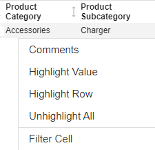
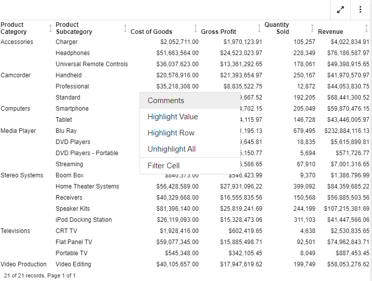
Using the Designer Style interactive report, the cell menu allows you to customize the display of your report, while adding the ability to quickly add filters. The cell menu displays when you click on each cell in a report. This enables you to highlight an individual value or a row or add comments about this individual cell in your report. You can also reverse a previously highlighted aspect. The cell menu is shown in the following image.

The Filter Cell option enables you to filter the report for just that row in the report. For example, if you want to see Accessories, you would click on Accessories in the report to enable the cell menu. In this case, the request returns just the values for Accessories, as shown in the following image.

You can subsequently remove the filter by clicking Remove Cell Filter, as shown in the following image.

This returns the report to its original, unfiltered state.

Legacy Report Cell Menu Options

When you are working in an interactive report, that uses the Legacy style, the following data cell options display.

Option

Definition

Drill down

Enables you to drill down one level in the hierarchy of your data source. This option displays for reports that have Auto Drill enabled.

Drill up

Enables you to drill up one level in the hierarchy of your data source. This option displays for reports that have Auto Drill enabled.

Restore Original

Restores the report to the default state specified in the report procedure.

Auto Links

Displays a list of target reports that are linked to the Auto Link enabled report. This option displays for reports that have Auto Linking enabled.

Comments

Enables you to add comments about data in your report. The result is an annotation that displays when you hover over it at run time.

Highlight Value

Enables you to highlight a particular value in your report.

Highlight Row

Applies highlighting to the selected row in your report.

Unhighlight All

Removes any applied highlighting from values or rows in your report.

Filter Cell

Enables you to filter the output, showing only a selected row of data.

Remove Cell Filter

Removes any applied cell filters.

Using the Column Menu for Reports

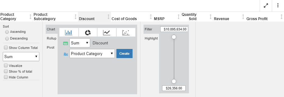
The column menu displays when you click a column heading in a report. This provides you with access to formatting tools, chart type options, and filters, giving you more control over what displays in your report.

For a non-measure or dimension column, there are three primary sections to the column menu, as shown in the following image.

You can customize each column in your report. For example, you may want to filter on specific product categories while displaying column totals for others. This allows you to create and customize your report column by column.

You can use the following information to identify column menu components as you build your report:

Ascending. Sorts the selected column in ascending order.

Descending. Sorts the selected column in descending order.

Show Column Total. Displays the column total for the currently selected column. Column totals display at the bottom of the report.

Hide Column. Hides the currently selected column. This removes the currently selected column from view.

Chart Rollup. Select a chart type and, optionally, specify an aggregation other than the default value, Sum. Select a column for which to create the chart and click Create. The chart is created in a separate dialog box, enabling you to interact with the chart using the chart features and options.

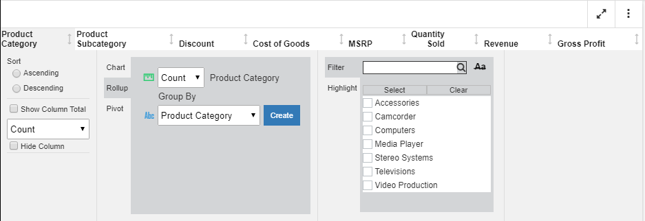
Rollup. Use the Rollup option to select an aggregation for the currently selected column. You can also select a Group By value, options for which include the list of different columns in the report. Once you have made your selections, click Create to create the rollup, as shown in the following image.

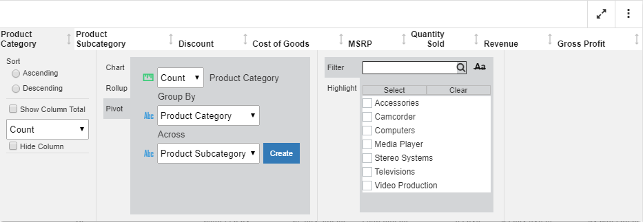
Pivot. Use the Pivot option to create a cross-tab Pivot table. You can select an aggregation for the currently selected column. Next, specify a column value by which to group the report. Indicate an Across value to create the across values in your table. Click Create to create the pivot table, which displays in the analysis panel, as shown in the following image.

Note: The available group and across values include the dimension column values in your report (for example, Product Category).

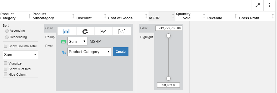
Numeric Slider. If you are working with a measure value (for example, MSRP), you can use the slider tool to narrow the values you want to display. The slider shows the lowest to highest values in your measure, as shown in the following image.

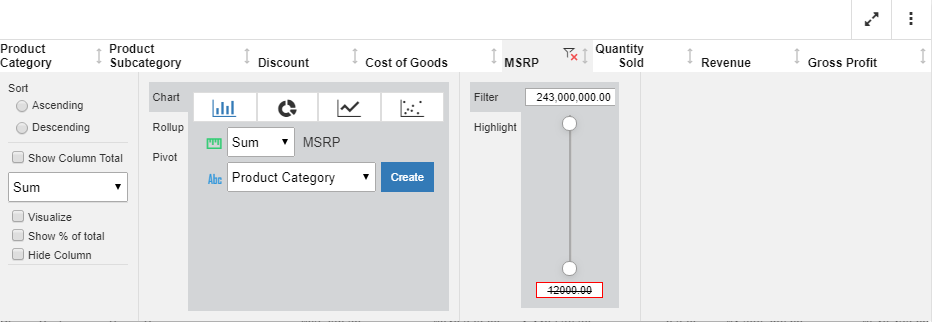
You can specify a range of values by entering the values into the text boxes. This allows you to specify a range of values for a specific measure. If a value falls outside of the range of the data values, it will be crossed out, indicating that the value is invalid, as shown in the following image.

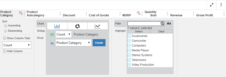
Filter. Use the filter option to narrow the data in your report. The filter option allows you to search on a value, or use the check boxes to select one or more values. You can use the Select option to select all values in your data hierarchy. Click Clear to clear the selected values. Once a filter is in place for a column, you can use the funnel-shaped icon, located next in the column heading, to clear the filter. This icon is shown in the following image.

If you are working with a date field, you can filter on a specific date using the filter control in the column menu. The filter control enables you to filter on a specific date or a range of dates, which you can indicate by holding the Ctrl key and clicking, while indicating the starting and ending dates. The range of dates is highlighted after you make your selection. The calendar filter is shown in the following image.

Note: When a calendar filter is specified, you can remove the filter by clicking the Remove Filter icon at the top of the date column.

Highlight. Select Highlight to highlight select components of your report. For example, Camcorder, Media Player, and Stereo Systems are highlighted in the following image.

Once the highlight filter is in place, you can remove it by clicking the Remove Highlight filter icon.

For measures, there are two additional options:

  • Visualize. Adds visualization bars to, or removes them from, the selected column.
  • % of Total. This is a calculation of the current value against the total for the values in a column. When you click Create, a new column is added, showing the calculated values.

These options are shown in the following image.

Using Sort Column Indicators in Your Report

Interactive reports support the use of sort column indicators when you want to sort data in a report. You can sort a column in ascending and descending order, giving you control over the display of information in your report. The indicator that shows how a column has been adjusted by a previous action shows to the right of the column, as shown in the following image.

As shown above, the selected column is sorted in ascending order, where the values in the column are sorted from lowest to highest. If you click the arrow again, the column will be sorted in descending order, where the values are sorted from highest to lowest. If you click the arrow again, it will return to the default arrow that points in both directions, indicating that no sort has been applied.

Using the Edit Tool for Reports

How to:

When you select Edit from the Options menu of an In-Document Analytics enabled report, a tool opens that contains options that reorganize and enhance the information in the default display of your report.

You can use the Edit tool to change the default column sort order for a single column or multiple columns, hide and show columns, add the result of a calculation to the top of a column, or add group subtotals to an In-Document Analytics enabled report.

These tools help you re-sort, re-group, and analyze multiple factors in a published report. You can use the Apply Changes option to save your changes to the default look and feel of a report before you distribute it.

Procedure: How to Open the Edit Tool

  1. From an In-Document Analytics report, open the Options menu and select Edit, as shown in the following image.
    The Options menu with the Edit menu option selected

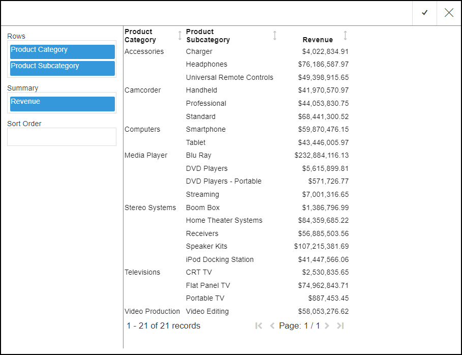
    The Edit tool opens, as shown in the following image.

    The Edit Tool with the reconfiguration area.

Procedure: How to Change a Column Sort Order

  1. Drag the column name tile for the new sort order to the Sort Order bucket.

    An arrow appears to the left of the column name tile.

    • If the arrow is pointing up, column entries for that column name tile are sorted in ascending order.
    • If the arrow is pointing down, column entries for that column name tile are sorted in descending order.

    Note: The default direction of this arrow follows standard report sorting rules.

  2. Click the arrow to change the sort order.

Procedure: How to Select Multiple Columns to Sort in Ascending or Descending Order

  1. Drag the column name tiles for the new sort order to the Sort Order bucket.
  2. Place each column name tile in the order in which entries must be sorted.

    For example, place the tile for the Group Name field above the tile for the Group Member field to sort entries by group name.

  3. Click the arrow to the left of each column name tile to select the sort order.
    • If the arrow is pointing up, column entries are sorted in ascending order.
    • If the arrow is pointing down, column entries are sorted in descending order.

Procedure: How to Hide and Show Columns

  1. Right-click a column name tile and select Hide to remove the corresponding column from the display.
  2. Right-click the column name tile again and clear the check mark from Hide to restore the corresponding column to the display.

Procedure: How to Sort on a Hidden Column

Changes to a report based on changes to the sort order of an individual column remain visible even if that column is hidden.

  1. Select the column name tile, update the sort order, and save the change as described in How to Change a Column Sort Order.
  2. Right-click the column name tile and select Remove to remove the field from the Sort Order bucket.
  3. Right-click your selected column name tile in the Rows or Summary bucket and select Hide.

    The report remains in the selected sort order even though the column the sort is based on is no longer visible.

Procedure: How to Add an Aggregate Calculation Result to a Column

  1. Right-click a column name tile, select Aggregate, and then select the calculation result to display, such as Sum, Average Count, Minimum, or Maximum.

    Notes:

    • The range of available calculation results depends upon the type of data in the selected column name tile.
    • You cannot select multiple calculation results from the list.

    The result of your selected calculation appears at the top of the column with a label describing the result, such as Total Amt. or Average.

  2. To clear the calculation result from the report, right-click the column name tile and select None.

Procedure: How to Add Subtotals to a Report

This feature is relevant only for reports that did not originally include row totals or column totals. If the report enables either of these settings, this menu option is not available.

To add subtotals to a report, you must select the measure field that the subtotal will be based on from the Summary bucket and then select the fields that the subtotal groups will be based on from the Rows bucket.

  1. Right-click on one or more measure column name tiles in the Summary bucket, point to Aggregate, and select any option from the shortcut menu other than None.
  2. Right-click on one or more column name tiles in the Rows bucket, and select Enable Subtotals.

    Entries for each group subtotal appear in your selected column.

  3. To clear the display of subtotals, right-click the column name tile again and clear the check mark from the Enable Subtotals option.

Procedure: How to Save Changes Made in the Edit Tool to the Main Report

  1. Close the Edit tool by clicking the Apply Changes check mark in the upper right corner.
  2. Select the Ellipsis options menu on the report page, and select Save Changes.

Adding a Comment to an In-Document Analytics Report

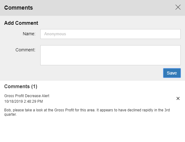
You can add comments to the individual cells within an interactive report that use In-Document Analytics capabilities, to include information explaining your data, where it appears. For example, if you include data for Gross Profit, and you would like to include a comment about the decrease over the course of a quarter or year, you could add a comment to the Gross Profit cell that you want to call out. Recipients of this interactive report can view, and reply to your comments. Commenting is only available from the Cell menu on any given cell when creating a report.

You can insert a comment by clicking a cell in a report, as shown in the following image.

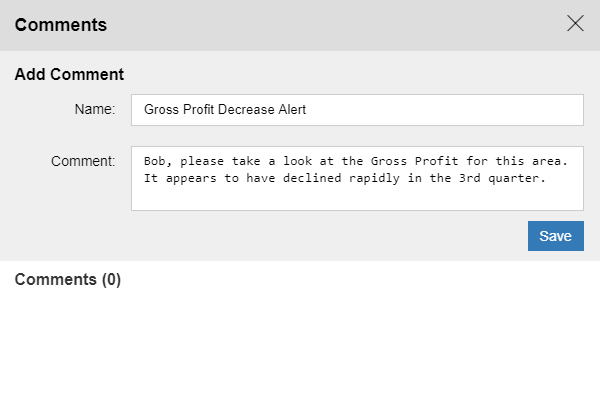
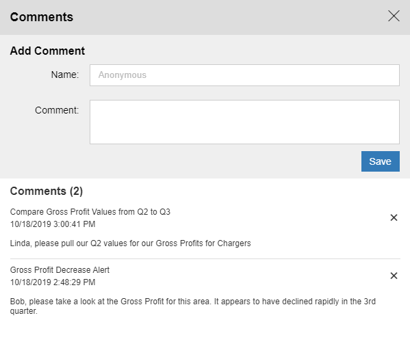
In the Comments dialog box, you can enter a name for the comment, as well as comment text itself. An example of a comment is shown in the following image.

Click Save to save the comment. The comment is saved, as shown in the following image.

If you exit the Comments dialog box without saving, your comment will not be preserved.

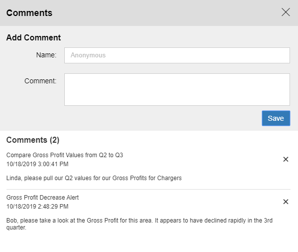
You can add multiple comments in a session, or interactively add comments with other users in your enterprise, as shown in the following image.

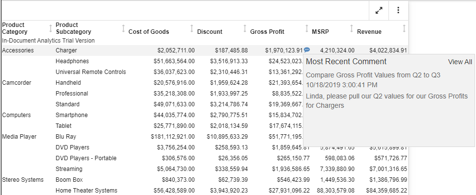
When you close the Comments dialog box, a bubble icon displays, indicating that there is a comment associated with the cell on which you commented, as shown in the following image.

When you hover over this bubble, the most recent comment displays. Clicking <strong>View All,&nbsp;</strong>opens the Comments dialog box, where you can view the history of comments related to this cell value, as shown in the following image.

In-Document Analytics Options for Charts

In this section:

Similar to the options that are available in an interactive report, you can use chart-specific In-Document Analytics menus and options to perform your analysis.

Working With Charts Using the Chart Rollup Tool

If you are working with a chart using the Chart Rollup Tool and you subsequently create a new chart, the new chart launches with a metadata tree, buckets, and the chart picker. This look and feel is similar to the common interface of WebFOCUS Designer, as shown in the following image.

The interface loads with the fields that you had originally selected. This makes it easy to select different fields to create different types of charts at run time.

You can drag or double-click items to add items into the buckets. In this way, you can model different scenarios to create a chart that meets the needs of your organization. Once you have selected the fields to include, you can select a chart type from the chart picker, which displays on the right of the interface.

When you are done, click the checkmark, located at the top right of the interface, to apply the specified changes to your chart and return to the original canvas.

You can test out various scenarios and review different results, all within one session.

Legacy Style Chart Options

Options for an interactive chart that used the Legacy styling are described in the following table.

Note: For charts that employ the new attribute syntax, only the following four icons display: More Options, Advanced Chart, Original Chart, and Aggregation. If you have applied a filter, the Remove Filter icon displays.

Option

Definition

More Options

New. Creates a new instance of the chart. This option is available only when the chart is created from a column menu on a tabular report.

Group By (X). Changes groups by the horizontal sort field.

Add (Y). Adds a vertical sort field.

X-Axis. Specifies a measure or dimension sort field. Applies to scatter charts.

Y-Axis. Specifies a measure. Applies to scatter charts.

Arrange By. Specifies the marker color. The marker color depends on the field assigned to the color attribute. If no field is assigned to this category, then all of the markers will be the same color. Applies to scatter charts.

Export to. Exports to Excel, Word, or PowerPoint.

Stacked. Stacks the risers on top of each other, with the length of each riser representing the data value. Applies to column charts.

Top. Displays the top values. Options are Top 3, Top 5, Top 10, and Clear Top. Applies to pie charts.

Trend. Draws a trendline and equation label for an individual series. Applies to scatter charts.

Chart/Rollup Tool. Opens the Chart/Rollup Tool, which you can use to select multiple group fields in the chart or rollup table generated. The Chart/Rollup Tool contains a list of columns available in the report and Group By and Measure sort fields. Drag the columns into the desired sort field.

Note: When working with the Chart/Rollup Tool for charts (specifically those with the new chart attribute syntax), the Series tab is not supported. It is available with charts that are created with tabular reports or stand-alone charts that do not use the new chart attribute syntax.

Restore Original. Restores the report to the default state specified in the report procedure.

Column

Displays data as a column chart.

Pie

Displays data as a pie chart.

Line

Displays data as a line chart.

Scatter

Displays data as a scatter chart.

Rollup

Displays the chart as a rollup table.

Advanced Chart

Opens the Chart/Rollup Tool.

Original Chart

Restores the chart to the chart type specified in the report procedure.

Lock/Unlock

Freezes the chart or rollup table. You can link or unlink a chart or rollup table to the filters that you have applied in your report using the Freeze Chart or Freeze Rollup icon. The icon indicates whether the report is linked to the filter (Freeze Chart or Freeze Rollup) or not (Unfreeze Chart or Unfreeze Rollup).

This option is available only when the chart is created from a column menu on a tabular report.

Aggregation

Applies the following options to a Measure field: Sum, Avg, Min, Max, Count, and Distinct. The default value is Sum.

Remove Filter

Removes a filter from a chart. You can apply a filter by pointing to or lassoing an area of the chart and then clicking the Filter Chart or Exclude from Chart option from the chart tooltip.

Creating Content Using the Chart Rollup Tool

How to:

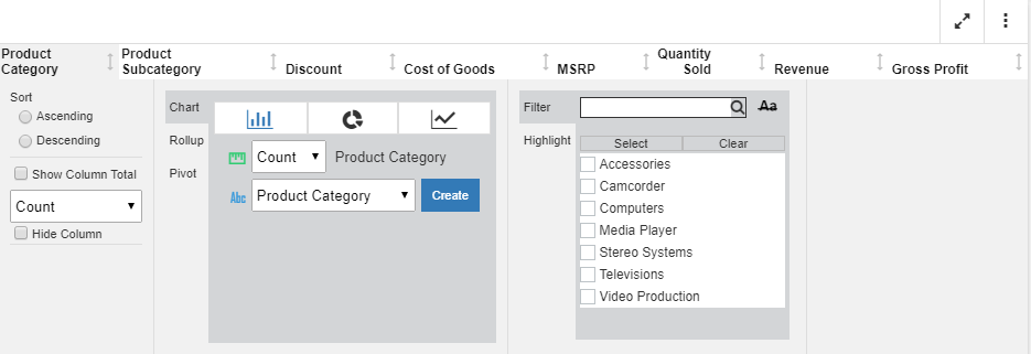
You can access the Chart Rollup Tool from the column menu in a Designer Style interactive chart or report enabled. There are three tabs: Chart, Rollup, and Pivot. As you create charts, rollups, or pivot tables, each artifact displays in the analysis panel.

You can use the Chart Rollup Tool to select multiple group fields to generate the chart, rollup or pivot table.

For the Chart tab, you can select a chart type, an aggregation, and a column for the chart, as shown in the following image.

Procedure: How to Use the Chart Tool

  1. Create a report with multiple dimensions and measures.
  2. Click on the primary dimension.
  3. From the Chart Rollup tool, select a chart type.
  4. Optionally, add an aggregation for the currently selected dimension.
  5. Select a dimension or measure from the field list.
  6. Click Create.
    The chart displays in the analysis panel. You can interact with the chart in the same way as any other artifact.

    For the Rollup, you can perform an aggregation on the current report column. You can also select a Group By value, which lists all columns in the report, as shown in the following image.

Procedure: How to Use the Rollup Tool

  1. Create a report with multiple dimensions and measures.
  2. Click on the primary dimension.
  3. From the Chart Rollup tool, select the Rollup tab.
  4. Optionally, select an aggregation to be applied to the selected column.
  5. For the Group By field, select a dimension or measure for which to perform the rollup.
  6. Click Create.
    The Rollup displays in the analysis panel.

    For Pivot tables, you can similarly select an aggregation for the currently selected column in the report. You can select from the existing dimensions for the Group By and Across fields, as shown in the following image.

Procedure: How to Use the Pivot Tool

  1. Create a report with multiple dimensions and measures.
  2. Click on the primary dimension.
  3. From the Chart Rollup tool, select the Pivot tab.
  4. Optionally, select an aggregation to be applied to the selected column.
  5. For the Group By field, select a dimension by which to group the table.
  6. For the Across field, select another dimension that will display as an across field.
  7. Click Create.

    The Pivot table displays in the analysis panel.