Interacting With Visualizations

In this section:

How to:

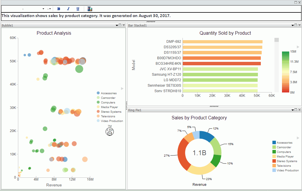
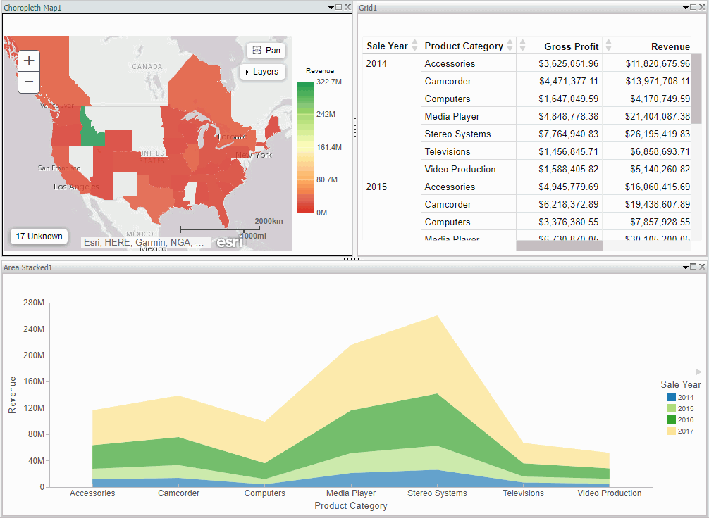
A visualization is comprised of one or more visuals, such as charts, maps, or grids and text. You can create different views of your data in a single visualization, and share that visualization with others in your enterprise.

The following image shows a sample visualization. This visualization includes a map, a matrix grid, and a stacked area chart.
This section summarizes the tasks that are available to you when working with visuals. It provides centralized instructional information on performing each task and offers links to the most common topics when working with visuals.

Task

How To

Change visual

On the Home tab, in the Visual group, click Change.

Note: The Change icon updates depending on the chart, map, or grid that you select from the Select a Visual menu. By default, the Change icon displays a stacked bar chart.

Select a chart, map, or grid from the Select a Visual menu.

Insert new visual

On the Home tab, in the Visual group, click Insert. Use the default stacked bar chart or click Change to select a different chart, map, or grid from the Select a Visual menu.

Note: You can also add additional charts, maps, or grids to a visualization by dragging a data field onto the canvas and placing it using the handles that are available.

Rearrange visuals

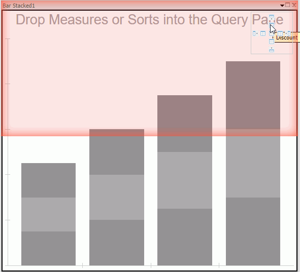
Drag a visual on top of another visual to activate a shaded area that contains handles, which can be used to indicate placement.

Copying a visual

On the canvas, select a visual. On the Home tab, in the Clipboard group, click Copy.

Note: You can also press CTRL+C to copy a selected visual.

Pasting a visual

Copy a visual. On the Home tab, in the Clipboard group, click Paste.

Note: You can also press CTRL+V to paste a copied visual on the canvas.

Duplicating a visual

On the canvas, select a visual. On the Home tab in the Clipboard group, click Duplicate. A duplicate visual is created and a sequential number is assigned based on the type of visual.

Delete visual

Select a visual. On the Home tab, in the Clipboard group, click Cut. You can click the Close button in the upper-right corner of the current visual. From the Query pane, right-click a visual and click Delete. You can also press the Delete key when a visual is selected.

Apply Filter

Drag a dimension field or measure field into the Filter pane to access the filter options that are available. To add filter options for a field that is already in the Query pane, select the field and on the Field tab, in the Filter group, click Filter.

Add visuals to the storyboard

Create a visual. On the Home tab, in the Storyboard group, click Add.

Procedure: How to Insert a New Visual

  1. On the Home tab, in the Visual group, click the down arrow next to Insert.
  2. On the menu, click one of the following options:
    • Chart. Inserts a stacked bar chart visual.
    • Grid. Inserts a grid visual.
    • Text. Inserts a blank text cell.
  3. Populate your visual with data or add text to the text cell.

    Note:

    • By default, when you click Insert, a stacked bar chart visual is inserted.
    • You can also drag a data field from the Data pane to the canvas to insert a new visual. This inserts the default visual, a stacked bar chart. You can use the placement handles to position your new visual on the canvas, for example, above an existing visual or to the side of an existing visual.

Procedure: How to Add Text to Your Visualization

  1. On the Home Tab, in the Visual group, click the down arrow on next to Insert.
  2. On the menu, click Text.

    A text cell opens on the canvas.

  3. Add text to your visualization.

    Note: You can resize the text cell and use the text formatting options to customize the display of any text that you add, as shown in the following image.

    You can also position the text cell in your visualization by dragging the text cell on top of a visual. Use the placement handles to indicate placement of the text cell.

Procedure: How to Create a Visualization

  1. Begin with the default canvas, which consists of a stacked bar chart template.
  2. Insert a new visual in one of the following ways:
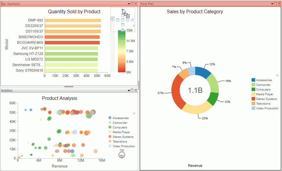
    1. Drag a data field from the Data pane onto the canvas. Handles display, which allow you to select the location for the new visual, for example, top (above) or left of the current visual, as shown in the following image.
    2. On the Home tab, in the Visual group, click Insert.

      Note: You can optionally click the down arrow on the Insert button to specify the addition of a chart, grid, or text.

  3. Add another visual.

    Now, three visual cells display side-by-side.

  4. Click a visual to select it.

    Note: You can click a visual to activate it, or double-click on the visual number or name in the Query pane.

  5. Reorganize your visuals using the handles.
  6. Once you have organized the placement of your visuals, select one and specify the visual type.
    1. On the Home tab, in the Visual group, click Change.

      Note: The Change icon updates depending on the chart, map, or grid that you select from the Select a Visual menu. By default, the Change icon displays a stacked bar chart.

    2. In the Select a Visual menu, click the type of visual you want to use. For example, Line, Area, or Map.
    3. Repeat these steps for all three visuals on your canvas.
  7. Populate each visual with your data.

    You can change the type of visual that you previously selected at any time. You can also resize or reorganize the position of each visual as you add data.

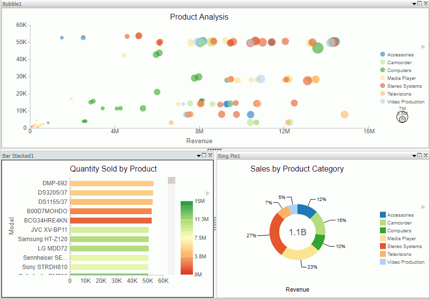
    For example, move the lower-left visual to the top of the visualization.

    The bubble chart now runs across the top of the visualization.

  8. Click Save to save your visualization.

Minimizing or Maximizing a Visual

How to:

When working on a visualization with more than one chart, map, or grid, you can maximize and minimize individual visuals. This allows you to focus on one visual at a time, and then minimize it to view it alongside the other visuals.

The maximize and minimize icons are located in the top-right corner of each visual, next to the Close button. When you click the Maximize icon, the current visual moves to the foreground and is the only visual that displays on the canvas. You can work on this visual, and then minimize it to view the other visuals.

Note: You can view other visuals in the maximized mode by selecting a different visual in the Query pane.

Procedure: How to Minimize or Maximize a Visual

  1. Create a visualization with two or more visuals.
  2. Perform the following actions to minimize or maximize your visual:
    • Click the maximize icon or double-click on the Title bar to maximize your visual.
    • Click the minimize icon or double-click on the Title bar to minimize your visual.

    You can maximize one visual at a time, and you can switch between visuals in this mode by double-clicking a different visual in the Query pane.

Procedure: How to Delete a Visual

  1. In your visualization, select the chart, map, or grid that you want to delete.
  2. Perform one of the following tasks to delete the visual:
    • Press the Delete key.
    • On the Home tab, in the Clipboard group, click Cut.
    • Click the Close button in the upper-right corner of the current visual.
    • From the Query pane, right-click on a visual, and click Delete.

    Note: You can use the Undo and Redo options on the Quick Access Toolbar to reverse or redo any prior actions.

Renaming a Visual

How to:

You can rename a visual on the canvas or within your visualization. You may want to do this for presentation and organizational purposes, as each visual has a default label (for example, Bar 1, Bar 2, and Bar 3). You can change these labels by renaming the visual in the Query pane.

Once new labels are in place, it is easier to recognize which visual you want to select at any given time.

Using the shortcut menu for a visual in the Query pane, you can also rename your visual.

Procedure: How to Rename a Visual

  1. Create a visualization with one or more chart, map, or grid.
  2. In the Query pane, right-click the visual number for which you want to modify the title.
  3. Click Rename.
  4. In the Edit Title dialog box, enter a new name for the visual.
  5. Click OK.

    The visual is renamed in the Query pane and the new title is reflected at the top of the selected visual.

Using Paper-Clipping to Group Values in a Visual

How to:

Paper-clipping gives you the advantage of lassoing values in a visual to create logical groups within your selected dimension. Paper-clipping uses the core functionality of dynamic grouping, giving you access to grouping capabilities that meet your business needs. You can also add additional groupings or fields to an existing group, and rename the groups and values, giving you control over how the information displays.

When you paper-clip values together, a new group is created using the naming convention of dimensiongroup_1. You can add values to this group by lassoing this grouped component, along with any additional components you want to add. These new values become part of that existing group.

Note: If you group two values and then add another value to that grouping, you must manually rename the group in order to update its display.

If you lasso other values in your visualization, and you do not capture or include a previously defined grouping, a new grouping is created for the selected fields in the current dimension. It is labeled using the original dimension label (dimensiongroup_1), but a new, unique grouping is created for these values. You can see the groupings by right-clicking the group in the Query pane and selecting Edit Group. If you want to add new values to an existing group, you must lasso the existing group, in addition to the fields that you want to add to it, in order to combine the additional fields into the existing grouping.

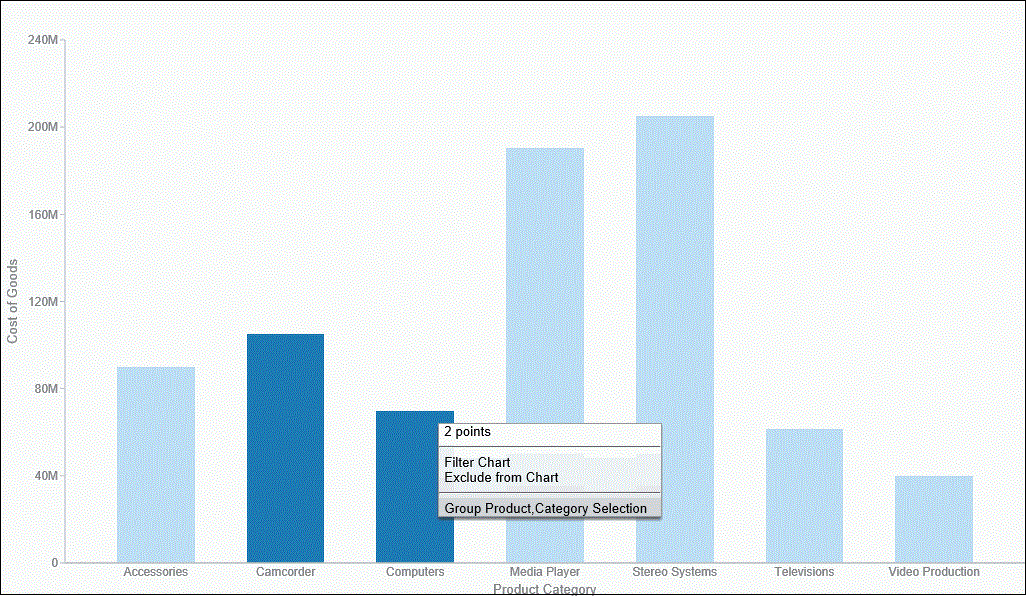
To enable paper-clipping, lasso the values that you want to group, release the mouse, and from the menu that displays, select Group n Selection, where n is the dimension associated with the values you select. This menu is shown in the following image.

Note: Paper-clipping allows you to group on the first BY field only. In this example, the first BY field is Product Category. If you are working with a matrix chart and you apply this rule, you are only able to group on the first BY field. In addition, you cannot group on a numeric field (for example, Sales_Year). In this case, if the numeric field was the first BY field, grouping is not available.

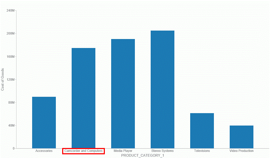
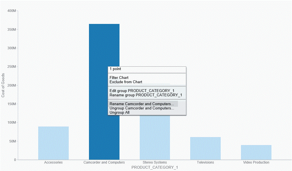
Once you group the values, they display in a unique group on the relevant axis. The group label is based on the original values stored for those components. For example, in the previous image, we grouped Camcorder and Computers in the PRODUCT_CATEGORY_1 group, as shown in the following image.

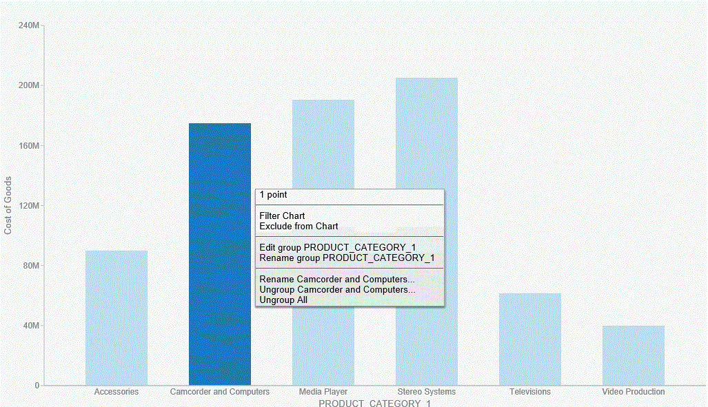
Once you create a group, you can easily perform the following functions:
  • Edit group. Opens the Edit Group dialog box, where you can edit the values in the current group. For example, you can add additional values into the current group or delete them. For more information on editing an existing group, see Dynamic Grouping.
  • Rename group. Enables you to rename the group using the Rename Group dialog box. The revised name displays along the relevant axis and replaces the existing field name in the Query pane.
  • Rename x. Enables you to rename the group name (x) that is assigned based on your grouping. This is particularly useful in cases where space is an issue in your visualization. This revised value also replaces the original group name in the Edit Group dialog box.
  • Ungroup x. Ungroups the values of the group (x) that were previously grouped.
  • Ungroup All. Ungroups all existing groups, returning the visualization to its original state.

    Note: Upon ungrouping all groups, the original dimension displays as a group in the Query pane, by default. However, no grouping is applied.

These options are shown in the following image.

Note: You can also edit an existing group by right-clicking the group in the Query pane and selecting Edit Group.

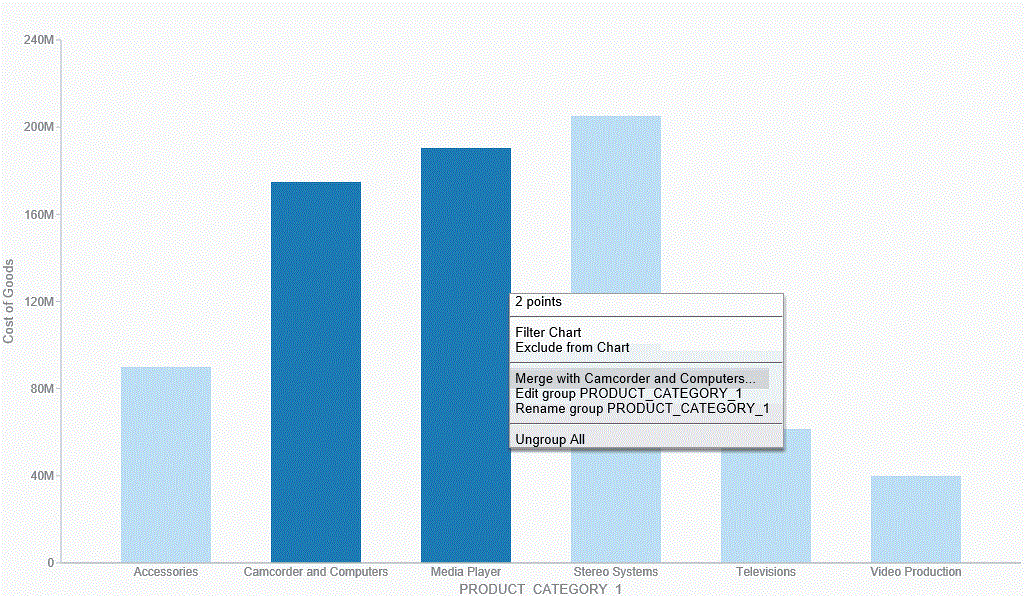
If you want to add another value to an existing group, lasso the existing group and the new value. From the menu, click Merge with x, where x is the value of the existing group, as shown in the following image.

The new value is added to the existing group. You can then rename the group so that its label contains all values in the group. You can optionally label it with a new, unique name. This option is shown in the following image.

Note: You can also use the Edit Group dialog box to rename groups or groupings. For more information, see Dynamic Grouping.

You can use the following procedures to create and manage your paper-clipped values.

Procedure: How to Paper-Clip Two or More Values Together

  1. In visualization mode, create a bar chart with one measure and one dimension. The bar chart displays.
  2. Lasso two or more columns in the visualization.
  3. From the menu that displays, click Group n Selection, where n is the name of the dimension in your bar chart.

    The two values are paper-clipped together, or grouped, as indicated on the x-axis.

    Note: If you have swapped the orientation of your visualization, the paper-clipped values display on the y-axis.

Procedure: How to Merge an Additional Value into an Existing Group

  1. In visualization mode, create a bar chart with one measure and one dimension. The bar chart displays.
  2. Lasso two or more columns in the visualization.
  3. From the menu that displays, click Group n Selection, where n is the name of the dimension in your bar chart.

    The two values are paper-clipped together, or grouped, as indicated on the x-axis.

    Note: If you have swapped the orientation of your visualization, the paper-clipped values will display on the y-axis.

  4. Lasso this existing group, as well another column, to merge this additional value into the group.
  5. From the menu that displays, click Merge with x, where x is the name of the group you originally created.

    This value is merged into the existing group.

    Note: The name of the group is not dynamically updated. In order to reflect the contents of the revised group, you must edit the group using the right-click menu option or the Edit Group option that is available in the Query pane.

Procedure: How to Rename an Existing Group

  1. In visualization mode, create a bar chart with one measure and one dimension. The bar chart displays.
  2. Lasso two or more columns in the visualization.
  3. From the menu that displays, click Group n Selection, where n is the name of the dimension in your bar chart.

    The two values are paper-clipped together, or grouped, as indicated on the relevant axis.

  4. Lasso the grouped column and from the menu that displays, click Rename x, where x is the existing label of the group.
  5. In the Rename Value dialog box, enter the new name for the group.
  6. Click OK.

    The group is renamed, as shown on the relevant axis.

    Note: Optionally, you can rename a group using the Edit Group dialog box. This is available when you right-click on a grouped value in the Query pane and click Edit Group. For more information, see Dynamic Grouping.

Viewing Data Behind Visuals

How to:

You use InfoAssist to analyze your data by creating or building interactive visualizations. As you develop these visualizations, you can create different views of the data, and find patterns or trends.

As you gain insight and spot patterns, you may want to share only the underlying data that comprises a specific visual with others in your enterprise. You can do this using the data options, as shown in the following image.

The Show data option provides options for you to view and share this data. The Export data option enables you to export the data specific to your visualization in a summary or detailed format. You can also review related data by using the Show Data with Related Columns option.

The Show Data with Related Columns functionality allows you to review more specific underlying data based on the fields that you have selected. Specifically, it displays data related to other fields that are part of the dimension hierarchy that you select. For example, if you selected the Product,Category dimension field, the related column data would include data from the Product,Subcategory and Model dimension fields, because these data fields are part of that dimension hierarchy.

Similar to the Show data option, the Show Data with Related Columns option provides more detailed data based on the data fields that you select. You can sort and review the data columns, which display in a separate browser window. Depending on the size and breadth of your dimension hierarchy, a multiple page report may be produced.

Note: You can export data in .xls or .csv format.

When you select the option to show data or show data with related columns, a report is generated in a separate browser window. This report is an report, which you can review, sort, and modify using the drop-down menus that are available. For more information on reports, see the TIBCO WebFOCUS KnowledgeBase at: http://documentation.ibi.com.

When you point to the Export Data option, you can:

Note:

Procedure: How to Show the Data Behind Your Visual

  1. Create a visual, such as a chart, map, or grid.
  2. In the upper-right corner of the visual cell, click the down arrow.
  3. In the menu that appears, click Show Data.

    A new browser window opens. This window displays the data for your visual as . You can use this report to create and share lightweight, browser-based data discovery analytics that are portable, and only require access to a browser.

Procedure: How to Show Data With Related Columns

  1. Create a visual, such as a chart, map, or grid.
  2. In the upper-right corner of the visual cell, click the down arrow.
  3. In the menu that appears, click Show Data with Related Columns.

    A new browser window opens. This window displays the data for your visual as . You can use this report to sort and work with the underlying hierarchical data in your visual.

Procedure: How to Export the Data Behind Your Visual

  1. Create a visual, such as a chart, map, or grid.
  2. In the upper-right corner of the visual cell, click the down arrow.
  3. In the menu that appears, point to Export Data, and then click one of the following:
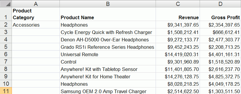
    • Summary. A prompt appears, asking you to open or save a Microsoft Excel file. This file is a summary of your data from a high level for a general analysis, as shown in the following image.
    • Data Detail. Generates a detailed report that provides specific data regarding your data analysis.

Using Multi Drill in Visualization Mode

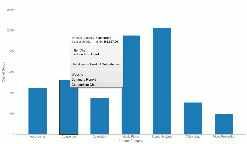
Similar to the functionality that is available in Chart mode, you can create multiple drill down links on a measure field in a visualization. This enables you to define custom links to other reports or websites, making it easy to link content from internal and external sources. Once defined, these links display on the shortcut menu that displays when you hover over a riser, as shown in the following image.

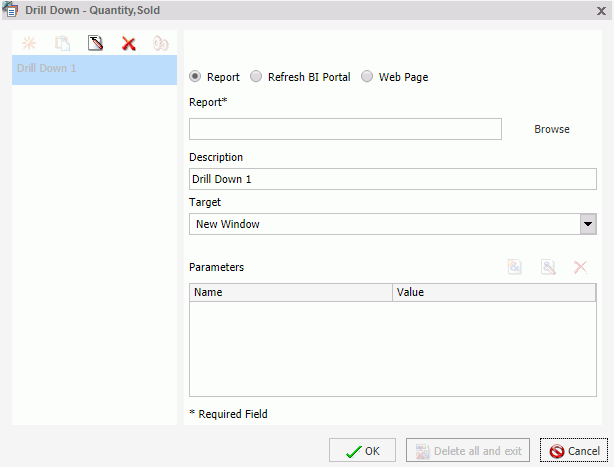
You create multiple drilldowns using the Drill Down dialog box, which you can access from the Links group on the Field tab. In the Query pane, click a measure to enable the Field tab. In the Links group, click Drill Down. The Drill Down dialog box displays, as shown in the following image.

Note: When creating a drill down in Visualization mode, the Auto Link Target option is not available.

For more information and instructional guidance, see Using Multi Drill.

Creating Multi-Y Axis Comparative Visuals

How to:

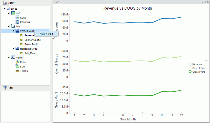
When creating a chart with more than one measure (numeric) field, you can split the Y axis to create multiple charts, based on each unique measure field.

Note: Measure fields are selected from the Data pane and display under the Vertical Axis (Y) in the Query pane.

This functionality is useful when analyzing trends for multiple measure fields, as you can view data for each measure field separately within the same chart, as shown in the following image.

This functionality is available for Bar, Bar Stacked, Line, Area, and Area Stacked charts.

Procedure: How to Create a Multi-Y Axis Comparative Visual

  1. Launch InfoAssist in Visualization mode.
  2. On the Home tab, in the Visual group, click Change.
  3. Select one of the following visual types: Bar, Bar Stacked, Line, Area, or Area Stacked.

    Note: Bar Stacked is the default visual type.

  4. Add multiple measure fields to the visual. For example, Gross Profit and Revenue.
  5. Add at least one dimension field to the visual. For example, Product Category.
  6. In the Query pane, right-click Vertical Axis.
  7. Click Multi-Y split.

    The chart changes to display individual charts for each measure field.

    Note: You can revert your chart to an integrated display by right-clicking Vertical Axis and then clicking Multi-Y split.