In most chart types, measure values for different categories are communicated based on visual cues. For example, the height of a riser in a bar chart, the size of a slice in a pie chart, or the color or an area of a heatmap all communicate the measure value of the dimension value that they represent. By comparing different areas of the chart, and by using the legend and tooltips, you can quickly identify overall trends in your data.
To display measure values in a chart, you add them to a measure bucket. The names of these buckets differ, depending on the type of chart, and many chart types include multiple measure buckets, so you can evaluate the relationships between different metrics. For example, in a bar chart, you can display measure values using the Vertical, Size, and Color buckets. The Vertical bucket expresses values of the selected measure field using the height of each bar, the Size bucket expresses values using the width of each bar, and the Color bucket expresses values using the color of each bar, based on a color scale. The Color bucket can accept either a measure field or a dimension field. If you use a dimension instead of a measure, the color of each bar or bar segment is based on dimensional series values.
Each chart type has a default measure bucket. When you double-click a measure field or drag it onto the canvas, it is automatically added to that bucket. In the case of a bar chart, the default measure bucket is the Vertical bucket. For more information about the buckets available for each chart type, see the topics under Creating Charts.
By default, when a measure field is added to a measure bucket, the values are aggregated as a sum. The aggregation is performed for each dimensional sort value. To change the type of aggregation for a single field from sum to another option, such as count or average, right-click the measure field and point to Aggregate. A list of available aggregation options displays. For more information about aggregations, see Using Prefix Operator Aggregation Functions.
Alternatively, you can change the evaluation of all measure fields in your chart at once. From the Calculation Options menu
 , you can change the evaluation in all measure buckets from a summary aggregation to a count aggregation or to detail values,
in which case measure values are not aggregated at all, instead displaying the value of each record in your data set. When
you select one of these options, the icon displays above the chart buckets.
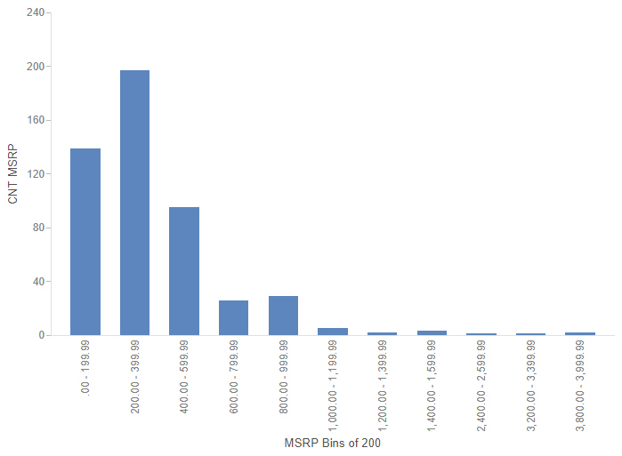
The count evaluation method displays the number of records within each sort value. This allows you to see the distribution of your data, such as in a histogram. To create a histogram, create a new bar chart and create a set of bins for the measure field distribution you want to evaluate. Add the newly created bins to the Horizontal bucket, then add the original, associated measure field to the Vertical bucket. Finally, change the evaluation method from Summaries to Counts. The chart now shows the number of records that fall into each bin range, as shown in the following image.

When using the Counts evaluation option, you can still change the aggregation option for each individual measure field, just like when you are using the Summaries option.
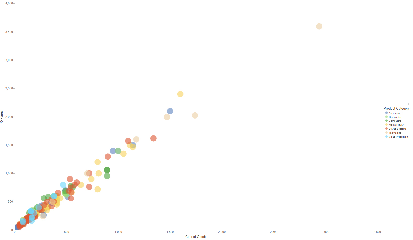
The Details evaluation option allows you to see the value of each individual record in your data set. Since every record is displayed, the Details option is best used for chart types that can display lots of values effectively. For example, the following image shows a scatter plot where each point represents a different record. The Revenue and Cost of Goods values represented by each axis are the non-aggregated revenue and cost of goods for each individual record.

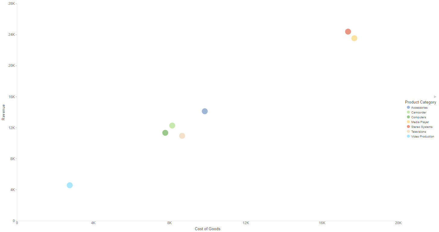
If we had used the Summaries option, the chart would have displayed one point for each sort value, as shown in the following image. In this example, the sort value was the dimension in the Color bucket, Product Category.

Note: If you are using a very large data source, you may wish to filter your chart before displaying detail values in order to reduce the resources required to display all records.