| Query
|
Enter a search query. Enter USE to start an EQL statement or SELECT to start an SQL statement. You can search based on filter and time Bloks as well.
|
| Date & Time
|
You can enter absolute and relative time ranges.
For example, enter -5h as a relative time range to display results for events that occur in the last 5 hours.
|
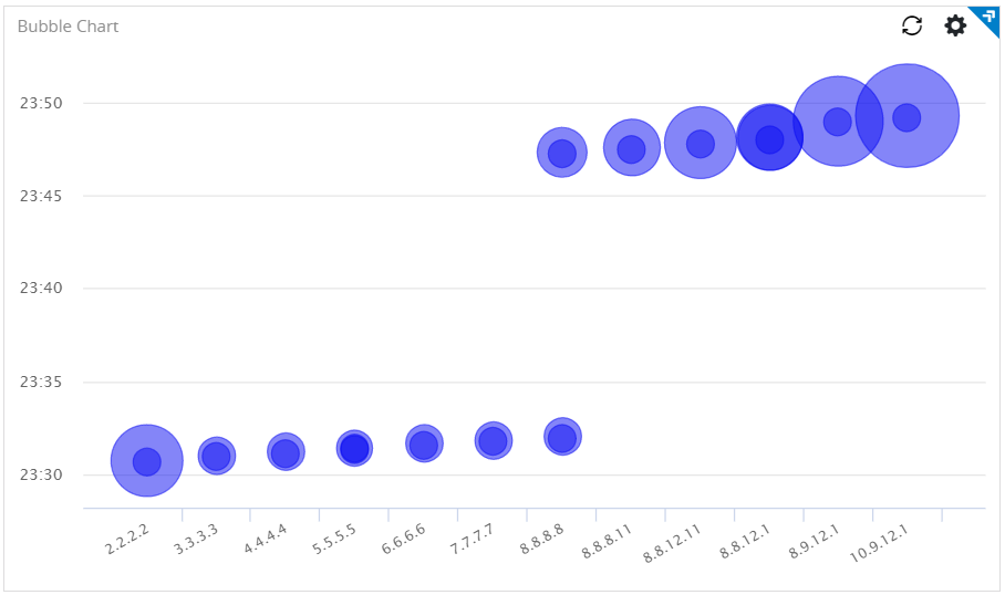
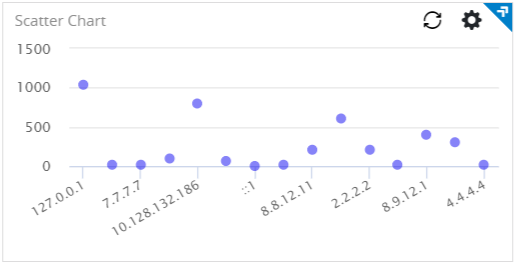
| Bubble type
|
To display a bubble chart, select Bubble.
To display a scatter plot, select Scatter.
|
| X-axis data
|
Choose the column name to define the X-axis.
|
| X-axis label
|
Define the label name for the X-axis that is displayed on the widget.
|
| Y-axis data
|
Choose the column name to define the Y-axis.
|
| Y-axis label
|
Define the label name for the Y-axis that is displayed on the widget.
|
| Bubble value
|
Choose the column that to be displayed as bubbles. The size of the bubble is proportionate to the column value. This field is available only for the
Bubble type.
|
| Buffer size
|
The number of rows to be displayed in the widget after refreshing the widget. For example, if the buffer size is 100 and the query returns 150 results, the latest 100 results are displayed.
The default is 1000 rows.
This field is available only for the
Bubble type.
|
| Use bubble color
|
The color of the bubbles or scatter points on the widget. Click the color value to change the color.
|
| Use color threshold
|
Define the threshold range for the colors on the widget.
|
| Use color value
|
Define the column name by selecting the column.
You can use an Enrichment List or EQL conditional functions such as
IIF in the query to return specific color values.
|
| Widget description
|
A short description for the widget. On the Advanced Dashboard, the description is displayed when you hover over the widget.
|
| Auto load
|
Click the slider to ON to automatically load widget data on the Advanced Dashboard.
- By default, it is disabled for newly created widgets, but enabled for the widgets created in
LogLogic LMI 6.3.0 and earlier.
- Disabling the
Auto load option disables the
Auto refresh option. However, you can manually refresh the widget on the Advanced Dashboard to load its data.
|
| Auto refresh
|
Click the slider to ON to refresh the widget. By default, it is set to OFF.
|
| Refresh widget every
|
If Auto refresh is set to ON, enter a time interval in seconds to refresh the widget. Refresh action starts after the data is completely retrieved and displayed.
|