Creating a Plot with TERR and dygraphs
If you have time and date data, you can create a line plot showing trends with the TERR-compatible, JavaScript-enabled dygraphs package.
About this task
For information about the packages used in this example task, see the following links.
| Package link | Package short description |
|---|---|
| http://www.quantmod.com/ | The quantmod package provides quantitative modeling functions. |
| http://dygraphs.com/ | The dygraphs package provides fast, flexible JavaScript charting functions. |
Note: You can perform this
task from RStudio using the
TERR
engine. If you use RStudio, the results are displayed in the RStudio Viewer
pane.
Before you begin
Procedure
Results
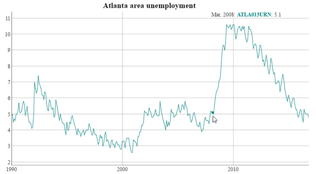
- You can resize the image. The X-axis label detail adjusts to the window size.
- You can highlight individual points on the line by hovering over the line with your mouse or pointer device. The row value for the highlighted point (in this case, the month and year, data source, and Y-axis value) is shown in the upper left of the browser window.