Spotfire® Enterprise Runtime for R

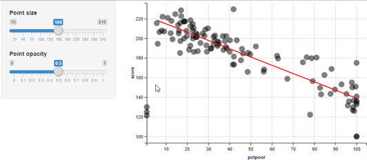
Displaying a Linear Model on a Scatterplot with ggvis

If you want to create an interactive graph that is similar to one you can create in ggplot2, you can install the ggvis package.

About this task

Perform this task from either RStudio or the TERR console. This example walks you through creating a scatter plot with a linear model prediction using data available on the internet, and then displays the results it in a browser. The ggvis package does not use JavaScript.

For information about the packages used in this example task, see http://ggvis.rstudio.com/.

Note: If you use RStudio, the results are displayed in the RStudio Viewer pane.

Before you begin

TERR, access to the internet, and a browser.

Procedure

  1. From the TERR console or RStudio prompt, install the ggvis package.
    install.packages("ggvis")
    TERR checks TRAN and then CRAN for the package to install, and then installs it along with any packages it requires.
  2. Download the data from the internet, and assign it to file.

    The data in this example is in a .csv file on github.

    file <- "https://github.com/smach/NICAR15data/raw/master/testscores.csv"
  3. Read in the .csv file using the utils package function read.csv, assigning it to the object testdata.
    
    testdata <- read.csv(file, stringsAsFactors = FALSE)
  4. Load the ggvis package.
    library("ggvis")
    The package and its required packages are loaded, and messages about any object masking are displayed, along with any warnings regarding TERR differences.
  5. Call the ggvis package function ggvis, passing in the testdata object, and providing the property information and modeling for the graph.

    In the example, these specify the following.

    • The x and y values to graph (pctpoor and score columns).
    • Point properties specifying size and opacity.
    • Sliders for interaction with point size and opacity, and which show default labels and scales for each point property.
    • A linear model prediction, specified as a red line.
    ggvis(testdata, ~ pctpoor, ~ score) %>%
      layer_points(size := input_slider(10, 310, label = "Point size"),
        opacity := input_slider(0, 1, label = "Point opacity")) %>%
      layer_model_predictions(model = "lm", stroke := "red", fill := "red")

Results

The specified graph is opened in a browser window. You can manipulate the sliders to change point size and opacity.
linear model created using the ggvis package