Column matches
When you combine data from different data tables in one visualization, you must consider how the columns in the data tables match. A rule of thumb is that all the columns you are planning to group the visualization by, should exist in all the data tables. For example, this could be columns that will define what a marker is in a scatter plot, columns you wish to set on the category axis of a bar chart, or columns you wish to trellis or color the visualization by. If your data is structured that way, configuring the visualization and matching columns will be easy. However, there are cases when it is OK that some columns in the main data table do not have matches in all the data tables. And, even if the data is configured the recommended way, you might sometimes need to make a few manual adjustments.
Automatic column matching
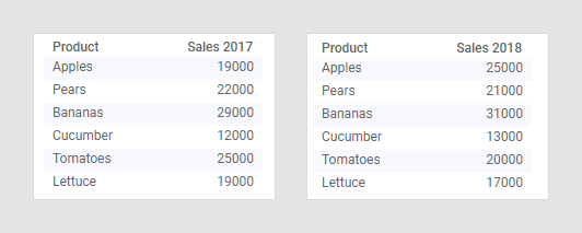
When adding multiple data tables to an analysis (in any Spotfire client), Spotfire will automatically match columns with the same name and data type. For example, if you load the data tables below into Spotfire, a match will automatically be added between the columns named 'Product':
When the column match is available you can use the data from both tables in a single visualization, as described in Multiple data tables in one visualization.
Manual column matching
If the data tables that you want to use do not contain an exact column match directly, you can add and edit column matches using the installed client. This can be necessary if the columns you want to match have different names, or data types, or if the values in the columns use different casing.
For details, see Adding column matches manually, and the examples following that topic.
Viewing the current column matches
When matches have been added, they are shown in the Column Matches tab of the Data Table Properties dialog (installed client only). Click on a data table to see the current matches for that data table:
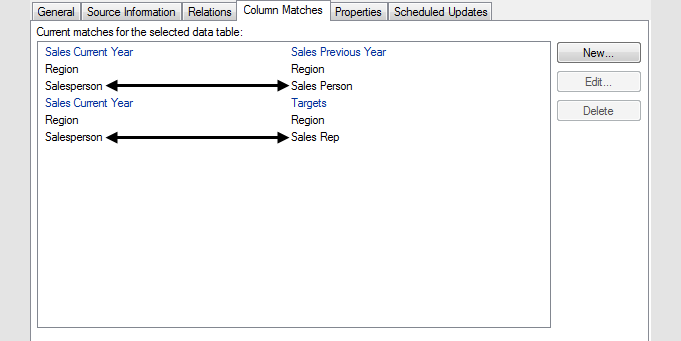
The data table names are displayed in blue text, while the column names are displayed in black text. The selected data table is always shown on the left-hand side.
You can also view columns matched in a specific visualization in the Data section of the Visualization properties:

If matches are missing, this is indicated here, and you can add a match if necessary. If a column has more than one match to a column in another data table, you can select which match to use in this specific visualization.
Missing column matches
As mentioned above, a rule of thumb is to make sure that all the columns you want to group the visualization by exist in all the data tables that will be used in the visualization. But there are cases when the visualization will be valid even if columns that are used on a grouping axis do not have matches to columns in the other data tables. The examples below illustrate this.
The visualization is valid
If you know that a category is unique, you can use it on a grouping axis even if the column only exists in the main data table. The left-most data table below contains information about employees in a sales organization: their names, gender, and office location. The right-most data table contains the total sales for each person.
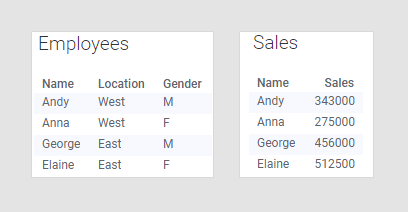
The only possible column match for the data tables is 'Name', because that is the only column that exists in both data tables. The 'Employees' data table contains only categories, while the 'Sales' data table contains the sales figures you probably want to compare. Combining these two data tables would make it possible to look at the data from location and gender perspective as well as just comparing the sales figures per person. Because each person in this example identifies only as one gender and works only at one office location, you can actually group by all the columns in that data table, provided that you select 'Employees' as the main data table, as seen in the bar chart below:
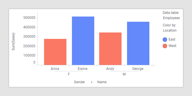
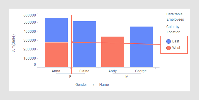
'Gender' and 'Name' define the category axis, while 'Location' defines the colors of the bars.
If you are going to group a visualization by unmatched columns, it is important to make sure the categories are unique. If the categories are not unique, you will end up with a visualization that shows incorrect data, as seen in the next example.
The visualization is NOT valid
The data tables below are similar to the ones in the previous example, but the 'Employees' data table has been updated to reflect that Anna is actually working out of both offices. The 'Sales' data table does not have to be updated due to this change, because the amount Anna sold for last year has not changed, and has nothing to do with which offices she works out of.
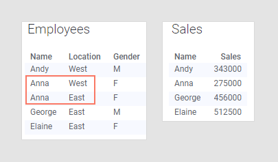
However, this change in the main data table will affect the visualization. Because the bars are colored by 'Location', and Anna belongs to both 'East' and 'West', she will now appear twice; once for the East office, and once for the West office. This means that it now looks like Anna has sold for twice the amount she actually has, which is of course incorrect.
With Anna working out of two offices, 'Location' can no longer be used on a grouping axis in the visualization. However, by removing 'Location' from the color axis, you can turn the bar chart into a valid visualization again:
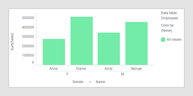
Now, each person is shown only once in the visualization, and while you cannot group by location, you can still group by gender.
If you are certain that you have a valid visualization, you can switch off warnings about missing column matches as described in Hiding warnings about possible mismatches.