Multiple data tables in one visualization
Sometimes, the data you want to analyze in Spotfire is located in different data tables. Working with visualizations combining data from multiple data tables is not very different from working with data from a single data table. You can choose the visualization that best suits your data, you can filter, mark, and drill down in your data. However, a couple of concepts are important when configuring and working with a visualization combining data from different data tables.
The main data table
In a visualization combining data from different data tables, the main data table plays an important part. A visualization always has only one main data table, which is the anchor point in the data for the visualization. It defines what a row is in an unaggregated visualization, and the columns in the main data table are the columns that can be used to group the visualization in different ways. Consequently, the main data table columns control what becomes an item (such as a marker in a scatter plot, or a bar in a bar chart) in an aggregated visualization.
When you mark items in a visualization, details are shown for the
columns in the main data table only. The main data table is also the data table
that all expressions refer to by default, unless you explicitly specify that an
expression should refer to another data table in the visualization by using the
qualified column name,
[Data Table Name].[Column Name]. (For example:
Sum([Sales Previous Year].[Sales]) where 'Sales
Previous Year' is the data table name and 'Sales' is the name of the column.)
To get the most out of your data, think through which data table is best suited to be the main data table before you start configuring the visualization.
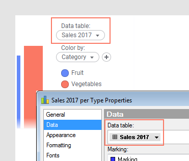
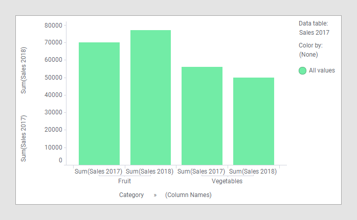
You select the main data table in the Data section of the Visualization properties, or in the data table selector in the legend. In the image below, the name of the main data table is 'Sales 2017':
Additional data tables
Columns from other data tables than the main data table can be used on aggregating axes in the visualization, but not on axes that are grouping the visualization.
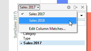
To add a column from another data table, you can use drag-and-drop from the Data in analysis flyout or the Filters panel, or select a column from the column selector. Open the column selector and switch to the data table of interest; the column selector will switch to show the columns in the selected data table instead. The data table selector is only visible if you have multiple data tables in the analysis and there are column matches available, see below. Column matches can only be edited using the installed client, but when they exist, you can add another data table to a visualization from the web client.
Matching columns
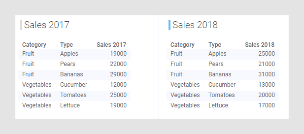
Another important concept to know about is column matching. For a visualization to show data from many data tables, at least one column that you are going to use to group the visualization in some way, should match a corresponding column in the other data tables in the visualization. A column is matching if it contains the same kind of data. If columns contain values of the same data type AND have identical column names they will be matched automatically. For example, in the two data tables 'Sales 2017' and 'Sales 2018' below, the columns 'Category' and 'Type' match between the two data tables. A basic rule when configuring a visualization is that all the categories you are going to use in the visualization should exist in all the data tables. That way, matching of columns is going to be easy. However, there are exceptions to that rule. To learn more about that, see the section about Missing column matches under Column matches.
If no automatic matches are found, you can add matches manually. To learn more about when and how to match columns manually, see Column matches, Adding column matches manually, and the following topics.
While it is generally not necessary to define a relation between data tables in addition to a column match, it can sometimes be useful to do so. With a relation between two data tables, marking and filtering from one data table can be propagated to the other data table. To read more about how to specify how filtering should work in related data tables, see Filtering in related data tables.
Basic example
Comparing the data in the two data tables above in a bar chart does not require any special adjustments. Just load the two data tables into Spotfire, create the bar chart, select one of the categorical columns on the category axis, and then select the two columns 'Sales 2017' and 'Sales 2018' on the value axis.
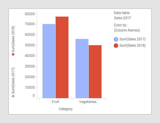
Because the columns 'Category' and 'Type' in those two data tables have identical names and contain values of the same data type, they have already been matched automatically. As the example illustrates, the main data table is 'Sales 2017', and therefore, the column used on the category axis originates in that data table. In this example, any of the two data tables could be used as the main data table, because the categorical columns are the same in both data tables. As always, when multiple columns are used on the value axis of a bar chart, (Column Names) should be used to group the visualization. In the image above, the (Column Names) option is used to color by, but using it to trellis by or, as in the image below, adding it to the category axis are other possibilities.
Different levels of detail
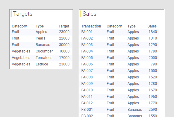
In the example above, the data tables had more or less the same columns; 'Category', 'Type', and a column containing the sales figures. You can also compare data from data tables with data on different levels of detail in a visualization. For example, you might want to compare sales targets for a certain year with the actual sales so far for the year. Perhaps you have a data table containing sales targets for fruits and vegetables. For each fruit and vegetable type, one single row represents the target, as seen in the 'Targets' data table below. In another data table, you might have the actual sales data for the current year, as seen in the 'Sales' data table below. In this data table, each sales transaction is represented by one row, which means that for each type of fruit and vegetable, there are several rows of sales figures.
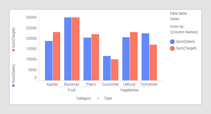
By combining data from those two data tables in a bar chart you can see which fruits and vegetables have reached their targets this year:
Recommended workflow
If you are unsure how to configure a visualization combining columns from different data tables, this recommended workflow can be helpful.
1. Choose the main data table
Start by having a look at the data in the different data tables, and try to answer a couple of questions. What data do they contain? What do you want to visualize based on that data? A data table containing categories you would like to group your visualization by is a good candidate for the main data table. For instance, you might want to group by region, department, salesperson, product type, or similar.
2. Configure the visualization with only the main data table
Add a visualization of the type you want to use, and then configure as much as you can of that visualization with columns only from the main data table. Select how and by which columns the visualization should be grouped, and if the main data table also contains columns that you want to show as aggregated, add those columns to the appropriate axes as well.
3. Add the aggregating measures
When the visualization has been configured as much as possible with only main data table, you can start adding aggregated columns from other data tables.