Data in analysis
The Data in analysis flyout shows a structured list of all data columns in a data table, that is, it gives you an overview of your data. It can be the starting point for configuring visualizations, because from the flyout, you can drag columns to drop targets in the middle of the visualizations and to the visualization axes. You can also filter to certain values (because each column in the panel is associated with a filter) and you can get recommendations about suitable visualizations and other operations from the expanded flyout.
 (when the analysis is in
Editing mode). If more than one data table is
available in the analysis, you can select which data table to investigate from
the drop-down list at the top of the flyout.
(when the analysis is in
Editing mode). If more than one data table is
available in the analysis, you can select which data table to investigate from
the drop-down list at the top of the flyout.
The columns are by default organized into categories to make them easy to locate. For example, loading the Excel file below results in the Data in analysis flyout to the right. Columns containing numerical data suitable to aggregate are gathered in the Numbers section, columns related to time are in the Time section, and columns useful for splitting data are in the Categories section.
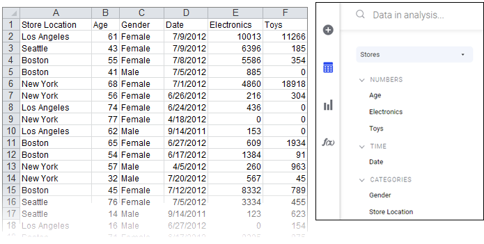
The category of a column affects what happens when you drag the column to a column selector or to a drop target in a visualization. If the suggested category for a column is not the desired category, you can change the categorization.
The
Data in analysis flyout can be expanded to get
more details about a column. It expands automatically when you select columns
in the flyout, but you can also expand the flyout yourself by clicking
Expand for details and recommendations
 , at the upper-right side of
the flyout.
, at the upper-right side of
the flyout.
You can easily change what is shown in a visualization by dragging a column from the flyout and dropping it onto a column selector or on a drop target within the visualizations. Moreover, you can use the flyout to filter to certain values in which you are particularly interested.
The sections in the data in analysis flyout differ slightly depending on the data source and the data content. Some examples of differences are described below.
In-database relational data from joined tables (connections created using the installed client)
If data tables from in-db databases have been joined with relations in the Views in Connection dialog (using the installed client), they can be treated as a single, virtual data table within Spotfire. In this case, there will be an additional field showing the Source structure in the flyout.
If such a source structure is available, you can click on the different parts of the joined table to see only the columns from each source.
If no relations have been defined, each data table in the data connection will be a separate data table within Spotfire.
Cube data (connections created using the installed client)
When you are working with cube data from Microsoft SQL Server Analysis Services, Oracle Essbase or SAP BW, you will see the underlying structure of the cube in the flyout (as long as you keep the sort order as Hierarchical).
Top levels can be expanded to reveal, for example, the different levels in a hierarchy.
It is recommended to use the hierarchical view when working with cube data, to avoid mixing unrelated columns in one visualization.
See the separate document Working with Cubes for more information about different cube systems.