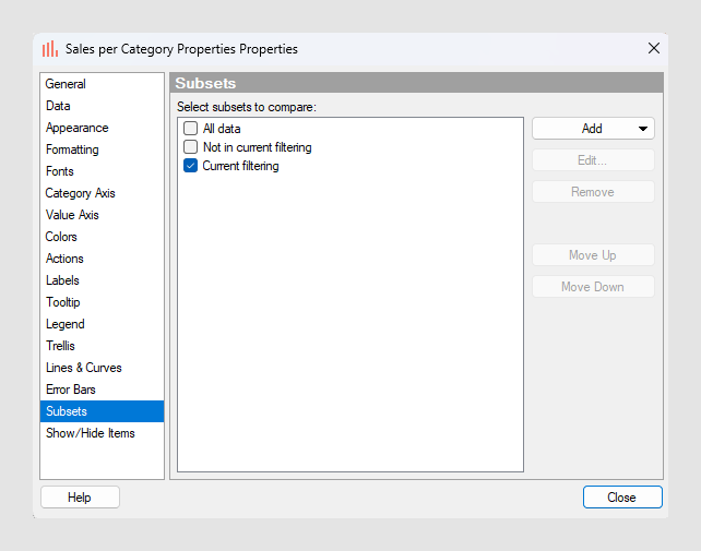
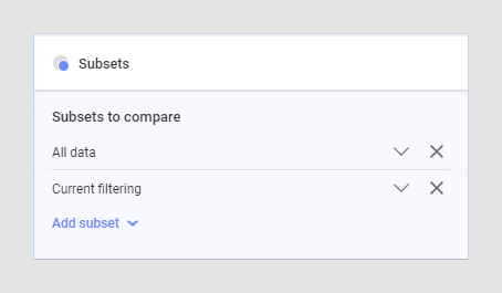
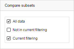
(Subsets)
When you have filtered data in your analysis, it is possible to display the following three categories; the data that is filtered to, the data that is filtered out, and the entire data. These categories can be compared in a single visualization by selecting the (Subsets) option in a column selector.
Which categories to compare in a visualization is specified in the visualization properties in the Subsets or Compare subsets section. See Subsets for more information.
- The data in Current filtering (the data that has been filtered to) and All data
- The data in Current filtering and the data that is Not in current filtering (the data that has been filtered out)
- The data that is Not in current filtering and All data
- All three categories
To put the settings in effect, you select the (Subsets) option in the column selector of interest.
Example of comparing filtered data to all data
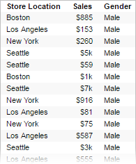
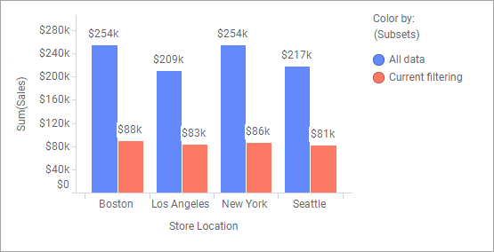
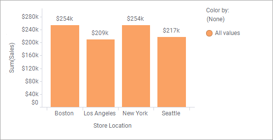
The bar chart is based on the data table above, and it shows the total sales for stores in four cities.
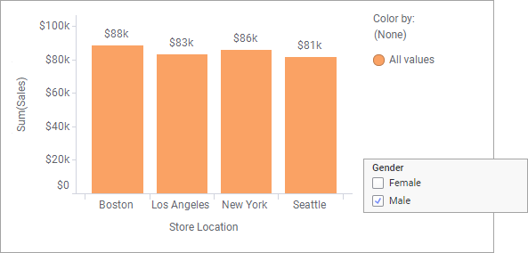
Assume you are interested in examining how much was spent by men only, and therefore filter to Male in the Gender column. The result is shown below:
Using subsets, you can show the eight bars above simultaneously in the bar chart by showing All data and the Current filtering under Subsets or Compare subsets in the visualization properties.
Then select (Subsets) for example on the Color by axis, and you will be able to compare the two categories in the bar chart.