Creating a combination chart
In a combination chart, you have the option to display both bars and lines in a single visualization. Because of the overlay effect, lines are drawn on top of the bars, it is easy to compare values for different columns or categories in your data. Trends can be identified, and you can spot deviations directly.
About this task

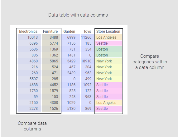
Comparing data columns
Procedure
-
On the authoring bar, click
Visualization types
 to open the flyout.
-
On the
Series axis in the legend, click a column
and select display option;
Show as bars or
Show as lines.

Example
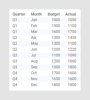
Assume you want to compare on a quarterly basis estimated figures in
a budget to actual figures. The "Actual" and "Budget" columns below contain the
monthly actual and estimated figures respectively.

See the settings made to compare the Actual to estimated Budget figures. Deviations are easily identified, for example, the budget was exceeded a lot in Q3.

See the settings made to compare the Actual to estimated Budget figures. Deviations are easily identified, for example, the budget was exceeded a lot in Q3.
Comparing categories within a column
Procedure
-
On the authoring bar, click
Visualization types
to open the flyout.
Example
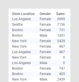
The data table contains sales, split per gender, at different store
locations.

The following combination chart shows the settings made to display the differences in the sum of sales made by women and men.

The following combination chart shows the settings made to display the differences in the sum of sales made by women and men.