Heat map
The easiest way to understand a heat map is to think of a cross table or spreadsheet, in which numerical values are represented by colored cells instead of the values themselves. The default color gradient sets the lowest value in the heat map to dark blue, the highest value to a bright red, and mid-range values to light gray, with a corresponding transition (or gradient) between these extremes.
Heat maps are well-suited for visualizing large amounts of multi-dimensional data and can be used to identify clusters of rows with similar values, as these are displayed as areas of similar color. In the installed client, you can configure the heat map so that its cells will be colored based on the values in a column, see Coloring in tables, cross tables, and heat maps to learn more.
Example
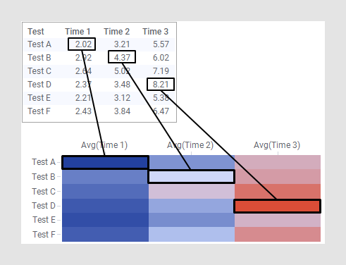
The example below shows how the values in the table are presented as color gradients in the heat map cells.
As the examples below will illustrate; how to configure a heat map depends on the format of your data.
Data in tall/skinny format
In this example, the data is in tall/skinny format, and each data table row corresponds to a single cell in the heat map.
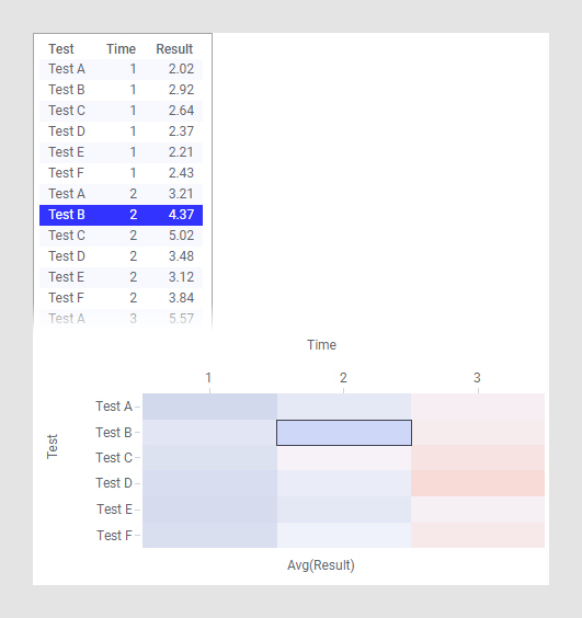
The column Test is selected on the Y-axis, Time on the X-axis, and the cell values are set to the column Result. Like in other visualizations, highlighting and marking in the heat map are applied to one or more rows in the underlying data table. This means that with the configuration in this example, marking a row in the table will mark a cell in the heat map.
Data in short/wide format
In this example, the data is in short/wide format instead, and each row in the data table corresponds to an entire row in the heat map.
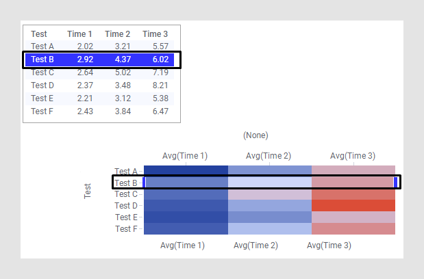
The Y-axis in this heat map is set up with the column Test, while the X-axis is set to (None). For the individual cell values in the heat map, the columns Time 1, Time 2, and Time 3 are selected. Cell value columns are always aggregated unless the Y-axis is set to (Row Number). This is because the data table may contain many rows with the same name, and the values in these rows must then be aggregated to one single value to be displayed in the heat map. The content of the data is the same as in the example with data in tall/skinny format, but the format of the data makes it necessary to configure the heat map in a different way. With data in short/wide format, this is a common way to configure a heat map.
Dendrograms
It is often useful to combine heat maps with hierarchical clustering, which is a way of arranging items in a hierarchy based on the distance or similarity between them. The result of a clustering calculation is presented either as the distance or the similarity between the clustered items depending on the selected distance measure.
You can cluster both rows and columns in the heat map. The result of a hierarchical clustering calculation is shown in a heat map as a dendrogram, which is a tree-structure of the hierarchy. Row dendrograms show the distance (or similarity) between rows and which node each row belongs to is a result of the clustering calculation. Column dendrograms show the distance (or similarity) between the variables (the selected cell value columns).
The example below shows a heat map with a row dendrogram where the distance between the rows were calculated.
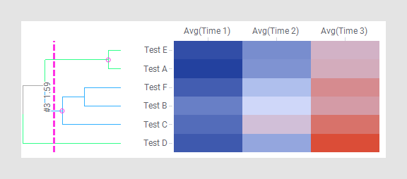
As a result of the clustering calculation, the rows in the heat map have been reordered to correspond to the cluster calculation. Test A and Test E are placed in the same cluster. Test F and Test B are placed together in another cluster, and this cluster forms another cluster together with Test C. Test D is not included in any of those clusters. This indicates that Test A and Test E are closer to each other than what they are to Test F, Test B, Test C, or Test D. It also indicates that Test D is the one that is the most distant to any of the other rows. See Dendrograms and clustering to learn more.
You can adjust the scales and scale labels, as well as other axis settings, from the visualization properties for each axis, and you can also add features such as zoom sliders from the properties.
All visualizations can be configured to show data limited by one or more markings in other visualizations only (details visualizations). Heat maps can also be limited by one or more filterings. Another alternative is to configure a heat map without any filtering at all. See Adding data limitations for a visualization for more information.
You can show data from multiple data tables in the same visualization if a proper data table matching is available. For more information, see Multiple data tables in one visualization and Column matches.