Creating a cross table
Cross tables are used to summarize large amounts of data, and then present the result in a structured table format.
Before you begin
Procedure
-
On the authoring bar, click
Visualization types
 to open the flyout.
Example
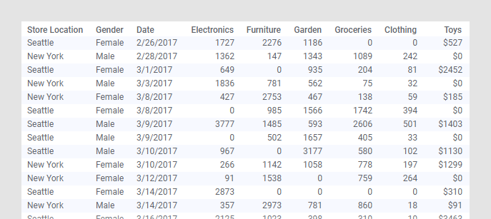
The data table contains purchases made by customers in January, February, and March at two different store locations.
The cross table below gives you an overview of the monthly sum of toys purchases made by men and women at each store location.
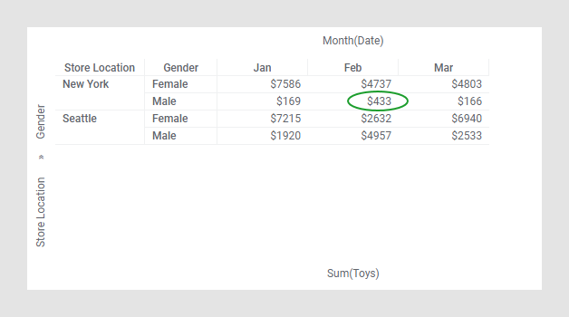
For example, the value $433 represents the sum of toys purchases made by men in New York during February.