TIBCO Cloud™ Spotfire® Web Client User Guide

Creating a waterfall chart

A waterfall chart is created in slightly different ways depending on how your data is organized, in a tall/skinny or short/wide format.

Before you begin

See Waterfall chart for a description of the concept.

About this task

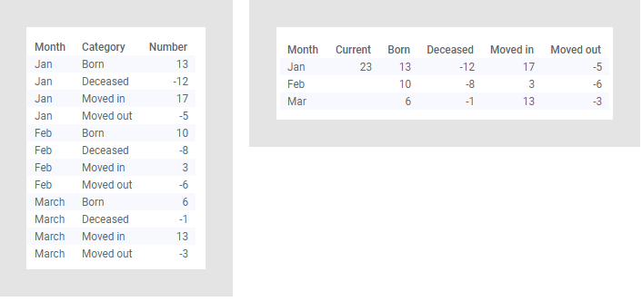
To show the difference between the two formats, the data tables below are used. Both data tables contain the same statistics for population changes over time but are organized differently. In the tall/skinny data table to the left, numbers are provided in a single data column, and in the short/wide data table to the right, the numbers are split on multiple data columns.


Data tables

Procedures how to create waterfall charts based on values in a single data column, and values split on multiple columns, follow.

Waterfall chart based on a single column (tall/skinny data)

Procedure

  1. On the authoring bar, click Visualization types to open the flyout.
  2. Drag the Waterfall chart visualization type to the wanted position on the analysis page.
    A suggestion of a waterfall chart is presented.
  3. On the Value axis, select the column containing the values to be visualized.
  4. Select which type of aggregated value to display for the selected column.
    Note: Because the waterfall chart in its nature adds up values, make sure the aggregation type is meaningful. Typically Sum is selected as the aggregation type.
  5. On the Category axis, select the column containing the factors over which the value changes.

Results

The waterfall chart is drawn representing positive value blocks in green, and negative value blocks in red.
Note: The predefined coloring in green and red can be changed using the Color by selector.
Tip: You can specify another order in which the factors are drawn. For more information, see Changing the default sort order of values in a column.

Example

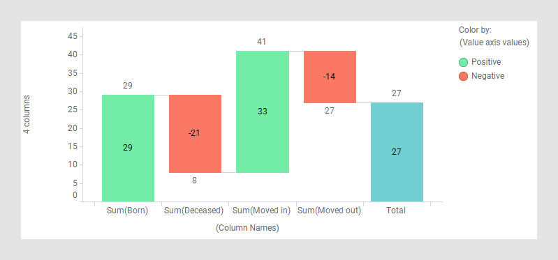
The waterfall chart below is based on the data table above with numbers in a single column. It gives an overview of the population changes for the entire time period.


Waterfall chart based on one column

Waterfall chart based on multiple columns (short/wide data)

Procedure

  1. On the authoring bar, click Visualization types to open the flyout.
  2. Drag the Waterfall chart visualization type to the wanted position on the analysis page.
    A suggestion of a waterfall chart is presented.
  3. On the Value axis, select the columns containing the values to be visualized.
    Note: When the number of columns added to an axis exceeds three, the name of each column is no longer displayed, only how many columns are selected.
  4. For each of the selected columns on the Value axis, select which type of aggregated value to display.
    Note: Because the waterfall chart in its nature adds up values, make sure the aggregation type is meaningful. Typically Sum is selected as the aggregation type.
  5. On the Category axis, make sure (Column Names) is selected.

Results

The waterfall chart is drawn representing positive value blocks in green, and negative value blocks in red.
Note: The predefined coloring in green and red can be changed using the Color by selector.

Example

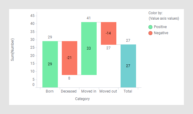
This waterfall chart is based on the data table above with the numbers provided in multiple columns. It gives the same overview of the population changes as shown above.


Waterfall chart based on multiple columns