Using labels to show data from other data tables
When column matches are available, you can sometimes choose to add labels from another data table to a visualization. This functionality is not available for all visualization types.
About this task
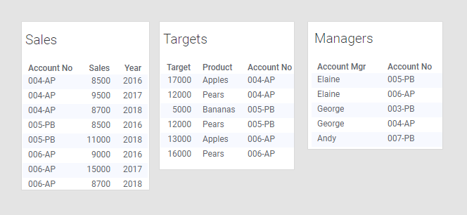
And a visualization has already been created with the 'Sales' data table as the main data table:
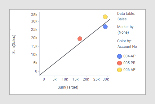
The X-axis shows sum of target, which is data that originates in the 'Targets' data table. The Y-axis shows sum of sales, which is data that comes from the 'Sales' data table (the main data table). The markers represent the different accounts, which is also data from the main data table. The visualization shows how each of the accounts have performed compared to their targets, but it might also be interesting to see which person is responsible for which account. But in the main data table there is no information about the account manager so it is not possible to group by account manager. However, the data table named 'Managers' contains information about which person is manager for which account, and it is possible to get that information into the visualization by using labels as aggregated values rather than grouping categories.
Procedure
- Open Visualization properties and go to the Labels section.
- Open the Label by column selector.
- Select the 'Managers' data table and then the 'Account Mgr' column.
- Select UniqueConcatenate as aggregation method.
- Choose .
Results
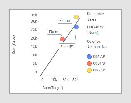
If the 'Account Mgr' column from the example here is added to the main data table, you can group the visualization by that column, as seen in the visualization below:
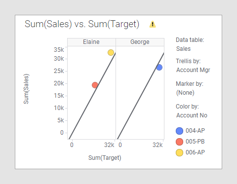
Note that you will get a warning in the visualization because the 'Account Mgr' column does not have a match in the 'Targets' data table. In this case it is actually not a problem, and you could switch the warning off. Read more about when and how you can disregard this warning in Column matches and Hiding warnings about possible mismatches.