Analyze data
Often, the visualizations you add using the Data in analysis flyout provide enough knowledge of your data, and no further exploration is needed. But, after you have added the visualizations to your analysis, there is a wide range of possibilities to extend the analytics, no matter which method you used for creating them.
Summarize data
A central part of the analysis is to decide how the data should be represented by the visualization items, that is, which parts the data should be split into, and which summarized values the items should represent. For the summarization, you have a rich selection of methods to choose from, where the most common aggregation methods are sum and average.
Interact with the data
Not only do separate visualizations let you analyze your data; the visualizations are also by default connected to each other, so your interaction with one visualization will spread to other visualizations. This way you can compare different views of the same data.
There are different ways to interact with the data, and by doing so, you get more knowledge of the data:
- You can filter to data values of particular interest, and base the visualizations on these values only.
- You can get more details of
the data in various ways:
- Hover with the mouse over visualization items to see details in tooltips.
- Mark items in one visualization, and items associated with the ones you marked will get marked in other visualizations as well.
- Use details visualizations, that is, mark items of interest in a visualization to form a subset of the data, and create a visualization that represents this subset only. This can be iterated in the new visualization, which enables you to drill down into subsets within subsets of your data.
- You have different methods to create your own groups of data. This is convenient when you want to analyze the data differently from using the ordinary way of grouping data by selecting columns on the different axes such as the X-axis, or the color axis. Examples of methods are binning data and creating subsets of data. In the installed client, you can also assign tags to data or create lists of data you want to track.
- You have several options to make calculations on the data to retrieve more information.
Get started
Get started with summarizing data
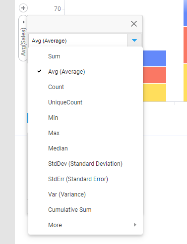
To specify how the data in the column you have selected should be summarized, select an aggregation method on the column selector. In this example, the Sales values are summarized into an average.
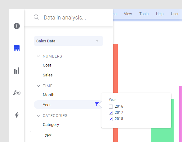
Get started with filtering
To filter to certain values in a data column, you hover with the
mouse pointer over the column in the
Data in analysis flyout, and click
Show filter
![]() . Then you adjust the filter.
. Then you adjust the filter.
Get started with viewing details
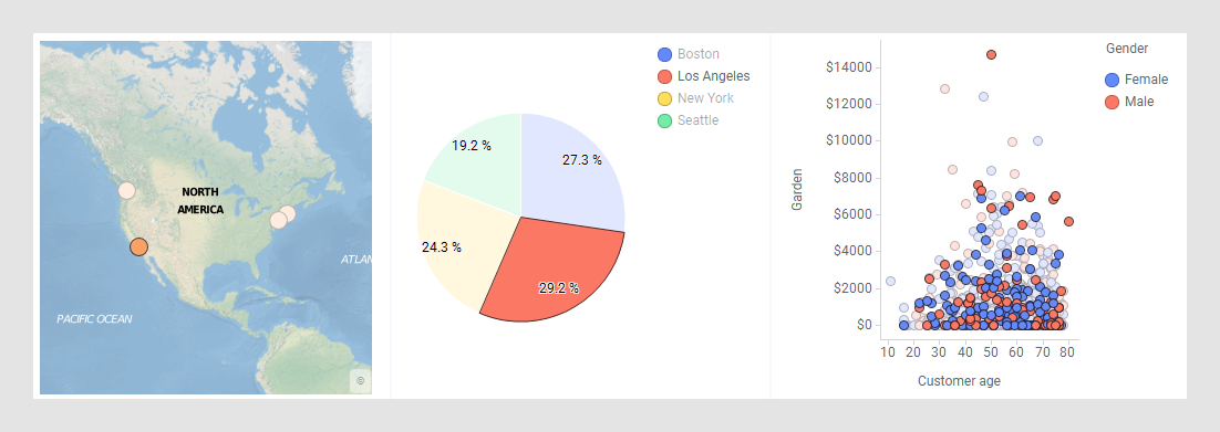
To drill-down into details, you mark items of certain interest in one visualization, and corresponding data in the other visualizations based on the same data table will by default be marked automatically. For example, if 'Los Angeles' is marked in the map chart below, 'Los Angeles' items get marked also in other visualizations. In the pie chart, the 'Los Angeles' sector gets marked, and in the scatter plot, 'Los Angeles' customers.
To drill down into subsets within subsets of your data, see Drilling down into details.