Combination chart
The combination chart is a visualization that combines the features of the bar chart and the line chart.

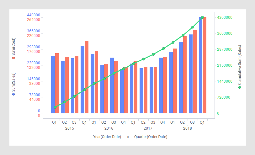
In a combination chart, you can display both bars and lines in a single visualization. Because of the overlay effect, where lines are drawn on top of the bars, it is easy to compare values for different columns or categories in your data. Trends can be identified, and you can spot deviations directly. For example, you can use the combination chart to compare the projected sales with the actual sales for different time periods.
The combination chart has similarities to both bar charts and line charts. As with these visualizations, columns containing numerical data are usually selected on the Y-axis. For each X-axis data point, the data is aggregated into values on the Y-axis. An aggregated value could be, for example, a sum or an average. These values are then displayed either in the form of bars or in the form of a line for each column or category to be compared.
Series by
Similarly to the function of Color by in other visualizations, Series by in the combination chart is a way to divide the data into slices. The difference is that the slices in the combination chart, called series, can be defined as bars, or lines, as well as being colored separately. That is, each series in the combination chart will be represented by a line or a set of bars in the visualization.

On the X-axis, columns containing categorical values are selected, or columns with time data when comparing data over time.
As mentioned above, you might want to compare columns in your data, or you might want to compare different categories within a column, as illustrated below.
Example: Multiple scales on the Y-axis
With dual or multiple scales on the Y-axis, you can compare several lines and bars with significantly different value ranges. See Adjusting scales on axes.