Creating a trellised visualization
A visualization that is trellised is split into a number of panels, where each panel represents a subset of the data.
About this task
Before you begin
Procedure
-
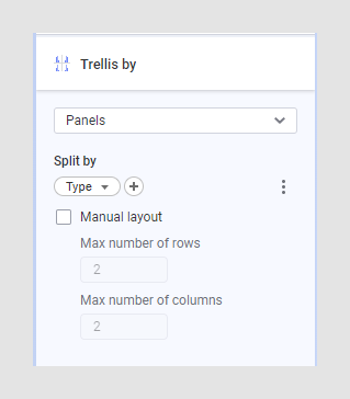
In the Visualization properties, locate the
Trellis section.


-
If you want you can change the category mode to determine which
combinations to show. Click the context menu
 next to the column
selector. See
Expression language details
for more details.
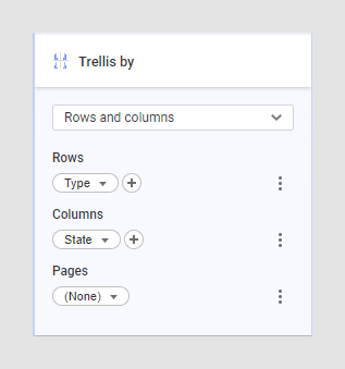
Note: You can also create a trellised visualization by going to the Data in analysis flyout, clicking the column containing the categories you want to split the visualization by, and drag it on any of the trellis drop targets. The vertical trellis axis corresponds to trellis rows, the horizontal trellis axis to trellis columns.
next to the column
selector. See
Expression language details
for more details.
Note: You can also create a trellised visualization by going to the Data in analysis flyout, clicking the column containing the categories you want to split the visualization by, and drag it on any of the trellis drop targets. The vertical trellis axis corresponds to trellis rows, the horizontal trellis axis to trellis columns.
Results
Visualization specific trellis settings
When trellising a waterfall chart, you can choose to continue a waterfall over trellis panels.
See Trellising map layers, when working with a map chart.