Adding and configuring a visualization
Data can be of many different kinds. Therefore, to present the data in the best way, there are several types of visualizations available.
Create a visualization from the Data in analysis flyout
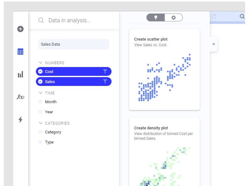
To create visualizations, use the Data in analysis or Visualization types flyout, or search for what you want to visualize. A page in an analysis can contain more than one visualization, but to make room for further visualizations, you can add more pages.When you want to explore certain data columns in your data table, and get suggestions on how they can be visualized, you use the Data in analysis flyout to create visualizations.
- On the authoring bar,
click
 to open the
Data in analysis flyout.
to open the
Data in analysis flyout.
- If your analysis contains more than one data table, select the data table you are interested in from the drop-down list.
- Select the data columns
of interest.

To the right, you get suggestions on visualizations based on the selected data. If you hover over a visualization, you can click MORE LIKE THIS, and similar visualizations are suggested. The visualizations might also show data from other columns, if certain findings related to the selected data are discovered.
- Click, or drag, the visualization you find suitable to the analysis page.
- Explore it as it looks, or adjust it to your needs.
Create a visualization from the Visualization types flyout
Another option is to create visualizations from the very beginning and make your own settings. To learn how to set up the different visualizations from scratch, click the links at the bottom of this page.- On the authoring bar,
click
 to open the
Visualization types flyout.
to open the
Visualization types flyout.

- Click, or drag, the visualization type you want to use to the analysis page.
- Adjust it to your needs. For information on the different visualization types, see the links at the bottom of this page.
Create a visualization by searching
You can create a visualization by typing search criteria in a text field.
- Click
Find
 on the menu bar.
- In the opened search
field, type what you are looking for in your data.

You get suggestions on visualizations matching your search criteria. The visualizations might also show data from other columns, if certain findings related to the selected data are discovered.
- Drag the visualization you want to use to the analysis page
- Adjust the visualization
to your needs. For example, you can change which data table to base the
visualization on using the data table selector in the legend or in the
Data section of the visualization
properties.

You can also change the axes, the colors or update other properties. For information on the different visualization types, see each section.Note: Some visualization types can only be authored using the installed client.