TIBCO Cloud™ Spotfire® User Guide

KPI chart

A Key Performance Indicators (KPI) chart is used to quickly inform about the current performance of a company or organization. Factors crucial for monitoring the company’s performance are presented in a grid of tiles. Examples of KPIs to monitor are net revenue, sales growth, or customer satisfaction.


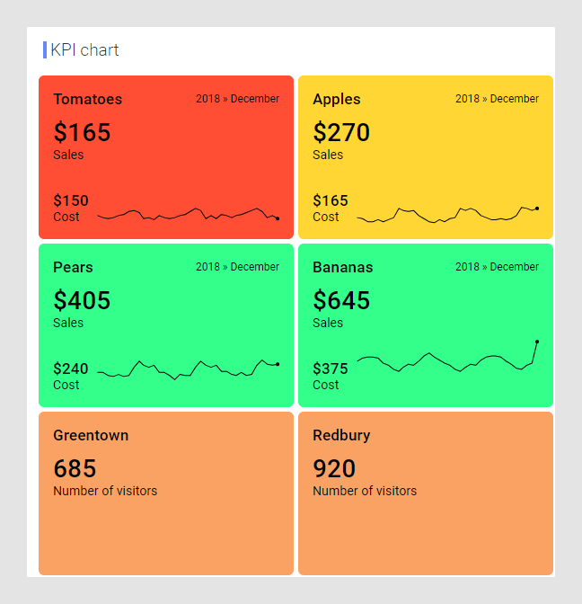
A single KPI chart can hold KPIs showing different types of measures. In the image above, one KPI shows sales and cost data and another KPI shows data about visitors. Each individual KPI can be split into tiles that represent different categories in your data. See the schematic representation below.

You have different options to arrange the tiles from the different KPIs in a single KPI chart. You can, for example, gather tiles where the KPIs show good performance at the top of the chart, or you can sort them alphabetically. That is, tiles from different KPIs can be mixed, and their values can be based on data from different data tables.

Performance can be visualized in different ways in a tile.

You can
  • show a primary value, which shows the most recent measure of a certain factor.
  • show a comparative value, to which the primary value is compared or evaluated. Examples are comparisons of the actual value to a target, or to a corresponding value for another time period.
  • use colors of the tile backgrounds to indicate the current performance level. Rules for the coloring can be configured. They can, for example, contain threshold values against which the current primary value is evaluated. Depending on the results of the evaluation, the tile backgrounds are colored differently.
  • show a sparkline that shows the primary value over time. The dot ending a sparkline indicates the current value. The sparklines can be supplemented with a scale showing the vertical range.
Important: The values in the tiles show the performance for the most recent time period. This time period can be shown in the upper right corner of the tiles.

When indicating the performance, often different calculations are required to define the KPI values. For more information on the calculations, see Custom expressions, Basic example of a KPI, and Comparing to previous time period.

A KPI in a KPI chart can be configured to show data limited by one or more markings in other visualizations only (details visualizations). It can also be limited by one or more filterings. Another alternative is to configure a KPI chart without any filtering at all. For more information, see Adding data limitations for a visualization.

You can show data from multiple data tables in the same visualization if a proper data table matching is available. For more information, see Multiple data tables in one visualization and Column matches.