TIBCO Cloud™ Spotfire® Web Client User Guide

Adding a new KPI to a KPI chart

A single KPI chart can display several KPIs. Which performance values that are displayed in the KPI tiles can differ from KPI to KPI. When adding a new KPI to a KPI chart, you define which values to monitor in the tiles, and for which categories.

About this task

The values of a KPI are displayed in tiles, where each tile represents a certain category (Boston in this example) .


KPI tile
There are different ways to visualize these performance values as illustrated above. You can
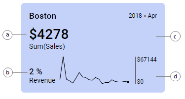
  • display a primary value, which shows the most recent measure of a certain factor (a). What is measured is displayed beneath the value.
  • display a comparative value, to which the primary value is compared or evaluated (b). Examples are comparisons of the actual value to a target, or to a corresponding value for another time period. What is measured is also displayed here.
  • use colors of the tile backgrounds to indicate the current performance level (c). Rules for the coloring can be configured. They can, for example, contain threshold values against which the current primary value is valuated. Depending on the results of the evaluation, the tile backgrounds are colored differently.
  • display a sparkline that shows the primary value over time (d). The dot ending a sparkline indicates the current value. The sparklines can be supplemented with a scale showing the vertical range.

Before you begin

A KPI chart is created.

Procedure

  1. Right-click a KPI in the KPI chart, and select Properties in the opened menu.
    The Properties pop-over for the selected KPI is displayed. In the side panel, the current KPI is highlighted.
  2. At the bottom of the side panel, click Add new KPI.
    The new KPI is added to the chart. In the side panel, the new KPI is highlighted.
  3. In the pop-over, select Values.
    The Values section is shown.
  4. On Value (y-axis), specify what to be calculated and displayed as the primary value in the tiles. You can
    • select a column and an aggregation in the column selector.
    • right-click the column selector and click Custom expression. This opens a dialog where you can type your own expression.
    The result of the calculation for the most recent time period is displayed as the primary value in the tiles. For time period, see the Time setting in the next step.
  5. On Time (x-axis), select the column or hierarchy to use for defining the time periods.
    The displayed primary value is the result for the most recent time period of the periods you have defined.
    Tip: To show the time period in the tile, select the Show time in tile check box beneath the Time axis. To indicate the development of the primary value over all the time periods, sparklines are used.
  6. Under Tile by, select the column that specifies which categories the tiles should represent.
    The categories are displayed at the upper left of the tiles.
  7. On Comparative value, use any of the options described in Step 4 to specify what the primary values should be compared to.
    The result for the most recent time period is displayed as the comparative value in the tiles.
  8. If you want to use colors for indicating performance, select Colors in the pop-over.
    The Colors section is shown. The default colors of the tile backgrounds reflect the primary values, and a gradient color transition is used.
  9. On Color by, use any of the options described in Step 4 to specify what calculation the coloring of the tile backgrounds should be based on.
  10. To let background colors of the tiles indicate performance levels in a different way, click Add color rule.
    The Add color rule dialog is displayed.
  11. In the dialog, add color rules that control how visualization items should be colored.

Results

The KPI is added to the KPI chart.
Tip: Select the check box Start each KPI on a new row to be able to better distinguish the individual KPIs from each other and to make the whole visualization clearer.