Using Column from marked - Examples
When you apply Column from marked on an axis in a visualization, you make it possible to switch the column on the axis's column selector by marking certain data in another visualization.
The two visualizations can be built on totally unrelated data tables. However, a prerequisite is that in the data table where you mark data, cell values in one of the data columns must be identical to column names in the other data table.
Two use cases of Column from marked follow below.
Browse through different columns on an axis
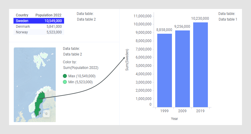
An analysis contains two data tables, Data table 1 and Data table 2.
Data table 1 contains population data for Sweden, Denmark, and Norway for three years, and the bar chart below visualizes the yearly population for Sweden.


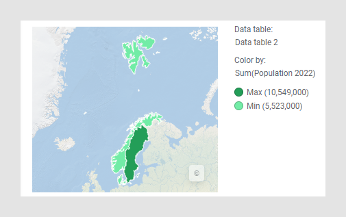
Data table 2 lists the population 2022 for each country, and the feature layer in the map chart reflects the population numbers.

By applying Column from marked on the bar chart value axis, you can, by marking a country at a time in the map chart, show each country's yearly population in the bar chart. You right-click the value axis, and select Column from marked to open this dialog:

Select the data table (Data table 2), and the data column (Country), whose marked values are intended to control what is specified on the bar chart value axis.
Now you will be able to, for example, mark a country in the map chart, and the yearly population for that country will be displayed in the bar chart. See the images below where, firstly, 'Sweden' is clicked, and then 'Norway'.

Use Column from marked in Data Relationships
The Data Relationships tool (available in the installed client) uses Column from marked to display the results from the calculation. The purpose of Data Relationships is to calculate the correlation between the columns in a table, and then find and display highly correlated columns to see what they look like.
The result when using Data Relationships is a new data table, where each row shows the correlation between two columns from the original data table. The row includes the names of the two compared columns, and values for how well they correlate.
In addition to the table visualization that displays the new correlation data, the tool creates, in the linear regression case, a scatter plot that shows one column plotted against the other from the original data table as shown below.

As you mark a row in the new correlation data table, the scatter plot is updated to display the two compared columns from that row. In this configuration, the X- and Y-axes of the scatter plot are configured using Column from marked. That is, the names of which columns to display are fetched from the marked row in the new correlation data table.
You change the marking by clicking another row in the table visualization.

The way this is set up, you can quickly browse the correlation between columns by stepping through the rows in the table visualization. To update the scatter plot manually by interacting with the column selectors of the X- and Y-axes would take much longer.