The OVER statement and the node navigation methods are used in many of the more advanced custom expressions, especially when time periods are to be compared to or combined with each other. The OVER statement makes it possible to redirect the way expressions or visualizations normally group data.
To understand how it works, consider again how markers represent slices of your data, and that the visualization properties, such as color or aggregations, determine how the data is sliced. Custom expressions work on each of the already defined slices in the visualization. This is the fundamental difference between node navigation methods in custom expressions and in calculated columns. When you add a calculated column with node navigation methods, they define how data is to be sliced. Since custom expressions work on the individual slices, node navigation methods in custom expressions actually does quite the opposite. When used in custom expressions these methods are telling the visualizations to ignore specific slices that are built into the visualization.
A description of the OVER expressions and node navigation methods is available under Advanced Custom Expressions.
Note: When working with in-db data you must always apply OVER expressions to the already aggregated data using the THEN keyword, since there is no row-level data available in that case. This expression structure can also improve the performance when working with in-memory data. See Using Expressions on Aggregated Data (the THEN Keyword) for more information.
Syntax
The syntax for the OVER statement is the same for custom expressions and calculated columns:
<method>(<method arguments>) over (<over methods>)
All OVER methods can be used with dot notation or as a normal function call, for example, [Axis.Color].Parent or Parent([Axis.Color]). If nothing else is specified, the calculations are always based on the current node.
An axis in a visualization can be used as a part of an OVER expression, provided that the axis is categorical (this can be specified in the Advanced Settings dialog). See Axes in Expressions for a table defining what terms to use to specify a calculation on a property. The syntax when referring to axes in an expression is [Axis.Axis Name]. For example, if the Axis Name is "X", the expression should refer to [Axis.X]. Note that the actual names to use may be different in two similar looking visualizations. For example, in the cross table you would refer to Axis.Columns whereas in a heat map you would use Axis.X for similarly set up visualizations.
Note: It is not allowed to refer to the Color axis in the size expression in a pie chart.
Usage of OVER Expressions in Visualizations
In visualizations, the most common ways to use OVER expressions is to use them on a continuous measure axis, e.g., on the Y-axis of a bar chart. However, it is also possible to use OVER expressions on categorical axes, e.g., on the X-axis of a bar chart, in order to create hierarchies.
General Notes
OVER expressions can only be used with aggregation methods. Since aggregation methods cannot be nested, there is also no way to nest OVER expressions. However, row methods can be used in aggregation methods, hence, the following expression is valid: Sum(If([A]>2, 1.0, 2.0)) OVER AllPrevious([Axis.X])
Example
To demonstrate what OVER does in custom expressions, consider the data set used in the overview and the first basic expressions.
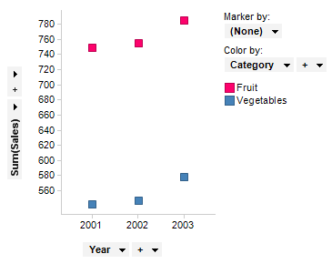
This visualization shows the sum of sales for the two categories fruits and vegetables for each year.
Change Sum(Sales) on the Y-axis to the custom expression Sum([Sales]) OVER (All([Axis.X])). Note that the X-axis must be categorical when OVER expressions are used to reference it. The expression might seem a bit confusing, but the terminology used will be explained shortly. Now look at the resulting visualization. It has the same number of markers as before, but the sum of the sales is equal for all of the markers of a certain category.
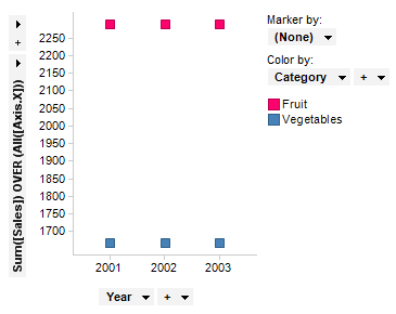
The sum of sales is the same because you told the aggregation to look outside of the individual slices. In the first visualization the sum of the sales was calculated for each year, but the OVER statement told the aggregation to ignore the slicing on the X-axis. This means that the method Sum([Sales]) simply calculated the sum of the sales for all three years. But since you defined the X-axis to be divided by year, the number of markers remains the same, but the value for the Y-axis has changed. More information on the All Method used can be found on the Advanced Custom Expressions page.
It is important to note that the term used is [Axis.X] instead of the name of the column (in this case, Year). When using the OVER statement, you cannot refer to explicit column names, but you should instead use [Axis.X] or [Axis.Color], for example, to refer to the column on the X-axis and the Color by, respectively. Since the custom expressions work on the actual slices in the data (in this case, markers in the visualization), allowing them to refer to columns that are not defined as visualization properties (for example, X-axis or Color by), would demand further slicing. Therefore, the custom expressions using the OVER statement can only be defined for columns used as visualization properties, and refer to the properties instead of the names. This also allows for changing the properties on the axes or the Color by, without making the custom expression invalid. See Axes in Expressions for a list of what to refer to in different visualizations.
Nodes
Another way to explain the OVER statement is this tree hierarchy.
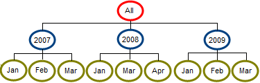
A marker or slice can include all data, for instance the data for 2007, or the data for January of 2007. Each of the slices in this hierarchy is called a node. Using the OVER statement, you can compare data from one node with the data of other nodes. For instance, you can compare January 2007 with February 2007, you can compare March 2009 with March 2008, or you can compare data from a single month with the data from that entire year. For more examples of expressions using the OVER statement, see the Advanced Custom Expressions topic.
Aggregated vs. Unaggregated Visualizations
OVER expressions are computed a bit differently depending on whether the visualization is aggregating or not. To illustrate this, consider the following data table:
Cat1 |
Cat2 |
Sales |
X |
A |
1.0 |
X |
B |
2.0 |
Y |
A |
3.0 |
Y |
B |
4.0 |
In aggregated visualizations (for example, in a bar chart), implicit intersections are added for all categorical axes that do not exist in the OVER expression. If you were to set up a bar chart with <Cat1> on the X-axis and <Cat2> on the Color-axis, and then use the continuous expression “Sum([Sales]) OVER AllPrevious([Axis.X])” on the Y-axis, you would get the following visualization:
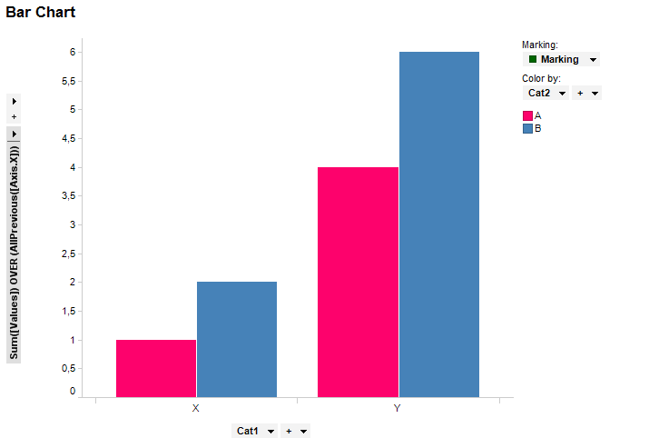
The actual expression executed here is “Sum([Sales]) OVER Intersect(AllPrevious([Axis.X]), [Axis.Color])”, which has resulted in bars with values “1.0, 2.0, 4.0, 6.0”.
In unaggregated visualizations, that is, where you have (Row Number) set on a Marker by-axis, there are no implicit intersections added (just as there is no grouping when having an aggregation method without OVER expression on the Y-axis). If implicit intersections were added then there would always be one category per row, which would make OVER expressions such as “Sum([Sales]) OVER AllPrevious([Axis.X])” redundant (the result would just be the values in [Sales], that is “1.0, 2.0, 3.0, 4.0”). An example of an unaggregated visualization is shown below.
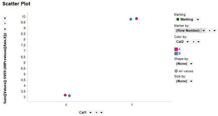
Here you can see that you have markers with the values “3.0, 3.0, 10.0, 10.0”, that is, no implicit intersections have been made.
Using Categorical OVER Expressions
OVER expressions can be used when creating hierarchies. Consider the following data:
Region |
State |
Sales |
East |
New York |
1.0 |
East |
New York |
2.0 |
East |
Vermont |
3.0 |
West |
Arizona |
4.0 |
West |
California |
5.0 |
Say that we wanted to show the percentage of sales for each Region together with the number of sales made for each State, then we could use the following expression on the X-axis in a bar chart: <[Region] NEST Sum([Sales]) OVER ([Region]) / Sum([Sales]) NEST [State]>, and on the Y-axis: Count(). The following visualization would then be generated:
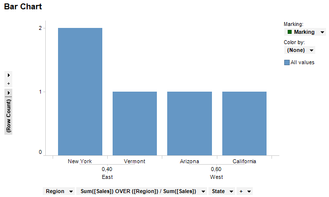
One thing to note here is that when hierarchies are evaluated before filtering, the result of the OVER expression always stays the same regardless of the current filtering applied.
However, instead of writing an OVER expression like this directly on the axis, one could just insert a calculated column and use that column instead. That approach is better performance-wise.
See also:
Custom Expressions Introduction
How to Insert a Custom Expression