Now that you know what custom expressions are, it is time to look at some basic examples of how they can be used.
Example
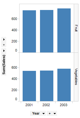
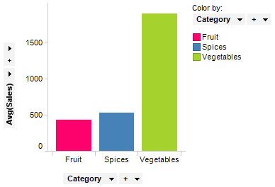
Let us start with a simple custom expression. Consider again the visualization from the overview page that shows the sales of fruits and vegetables.
This trellised bar chart shows the sum of the sales per Year and Category.
It shows that the sum of the sales of all vegetables and all fruits has increased each year.
Using a simple custom expression, Sum([Sales])/Sum([Cost]), you can see the ratio of how much higher the sales are compared to the cost for each category and year.
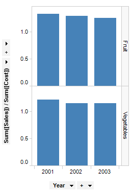
It is now possible to see that even though the generated sales have increased each year, the sum of the sales compared to the sum of the cost has mostly decreased.
Example
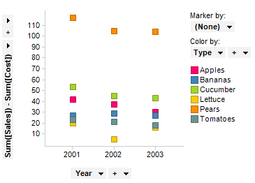
The previous example showed that the sum of the sales had decreased relative to the sum of the cost. If you want to see the amount of money earned for each product and year, simply subtract the sum of the cost from the sum of the sales using the custom expression Sum([Sales])-Sum([Cost]).
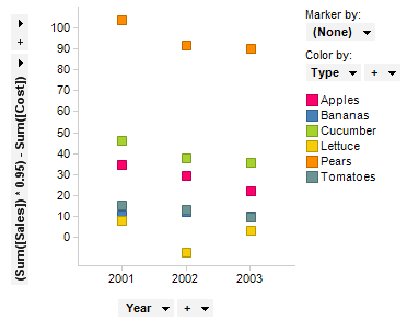
Now, assume that tax has not been subtracted from the sales price, and that five percent of the money received from customers cannot be counted as a profit. Simply change the custom expression to (Sum([Sales])*0.95)-Sum([Cost]) and you have the actual profit for each product each year.
Example
Consider another data set with sales data for a number of stores. In this data set, each row represents a specific purchase made by a customer. If you want to know how much money an average customer spends on different product types, this bar chart does not give you the correct answer.
This is because the aggregation Avg() returns the average sales figure for each row, which means this is an average of the money spent on a single purchase. However, since each customer can make several purchases, you have to use a simple custom expression.
Since each row in the data also contains information on
which customer has made the purchase (and in this case all customers have
unique names), the custom expression to use is:
Sum([Sales])/UniqueCount([Buyer]) which gives you the visualization
below.
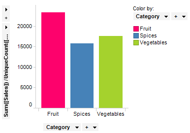
Note how much smaller the bar representing vegetables is compared to the bar in the first visualization. These two charts show that people spend more money on vegetables than they do on fruit or spices each time they make a purchase of either category. But overall, the average customer spends about the same amount of money on spices that they do on vegetables, and much more on fruit, meaning they must make many more individual purchases of vegetables.
Example
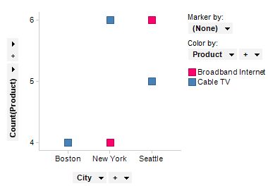
This data set is a record of orders and deliveries of Cable TV and Broadband Internet installations for customers in different cities. The first image shows the number of installations in the different cities. The visualization is colored by the type of installation.
If you are interested in analyzing the number of days it takes for cable TV and broadband Internet to be delivered and installed from the day it was ordered, this can be done with a bit more advanced custom expression. For this, we will use the DateDiff() function, found under Date and Time functions in the Custom Expression dialog. This function returns the difference between two date columns, in this case the columns Order Date and Delivery Date. You must also specify which part of the date you want to compare, and in this case it is the number of days we are interested in. Therefore, the base of the custom expression is: DateDiff("day",[Order Date],[Delivery Date]). This returns the number of days from order to delivery for each order. The complete custom expression looks like this: Avg(DateDiff("day",[Order Date],[Delivery Date])), and shows the average delivery time for both products in each city. See Functions Overview for details about the many functions available within Spotfire.
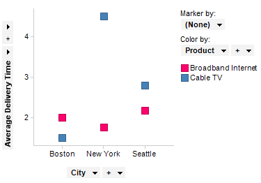
From this, it is possible to see that the average delivery time for cable TV in New York is much higher than in the other cities.
For more advanced custom expressions, the OVER statement is often used. It is described in the OVER in Custom Expressions topic.
If you are using a predefined hierarchy (in the example called MyHierarchy) on an axis and select Custom Expression you will see the expression <PruneHierarchy([Hierarchy.MyHierarchy],0)>. This syntax must always be used when a hierarchy is included in an expression. It specifies that this part of the expression is a hierarchy and it determines which level of the hierarchy slider to set. 0 is the leftmost level on the hierarchy slider, and the number of levels in the hierarchy determines how high a value you can specify. If the hierarchy expression is to be used together with another categorical column or hierarchy, each subset must be separated with NEST or CROSS, as for all categorical expressions. For example, <PruneHierarchy([Hierarchy.MyHierarchy],0) NEST [Another category column]>.
If the Column Names option is used on the axis, the underlying expression will be <[Axis.Default.Names]>. If the Column Names expression is to be used together with another categorical column or hierarchy, each subset must be separated with NEST or CROSS. For example, <[Axis.Default.Names] NEST [Another category column]>.
Subsets
If the (Subsets) option is used on the axis, the underlying expression will be <[Axis.Subsets.Names]>. If the Subsets expression is to be used together with another categorical column or hierarchy, each of them must be separated with NEST or CROSS. For example, <[Axis.Subsets.Names] NEST [Another category column]>.
See also:
Custom Expressions Introduction
How to Insert a Custom Expression