For a table visualization, a color scheme is always applied to a color scheme grouping. A color scheme grouping functions as a container for one or more columns on which you want to apply the same color scheme. You can add many color schemes to the same table. In fact, you can add as many as one color scheme per column. When you create a new table it has no coloring applied to it. You must add color scheme groupings with the columns you want to color, and set up color schemes for each of the groupings. To learn more about color schemes and how to set them up in different color modes, see Color Schemes Overview and Color Modes Overview respectively.
Example:
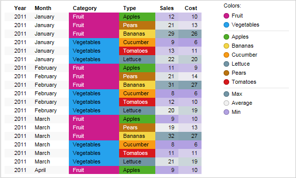
The image below shows a table with two different color schemes applied to it.
The color schemes are separated by a horizontal line in the legend. They are described separately below.
The upper color scheme in the legend contains the two columns Category and Type, both containing string values. The color scheme grouping for this color scheme is called Category and Type, as seen below where a part of the Colors page of the Table Properties dialog is shown.
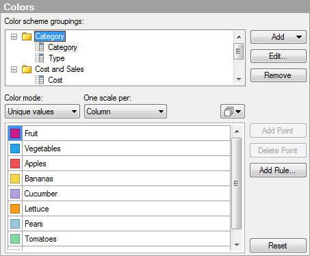
In the upper part of the dialog, the color scheme grouping Category and Type is selected, and in the lower part of the dialog, its corresponding color scheme is displayed. The color scheme is in Unique values color mode, and each of the values in the two columns has its own color.
The color scheme shown in the lower part of the legend contains the two columns Cost and Sales, which both contain integer values. The color scheme grouping for this color scheme is called Cost and Sales, as seen below where a part of the Colors page of the Table Properties dialog is shown.
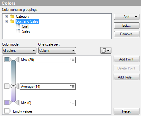
In the upper part of the dialog, the color scheme grouping Cost and Sales is selected, and in the lower part of the dialog, its corresponding color scheme is displayed. The color scheme is in Gradient color mode. The two columns share the same color scheme, but the scaling is separate for them. This means that the three color points Min, Average, and Max are calculated per column. If you want to use a common scale for the columns in the grouping, select the alternative (None) in the One scale per drop-down list. To see the scale for a column in the color scheme grouping, select it in the Color scheme groupings list. If the grouping itself is selected, as in the example, then the scale for the first column in the grouping is displayed.
To add a color scheme grouping:
Open the Visualization Properties dialog, and go to the Colors page.
Open the Add menu and select Color Scheme Grouping....
Response: The Add Color Scheme Grouping dialog is opened.
In the Name field, type a name to use for the new grouping.
In the Available columns list, select the columns you want to include.
Comment: A grouping can only contain columns with values of the same data type. The exception being the five numeric data types: Integer, LongInteger, Real, SingleReal, and Currency, which can be added to the same grouping. The “data type” in this case is called Numeric, but is a collection of these five data types rather than an actual data type.
Click Add >.
Response: The selected columns are added to the Selected columns list.
Click OK.
Response: The new color scheme grouping is added to the Color scheme groupings list.
Comment: A column can only be included in one grouping at a time. If you add a column that is already included in an another color scheme grouping, the column will automatically be removed from the other grouping.
See also:
Details on Add/Edit Color Scheme Grouping