Design a dashboard for mobile users
To provide the best small-screen mobile experience with Spotfire, design a dashboard to use visualizations that work well on a small screen, limit the controls, and provide a guided experience.
Spotfire provides a mobile application in the iTunes store that is customized for a mobile experience. However, if you plan to share Spotfire dashboards from the Spotfire® Web Player, and you expect users to be able to view it in a web browser on a small-screen mobile device (a cell phone), then you should take special care to design the dashboard for a small screen.
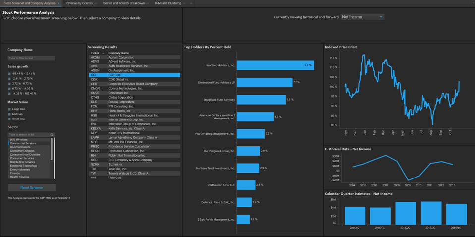
A typical Spotfire analysis viewed on a desktop might look like the following.
![Typical Spotfire Analyst desktop](../images/regular_spotfire_dashboard-html.png)
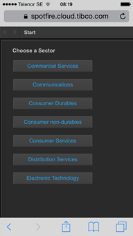
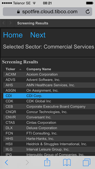
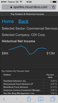
Three screens of the same analysis, presented for a guided mobile experience, might look like the following.
![]() | ![]() | ![]() |
- Types of visualizations suitable for mobile experience
Not all visualizations available in Spotfire are suitable for viewing on a small-screen mobile device. We recommend only the following visualization types that are best for a mobile experience. - Design for limited screen area
Plan your design for a small-screen mobile device by setting the same limitations that you expect the user to have. - Designing for a guided experience
When you design a Spotfire analysis for use on a small mobile device, provide easy-to-use forward and back buttons for a guided experience.