Visualizations trellised by data columns
Trellised visualizations are split into panels, where the panels display various subsets of the data table. For example, what is shown in a panel can be based on values from a specific numerical column only.
Subsets of data can be defined by splitting the data into categories that are available in a data column. Creating trellised visualizations with panels that compare categories is described in Creating a trellised visualization.
However, the following examples show trellised visualizations with panels based on certain data columns. In both examples, the data table below is used.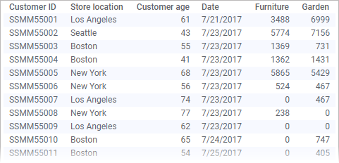
Example
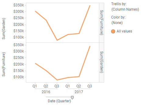
The line chart shows sales over time at the furniture and garden departments. How to create this type of line chart is described in
Creating a line chart.
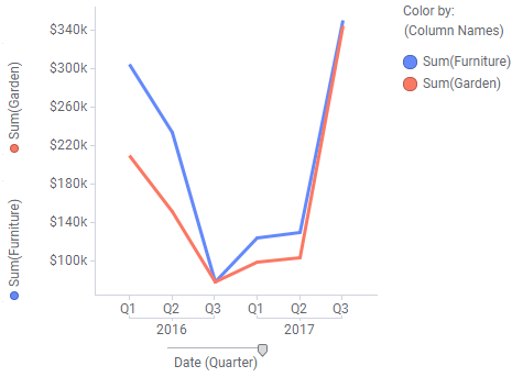
You can choose to show the lines for the two data columns in separate panels. Simply drag the (Column Names) setting on the color axis and drop it on any of the trellis drop targets in the visualization.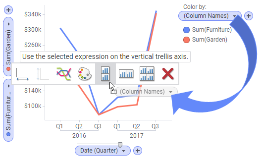
The result, when placing the panels vertically, is shown below.
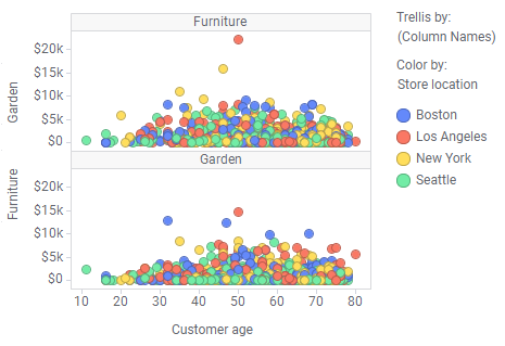
Example
The scatter plot shows how the furniture sales at different store locations are spread across the customers' ages.
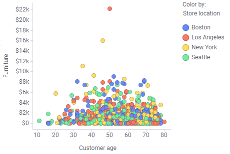
If another numerical column is added to the Y-axis, and the color axis is already occupied, the two data columns, furniture and garden, will be displayed in separate panels as shown below.