Creating a trellised visualization
A visualization that is trellised is split into a number of panels, where each panel represents a subset of the data. Using trellised visualizations, you can spot similarities and differences between the subsets of data, or within the subsets.
For splitting data per data columns, see Visualizations trellised by data columns.
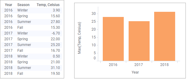
For example, the image below shows temperature data that is gathered for the different seasons during a three-year period. The maximum temperature per year is displayed in a bar chart.

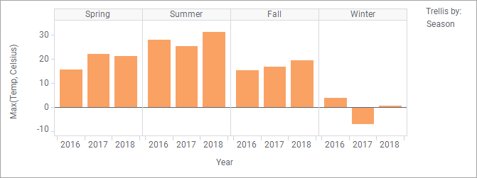
Assume you want to compare the highest temperature per season category across the years. By trellising the visualization by season you can view the seasonal temperatures in different panels.
The panels above are placed horizontally, but you can also place them vertically, or evenly distributed in a matrix.
Procedure
-
In the
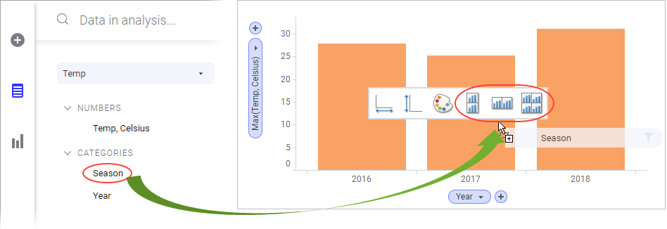
Data in analysis flyout, click the column containing the categories you want to split the visualization by, and drag it on any of the trellis drop targets.

The visualization splits into panels.Tip: In the Properties popover for the visualization, the Trellis section, more trellis options are available.
