Creating a line chart

A line chart is used for showing trends, and in most cases trends over time. It can also be used for discerning certain patterns.


line chart example

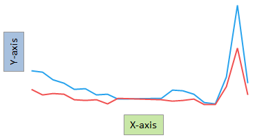
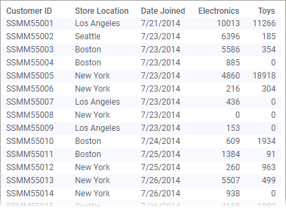
The main axes in the line chart are the X-axis and the Y-axis. To show trends over time, select a time column on the X-axis. For each data point on the X-axis, Y-axis values are placed. These values can represent aggregated data or non-aggregated data for the particular data point. An aggregated value could be, for example, a sum or an average. To draw the "full" line, straight lines are then drawn between these values.

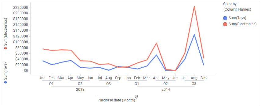
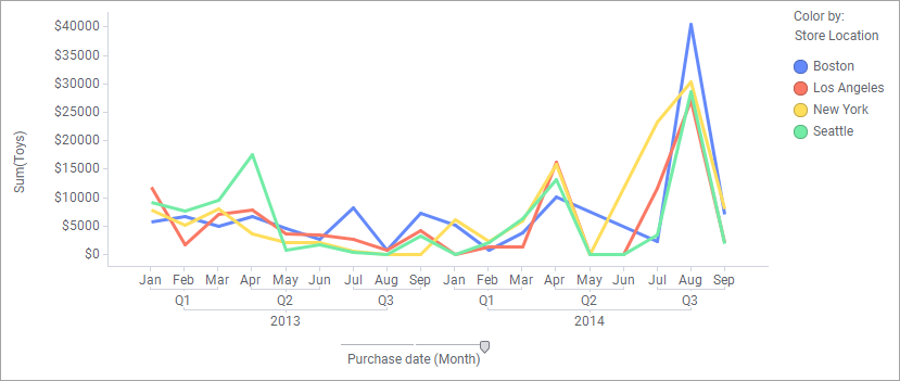
The line chart can consist of one line or of several lines. Several lines are added if you want to make comparisons of several data columns, or if you want to make comparisons between different categories within a column.

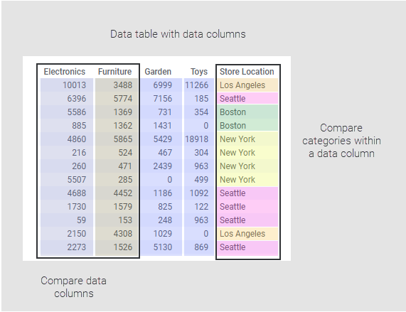
Depending on what you want to show, or on how your loaded data is organized, you add lines to the line chart in different ways.

Comparing data columns

Procedure

  1. On the authoring bar, click Visualization types to open the flyout.
  2. Drag the Line chart visualization type to the wanted position on the analysis page.
    A suggestion of a line chart is presented.
  3. On the X-axis, select a time column or any other column for which values should be compared.

    Values in time columns get a chronological order automatically. To display time data hierarchically, see Specifying time hierarchies.

  4. On the Y-axis, select the columns you want to present as separate lines.
    One line per column is drawn using different colors. The Color axis in the legend is set to (Column Names).
  5. For each of these columns, select which type of aggregated value to display.

Example

Assume the data below is loaded. It contains customers' electronics and toys purchases made at different store locations during a time period.

Below see the settings made to compare the sums of purchases made at the Electronics and Toys departments.

Comparing categories within a column

Procedure

  1. On the authoring bar, click Visualization types to open the flyout.
  2. Drag the Line chart visualization type to the wanted position on the analysis page.
    A suggestion of a line chart is presented.
  3. On the X-axis, select a time column or any other column for which values should be compared.
    Values in a time column get a chronological order automatically.
  4. On the Y-axis, select the column whose values you want to present.
  5. Select which type of aggregated value to display for the selected column.
  6. On the Color axis in the legend, specify the column containing the categories you want to present as separate lines.

Example

The data shown in the example above is loaded. Below see the settings made to compare the sum of Toys purchases at different store locations.