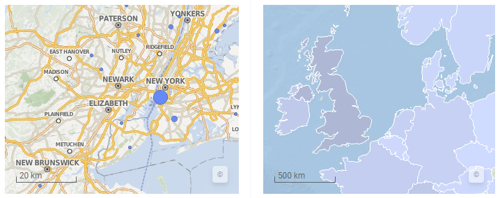
Creating a map chart
A map chart positions your data in a context, often geographical, using different layers. The layers can be either data layers, such as marker layers or feature layers, or reference layers, such as map layers, Tile Map Service layers (TMS), Web Map Service layers (WMS), or image layers. By adding different layers to the map chart, you can configure the map to suit your needs.
The data you use to create a map chart often has geographical context, such as columns with latitude and longitude values, or names of countries and cities.
You can add more than one layer of each layer type and control the properties for each layer separately. Zoom and pan using the navigation controls in the visualization to explore the data in the map chart.
- Each layer contains its own set of properties to add fine control for the specific type of layer.
- Transparency, a property in each layer, gives you fine control over the layer display.
- The marker layers can add indicators for a data column, such as locale or zip codes, major cities, or country names.
- The feature layers can add shapes defining areas such as regions, countries, or continents.
- The image layers can be used as both geographical and non-geographical backgrounds in your maps.
- Third-party services (TMS and WMS) can be used to add specific field interest or beauty to the map charts.
Procedure
- Setting map chart properties
The map chart contains properties for title and description, zooming (or controlling navigation), trellis views, and the legend display. Each layer also contains a number of properties specific to the layer. You should review and define the properties for the map chart itself as well as for all layers. - Adding layers
A map chart is normally built by several different layers. A number of different types of layers exist and each layer type serves a different purpose in the map chart. - Working with layers
From the properties popover, you can refine a map chart by reordering layers, hide layers, or permanently remove layers. - Viewing the geographic coordinates for a location
You can view the geographic coordinates, that is, the latitude and longitude, for a location in the map chart. - Navigation in the map chart
The zooming and interaction controls are located at the top right of the visualization. To select which controls to show in the map chart, open the Appearance section of the Map chart Properties. - Fixing geocoding issues
Sometimes the automatic geocoding does not work as expected. Below are some tips of what you can do to fix some geocoding issues. - Aggregating coordinate-based locations values
If geographic coordinates are available in the data loaded into a marker layer in the map chart, each marker is positioned at its coordinates. But you may not be interested in separate markers; instead an aggregated value representing multiple markers may be of interest. - Example of a line connection in a marker layer
Lines can be drawn in a map layer with markers to show connections between specific markers. You can specify in which order the markers should be connected, and arrows can be added to indicate the direction.


 to open the flyout.