Creating hierarchies
Data can be organized hierarchically by adding more than one column to an axis. Instead of working with the separate columns on the axis, you can create a hierarchy in which the columns are gathered.
In addition, a hierarchy selected on an axis is supplemented with a slider, by which you can easily switch between the various hierarchy levels. The visualization will immediately adjust to the current level of detail.
See also Specifying time hierarchies.
Procedure
-
Right-click one of the columns, and select
Create hierarchy.
You can, if you want, give the created hierarchy a name.
 on the authoring bar to open the flyout.
Example
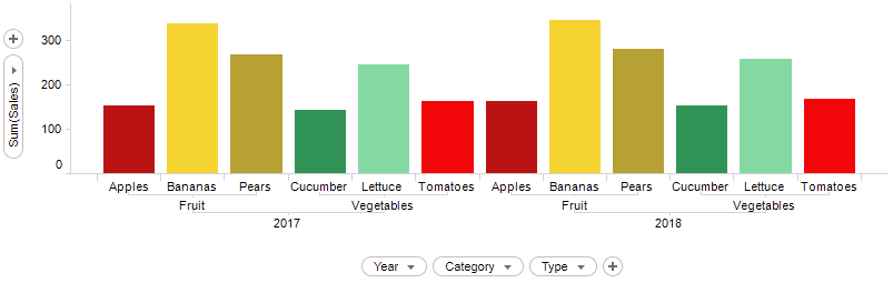
In the bar chart, three columns are selected on the category axis. The data becomes organized hierarchically with three different levels of detail.
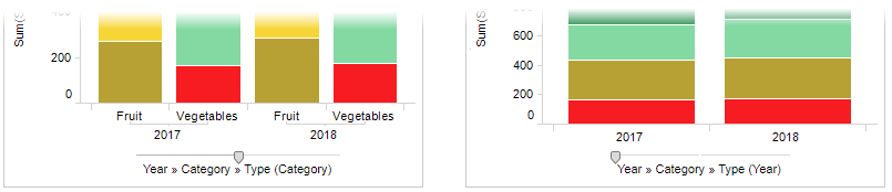
Below the columns on the axis are replaced by a created hierarchy, and a slider is provided.
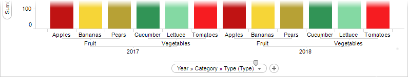
You can quickly switch the level of detail by dragging the slider handle as exemplified below.
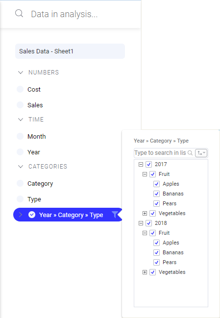
The created hierarchy is added to the
Data in analysis flyout and the
Filters panel. You can access its associated hierarchy filter both from the flyout and the panel.