QC Charts Example 2: Brushing, Assigning Causes and Actions
- Overview
- In this example you will learn how to investigate individual samples in the control chart by using brushing techniques. It will also be shown how to assign causes and actions to individual out-of-control samples and how to exclude those samples from the computation of the chart parameters. We will use Cover.sta, the same data file as in Example 1: Specifying Control Charts for Variables, Process Capability.
- Specifying the Analysis
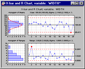
- Open Cover.sta via the File - Open Examples menu. Select Quality Control Charts from the Statistics - Industrial Statistics & Six Sigma submenu or from the Data Mining - Process Optimization -QC Charts submenu to display the Quality Control Charts Startup Panel. Then select X-bar & R chart for variables on the Quick tab (or the Variables tab). Click the Real-time tab and select the Auto-update option button. Now click the OK button. On the Quick tab of the Defining Variables for X-bar & R Chart dialog, click the Variables button and select the variable Width as the Variable with measurements and click OK. Enter a value of 3 in the fields for Constant sample size and Minimum number of observations per sample and click OK to produce the chart.
- Investigating out-of-control conditions (Brushing)
- Now, let us examine what caused the out-of-control conditions. A good way to start is to look at the sample statistics for those individual samples that show out-of-control conditions (samples 2 and 19 in our example).
In the Results dialog, click on the Brushing tab. Under Include/exclude samples, select the All out-of-control samples option button. Notice that sample 2 and 19 will be highlighted in the first field under Include/exclude samples.
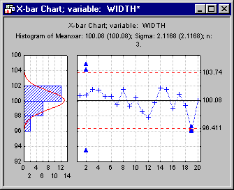
You can now examine the individual observations or review the sample statistics for those samples that you select. For example, let us look at the individual observations for both samples. Select the check box for showing individual observations (Show or … individual observations). The chart will now show the individual observations for those two samples. Shown below is the X-bar chart (click the X button on the Charts tab).
By inspecting the X-bar chart we notice that the variability of the individual observations in sample 2 is very large. In particular, a single outlier seems to have "inflated" the sample range, causing an out-of-control condition in the R chart. This could be an indication of a measurement error.
The variation of the values in sample 19 seems to be reasonable. However, notice that this particular sample tends to produce values "below" the overall average, "pushing" the sample mean below the lower control limit. Some phenomenon seems to have affected all observations in that particular sample.
We will later see how we can incorporate this information into the graph. In order to remove the individual observations from the chart again, select the Hide individual observations check box on the Brushing tab.
- Assigning causes and actions
- Let us assume we can explain what happened in samples 2 and 19. The outlier in sample 2 was caused by a measurement error due to a temporary gage defect. After a certain gage control had been adjusted, the gage was operating under normal conditions again. Sample 19 was obtained by an operator that has been newly assigned to the process and was not properly trained yet. This operator has been scheduled for a training course.
We will now incorporate this information by assigning causes and actions to the QC chart. You will notice that the data set Cover.sta contains two blank variables Causes and Actions that will be used to specify unique codes and text values that describe the causes/actions that have been taken.
Note: you could set up specific numeric codes and text values before you start the analysis in order to specify predefined "frequent" causes (e.g., 1 for gage error, 2 for operator error, 3 for valve defect, etc.). However, this is not absolutely necessary as you can specify codes for causes and actions as you examine the QC chart interactively.Although we could use the buttons on the Brushing tab we will now use the graphical brushing mode in order to assign causes and actions. Click the Brush button in the lower part of the Results dialog to display the Brushing Commands dialog.
Move the cursor over sample 2 until the cursor changes into a cross-hair-style brushing cursor. If you leave the cursor in the same position for a moment (without pressing a mouse button), you will notice that a small yellow box containing sample statistics will be displayed.
Click the Assign/remove cause button. In the resulting variable selection dialog select variable Causes in the first variable list and variable Actions in the second variable list and click OK.
In the Assigning a Cause dialog click the Specify a new cause button and on the Specify text labels for dialog click the New button. In the Edit text label dialog, enter the string "Gage problem" in the text field and click OK and OK again to return to the Assigning a Cause dialog. Because sample 2 is only out-of-control in the R chart, select the R or S (MR/MS) chart option button under Assign cause to. Then click OK (assign). Your chart should now contain a descriptive label "Gage problem" for the second sample in the R chart.
You can proceed in the same manner for assigning a cause for sample 19. Note that you could also assign actions to be taken by clicking the Assign/remove action button on the Brushing Commands dialog. After you are done, your graph may look like this:
Note: the codes for the different causes and actions will be stored in the variables that you selected for assigning causes and actions.If you would like to replicate this example analysis at a later time, you may want to delete those codes from data file before you start again.
- Excluding individual samples from calculations
- Finally, we may want to exclude samples 2 and 19 from the computation of the center line and the control limits, since they represent "special cause variation" and we would prefer to base our control chart parameters on "common cause variation" only. For a description of these two concepts, see the Introductory Overview.
On the Brushing tab of the results dialog select sample 2 from the field under Include/exclude samples. Then press the CTRL key on your keyboard and click on sample 19. Both samples should be selected now.
Now select the checkbox Exclude from computations. In the resulting variable selection dialog, select variable Exclude and click OK. The graph will be updated, and you will notice that the point markers for sample 2 and 19 are different, indicating that they are excluded from the computation of the control limits and the center line. Note that you could remove these points from the graph (and computations) by selecting Exclude (drop) from graph.
You will also notice that the control limits and the center line have changed (slightly) after excluding the two samples. This can be easily verified by including them again by selecting the check box Include in computations.
See also QC Chart Examples.