In this section: |
A number of tools in WebFOCUS Designer support your efforts to apply styling to pages and page components. You can resize content, hide content from smaller devices if it interferes with a responsive layout, edit page, section and container properties, apply filters, themes and styles, and create custom templates.
When you add content to a page, it is automatically placed in a container. To move and resize the content item, move and resize the container into which it was placed by dragging the container or its resizing handles. You can also configure and style a container by selecting it on the page and then using the options on the Settings and Format tabs of the Properties panel. Note that the options for a container are separate from those for the content item inside the container. To select the container, click the container toolbar, or select a container from the Outline tab of the sidebar. Empty containers can be added to the page by selecting the Container tab on the sidebar and dragging the selected container type into the canvas. A highlighted area shows where the container will be placed.
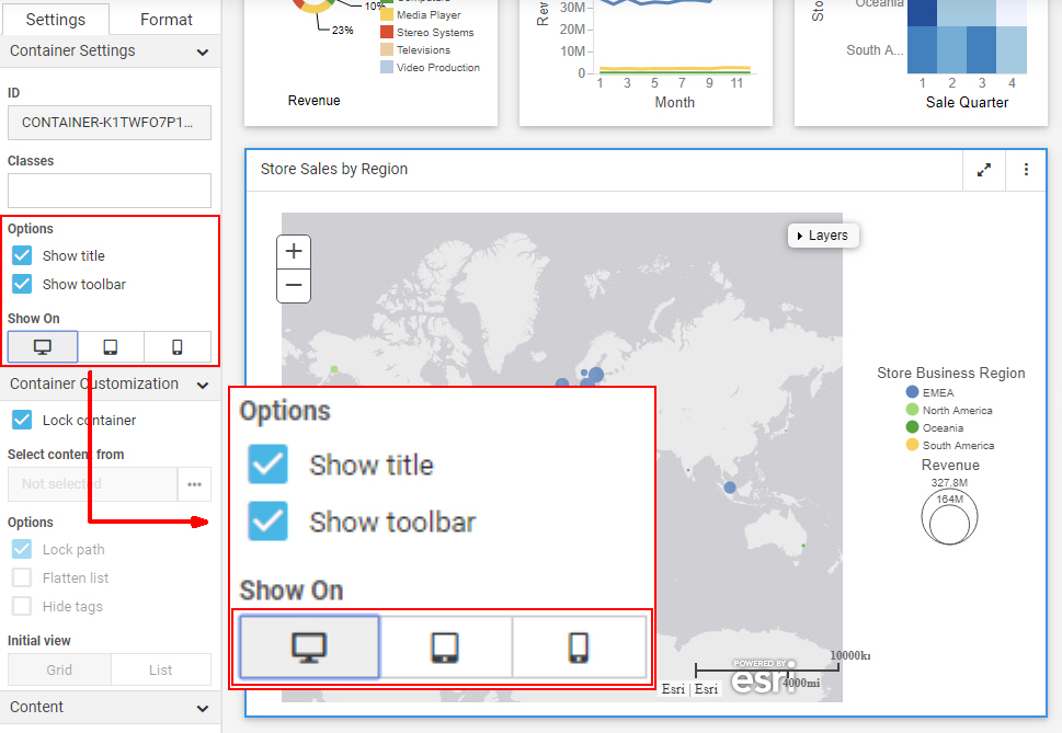
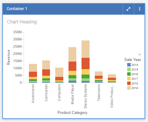
There are several types of containers. The default container for a single item is a panel container. The panel container is a basic container type that includes a title bar and toolbar with a run-time menu, as shown in the following image.
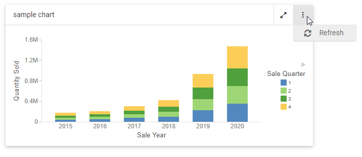
The run-time menu provides the ability to refresh the content in the container by default. If the content currently visible in the container uses the AHTML output format, additional In-Document Analytic run-time options are added to this menu. For more information about In-Document Analytics, see Overview of In-Document Analytics. You can also add custom options to the run-time menu and to the container toolbar using embedded JavaScript. For more information, see Enhancing Pages With Custom JavaScript.
To add multiple items, such as charts, reports, and images, to a single container, use the tab, carousel, or accordion container types. These container types include the same features as the panel container, as well as controls to navigate between multiple content items. You can add another content item to a container by selecting the Content tab on the sidebar, navigating to an item, and dragging it onto the existing container. You are given options to add the new item to a new tab, panel, or slide, or replace the visible, existing item in the container.
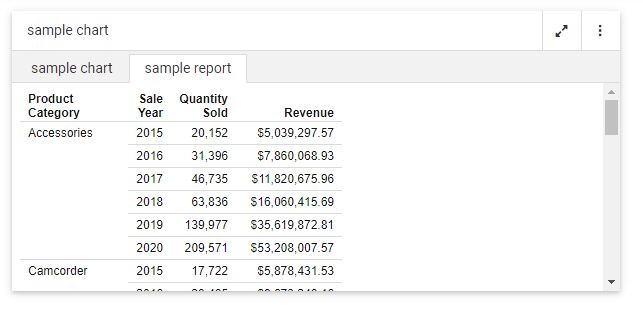
In a tab container, navigate between items using the tabs below the title bar. You can double-click the text in a tab to change it, and right-click a tab to delete, duplicate, or reorder it. A tab container is shown in the following image.
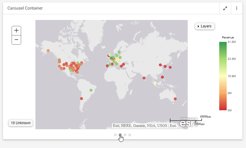
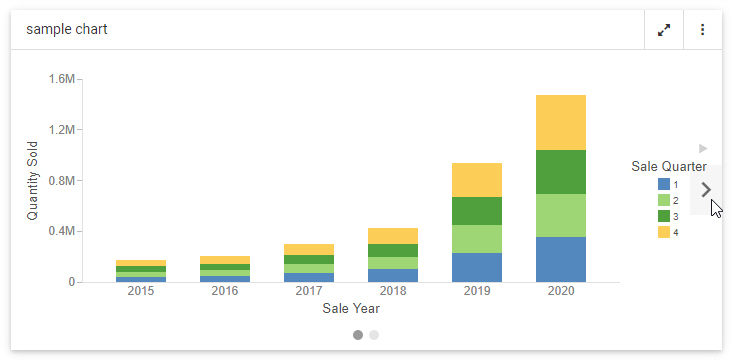
A carousel container allows you to switch between content items by clicking a dot at the bottom of the container, or by clicking arrows that appear when you point to the left or right side of the container. When creating a page, right-click a carousel container to duplicate, reorder, or delete a slide. You can set a carousel container to automatically cycle between content items using the options described in Automatically Advancing Slides in a Carousel Container. A carousel container, with navigation arrows, is shown in the following image.
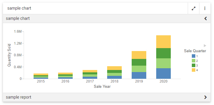
Accordion containers place content in collapsible panels. You can expand and collapse items in an accordion container by clicking a panel label. When creating a page, right-click an individual panel in an accordion container to rename, reorder, duplicate, or delete the panel. An accordion container is shown in the following image.
Other types of containers serve more specific purposes. The grid container type, only available in pages assembled from existing content, can be used as a filter container, as an alternative or in addition to the filter toolbar. Once you add filter controls from you content to a page, you can drag them from the default location in the filter toolbar into the grid control. Select the filter bar within the panel from the outline, and then select the Format tab to change the number of columns in the grid container. You can also drag a text label or submit button to the grid from the Control tab on the sidebar.
You can use a panel group container to keep a set of vertically arranged panels together when responsive folding occurs as the size of the page changes. To use a panel grid container, add it to the page, then drag new containers, content items, or fields into it. For more information, see Adding Panels to a Responsive Container.
A link tile container allows you to display a content item or image on a page that can be clicked to access additional, outside content. Drag the link tile container onto the page, then, from the Settings tab, use the link tile Background, Content, Attach all parameters, and Target properties, to set the displayed and target content, and configure how the link tile behaves. For more information, see Linking to External Content From a Page.
You can use the Explorer widget to provide access to the Workspaces view of the WebFOCUS Hub or WebFOCUS Home Page. This allows anyone accessing the page, or a portal containing the page, to open and run content items and create new content, depending on their privileges. In the Explorer widget, you can navigate through workspaces, folders, and content items from the Resources tree and Content area, and create new content using options in the +Content menu. For more information, see Providing Access to Content Items and ibi WebFOCUS Tools.
Right-click any type of container to access a shortcut menu of options. These include the ability to refresh the container content, change the title of the container, access the Settings or Format tabs, duplicate the visible content item, change the container type, or delete the container. If you select multiple containers, you also have the option to combine them into a tab, accordion, or carousel container.
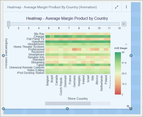
You can resize content on a page, at any time, using the sizing handles and the shaded placement area that appear on the canvas. When you hover over a container on the canvas, a series of handles appear. Drag a handle in the direction that you want to resize the item, as shown in the following image.
The content container snaps to the nearest row and column when you resize it. To change the number of columns in a section on the page, allowing more granular container widths, select a section, open the Format tab, and select an option from the Number of Columns area. 12 is the default. You can also change the amount of space between containers by selecting the entire page and typing a size for the Margin property, on the Format tab.
The Properties panel displays the properties for the element that is selected. To access container properties, select a container from the canvas or outline. To access section properties, click the grid inside the canvas, or select a section from the outline. To access page properties, click the page header or the toolbar, or select a page from the outline. If the page header and the toolbar are hidden, you can also access page properties by clicking the canvas outside a grid section.
The following properties are available when you select an entire page.
Settings tab:
If Include Page Filters is selected, you can select one of the following options to change the position of the filter toolbar:
Format tab:
Note: If the margin property is set to 0, you cannot select a section on the page from the canvas or access the section shortcut menu options. As a workaround, change the margin property value to 20px temporarily to gain access to the section and its options.
The following properties are available for sections.
Settings tab:
Format tab:
Note: Changing the row height does not change the margin, which can be configured on the page level.
The following properties are available for containers.
Settings tab:
Note: To see the full value displayed in the field, widen the Properties panel area by clicking the separator and dragging it to the right.
Note: This property is especially useful if you want to display different widgets to different users based on their roles. For example, you can create a series of subfolders with content and then apply security rules to show and hide these subfolders from users based on their group membership. Then you can configure the Path property to display the parent of these subfolders and flatten the list. Now each user can only see the widgets they are authorized to see in a simple list without any folders to navigate.
Note: Users can change the view at run time inside the Select Item dialog box.
Format tab:
The following options are available for content items in a page assembled from existing content. New content items in a page provide standard content creation options, in addition to these.
Settings tab:
Format tab:
How to: |
You can choose to hide certain content items from smaller devices, especially when dealing with large or multi-faceted items like maps or HTML pages. When an item is hidden from a device, the other items around it re-flow into the empty space and retain the responsive layout.
Note: All three device buttons are selected, by default, making the item visible on all devices. Manually clear the buttons to hide the item from specific device types.
An example of hiding a large item from mobile phones and tablets is shown in the following image.
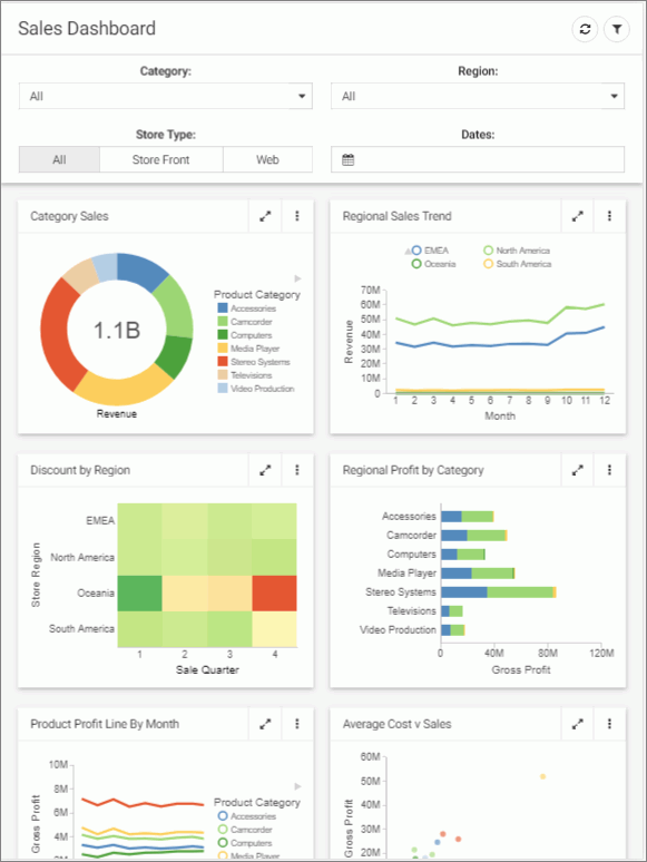
The item does not display. All remaining content items rearrange to cover the empty space, as shown in the following image.
Using a carousel container is one way to put multiple charts, reports, and other content items into a single container. Carousel containers include an unobtrusive control that allows users to cycle through the items added to it, as shown in the following image.
Unlike tabbed or accordion containers, carousel containers also include the option to autoplay the content within them, allowing you to show all of the content in the carousel container without requiring user interaction.
To enable autoplay for a carousel container, select the container and open the Settings tab on the Properties panel. The Autoplay interval and Rerun content properties are available in the Container Settings section. To enable autoplay, set the Autoplay interval to a value higher than zero (0) to enable autoplay. The Autoplay interval is the amount of time, in seconds, that each slide is shown before advancing to the next slide.
When the Autoplay interval is set, the Rerun content option becomes available. This option is turned off, by default. When enabled, the content on a slide of the carousel container refreshes each time it is displayed. When Rerun content is not enabled, the content on each slide only loads the first time it is displayed, and it is not refreshed unless manually prompted from the menu on the container toolbar.
How to: |
While customizing your page, you can apply themes and styles to various page elements. The general theme of the page is defined by the Theme setting, which you can configure in the Properties panel, on the page level. A theme affects the look of the entire set of elements on the page, including colors, opacity, and typeface styles. Themes also dictate the color schemes available as styles on the Format tab when editing sections, filters, or containers.
By default, the theme selected for a page is passed on to content in the page. You can select content items inside a container and change the theme for each one individually from the Format tab. If the content item was added to the page from the Content tab, you can additionally choose to use the original theme of the content item, instead of inheriting the page theme or selecting a specific theme to use.
There are four themes that WebFOCUS Designer offers:
To add a theme to this list, create a folder in the Global Resources area, in the Custom folder within the Themes folder. In that folder, you can add a custom StyleSheet to use with charts and reports, and a custom CSS file to use for pages. The .sty file and .css file must both be named themes.
Note: To facilitate the creation of a custom theme, you can copy and modify properties from one of the themes included with WebFOCUS. This makes it easy to identify the default classes used in a WebFOCUS Designer page.
Once you select a theme, you can further modify it by configuring styles. You can also save your unique combination of a theme and styles as a custom theme.
The style properties appear.
The page refreshes with the new theme.
The Style properties appear.
Note: Styles are based on classes in the selected theme. For example, use the class .pd-style-default-color to configure the Default style of the theme, use the class .pd-style-color2 to configure Style 2 of the theme, and use the class .pd-style-color3 to configure Style 3 of the theme.
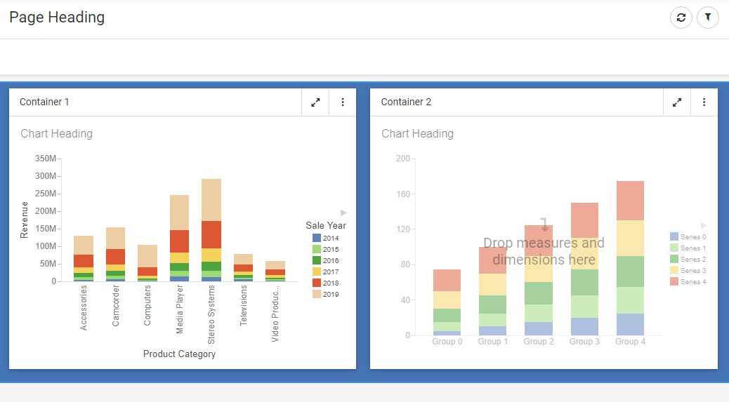
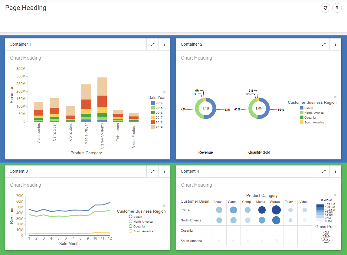
The page refreshes and applies the style to the section, as shown in the following image, where the selection of Style 2 has made the first section blue.
The page refreshes and applies the new style. You can apply different styles to different sections, as shown in the following image.
The Style properties appear.
Note: Styles are based on classes in the selected theme. For example, use the class .pd-style-default-color to configure the Default style of the theme, use the class .pd-style-color2 to configure Style 2 of the theme, and use the class .pd-style-color3 to configure Style 3 of the theme.
The page refreshes and applies the style to the container, as shown in the following image.
Note: When creating a visualization from existing content, to apply the same style to multiple containers, multi-select containers by holding the Ctrl key, and then click a style button.
The New Folder dialog box opens.
The custom theme folder is created. Your theme CSS file will reside in this folder. If you know which CSS classes should be used for your theme, you can create a new CSS text file, add your code, and save it with the name theme. The file must be called theme to be available for selection in WebFOCUS Designer. To facilitate the process, you can modify an existing theme CSS file. In this example, we copy and modify the theme CSS file for the Light theme.
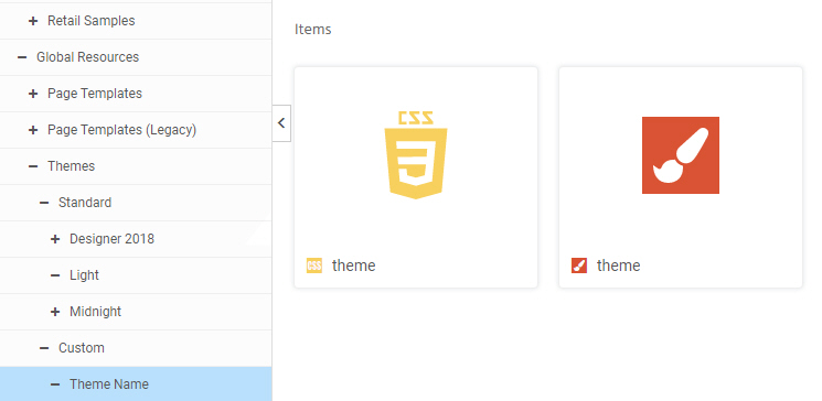
The following image shows the correct hierarchy of the custom theme file.
Note: Do not modify the name of the theme CSS file. It is imperative that both the CSS file and StyleSheet in your custom theme folder are called theme. The name of the folder in which the file resides is the theme name that is visible in WebFOCUS Designer.
The Text Editor window opens.
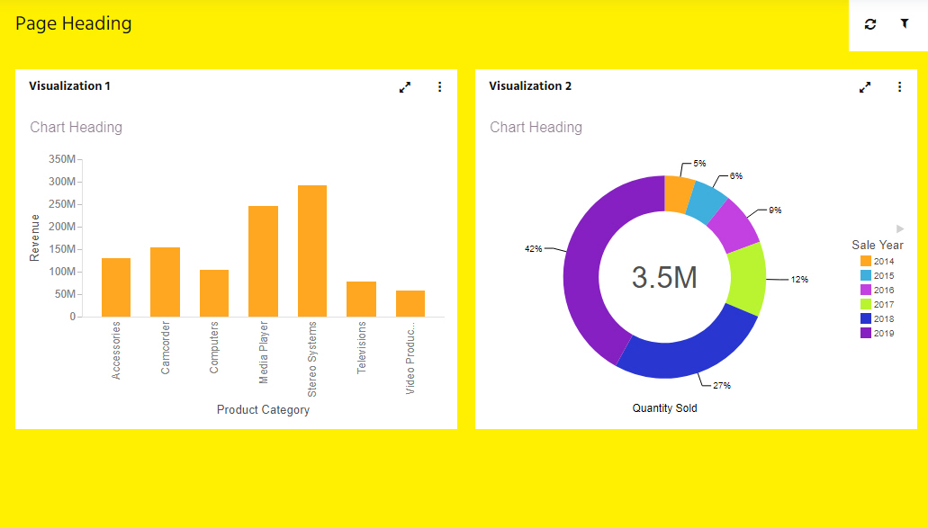
In this example, you could change the background color from white #fff to yellow #ffff00.
The styling properties in the StyleSheet will be applied automatically to content on the page when your custom theme is used, unless that content has a different theme explicitly assigned.
An example of a new theme applied to a page is shown in the following image.
Notice that the content theme, or StyleSheet, associated with the page theme was automatically applied to the content on the page.