Sorting Measures
|
How to: |
You can apply aggregation and sorting simultaneously to a numeric measure in an OLAP report, and sort the data from high to low (descending order) or from low to high (ascending order). All other columns are sorted correspondingly.
For the measure being sorted, you can restrict the report to a specified number of highest values (when sorting high to low) or lowest values (when sorting from low to high).
When you sort a measure, any subtotals, subheadings, or subfootings in the report are automatically suppressed since these elements relate to a specific sort field and are not meaningful when the report is resorted by the values in a measure column. For an illustration, see How to Applying a Percent Calculation to a Measure.
Note: Sorting by measures is not available in a report in which measures have been stacked. See Hiding and Displaying Measures.
Procedure: How to Sort Measures High to Low or Low to High in an OLAP Report
To sort the values of a measure from high to low:
- Click the diamond
 button.
or
- Right-click the measure and select Sort By Highest from the menu.
The report runs automatically. The highest value is now first in the column. The top of the diamond button becomes solid blue to indicate the current sort direction.
To sort the values of a measure from low to high:
- Click the bottom
half of the diamond
 button.
or
- Right-click the measure and select Sort By Lowest from the menu.
The lowest value is first in the column. The bottom of the diamond button becomes solid blue.
Tip: After a measure has been sorted once, clicking the upper or lower half of the diamond button inverts the sort order of that measure. Place your mouse pointer over either half of the diamond to see a message that indicates the next sort order that will occur if you click the diamond.
Example: Sorting a Measure From High to Low in the Report
- Run OLAPREP2.
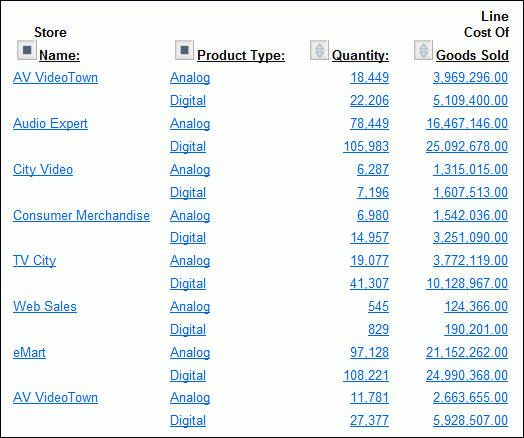
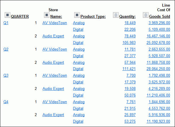
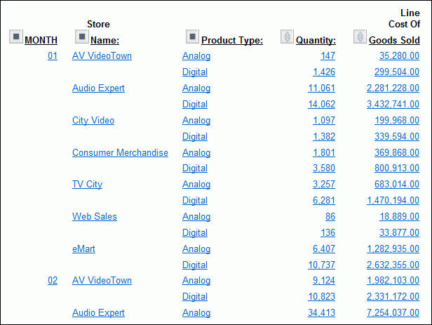
The OLAP report shows sales information sorted by quarter, store, and Product Type.
You are interested in seeing where the greatest quantity of goods has been sold.
- Click the top
half of the diamond button next to the Quantity measure to sort
the values from high to low.
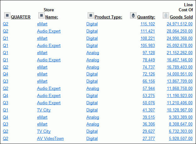
As shown in the following image, the report now displays data values for the Quantity measure in descending order. The top half of the diamond next to Quantity is blue and solid to indicate the current sort order of the measure. This is now the controlling sort in the report. All other values are reordered correspondingly.
Tip: To invert the sort order, click the diamond button again.
Procedure: How to Sort Measures High to Low or Low to High From the OLAP Control Panel
- Open the OLAP Control Panel.
- Click
a measure name in the Measures pane in the upper portion of the OLAP
Control Panel to open the sort options pane.
Do not click the Stack Measures check box, which controls the display of a measure, not its sorting.
- Select the Sort check box. This setting is required to apply sorting specifications to the selected measure.
- Select the High to Low or Low to High option button to specify the sort order you wish to apply. The default sort order is high to low.
- Click Ok.
The sort pane is replaced by the Measures pane, where the measure becomes blue to indicate that sorting specifications have been defined.
- Click Run to
display the report with sorting applied to the selected measure.
The diamond button next to the sorted measure changes to reflect the sort order. If the sort order is high to low, the top half of the diamond is solid blue. If the sort order is low to high, the bottom half is solid blue.
Note:
- Report execution is automatic when you sort a measure in an OLAP report. However, if the OLAP Control Panel is open, all current changes in the OLAP Control Panel are applied.
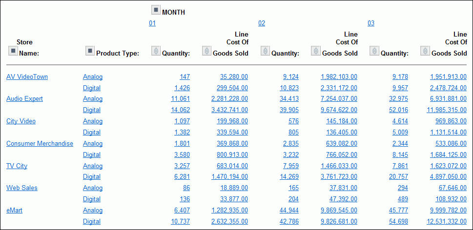
- If an OLAP request contains a horizontal (Across) sort field, the measures appear several times in the report, once for each Across value. If you apply sorting to a measure, the sort is performed on the first column occurrence of the measure, and reflected in all subsequent instances. The appropriate half of the diamond button becomes solid only for the first instance. Any additional sorting you wish to perform must be done from the first occurrence of the measure.
Procedure: How to View a Subset of Data for Sorted Measures
You can select to view only a subset of the total number of records in your report.
- Open the OLAP Control Panel.
- Click
a measure name in the Measures pane to open the sort options pane.
Do not click the Stack Measures check box, which controls the display of a measure, not its sorting.
- Verify that the Sort check box is selected. (This setting is required to apply sorting specifications to a measure.)
- Select
the Rank check box, then specify the number
of sort field values to be included in the report.
- Use the spin
controls located to the right of the word Highest or Lowest to increase
or decrease the number of sort fields.
or
- Position the cursor in the input pane and type a number.
The default number of sort field values is 5.
- Use the spin
controls located to the right of the word Highest or Lowest to increase
or decrease the number of sort fields.
- Click Ok.
The sort pane is replaced by the Measures pane, where the measure becomes blue to indicate that sorting specifications have been defined.
- Click Run to display the report with the designated number of sorted values.
Example: Displaying a Subset of Sorted Data for a Measure
- Run OLAPREP2.
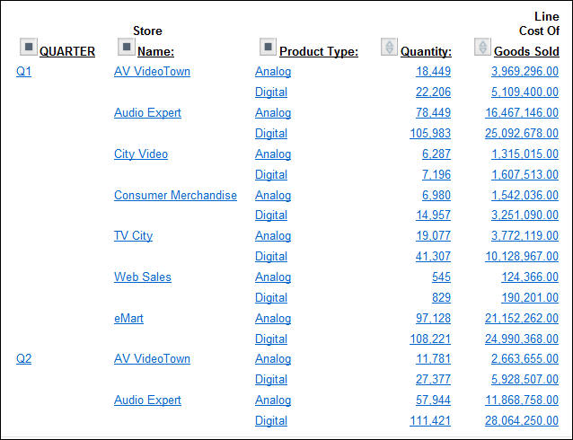
The report shows sales information sorted by quarter, store, and Product Type.
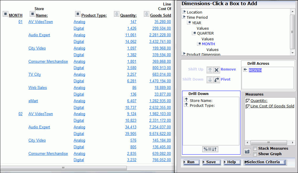
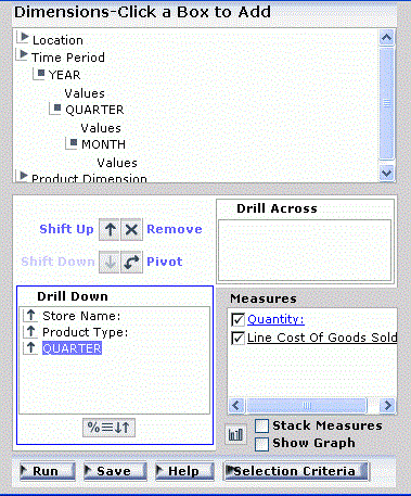
- Click the square icon next to QUARTER to open the OLAP Control Panel (notice that the original report is open on the left).
- Click Quantity in
the Measures pane.
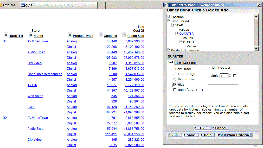
The sort pane opens, as shown in the following image.
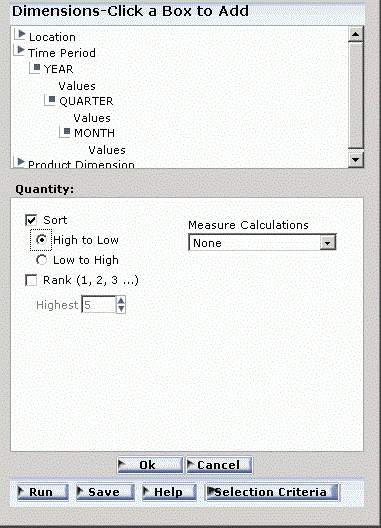
- If not already
selected, click the Sort check box.
High to Low sorting is selected by default.
- Click the Rank check
box.
Because the report is being sorted from high to low, you can indicate the number of values you wish to see, beginning with the highest.
- Specify Highest 4.
- Click Ok.
The main OLAP Control Panel window appears. In the Measures pane the Quantity measure is blue, indicating that sorting specifications have been defined.
- Click Run at
the bottom of the OLAP Control Panel.
As shown in the following image, the report now displays Quantity sorted from high to low with the highest four values appearing.

Procedure: How to Remove Sorting Criteria for a Measure
You can remove sorting specifications for a measure whether the measure appears or is hidden.
- Open the OLAP Control Panel.
- In the Measures pane, click the measure for which you want to remove sorting specifications.
- Clear the Sort check box.
- Click Ok.
 button.


 button.
The title appears in the new location.