Aggregations in Expressions
When the results of an expression should be an aggregated
view of the values in a column, you simply use the expression function
of your choice to determine the output. For example, when a column containing
sales figures should be summarized, you enter Sum([Sales]) in the expression
field.
Aggregated values combined with OVER
expressions allow you to split the data the way you want it.
Nested Aggregations
There are a few differences in how nested aggregations
behave when used in calculated columns and in custom expressions. See
below for some examples. (Copy the green
text below and paste it as a data table in an analysis to try it out yourself.)
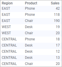
Region Product Sales
EAST Phone 42
EAST Phone 118
EAST Chair 190
WEST Desk 19
WEST Chair 20
CENTRAL Phone 18
CENTRAL Desk 17
CENTRAL Desk 12
CENTRAL Desk 13
CENTRAL Chair 20
In Calculated Columns
By writing function calls within functions you can get
complete control over the output of your expression. More than one aggregation
can be nested, and each nested aggregation can have its own OVER expression.
When the data table is filtered, the calculated column still shows values
based on the whole data table.
Note: Calculated columns based
on in-database data do not support OVER expressions or nested aggregations.
However, both constructions work fine when used in the context of a visualization,
using custom expressions.
Below is an example of how you can use the Add calculated
column tool to compute the total sales amount per region, and then find
the max of these sales.
To calculate the Max of Total Sales per Region in
a calculated column:
Copy the green text above
that contains the data.
To add the text that you copied
as a data table in Spotfire, click Files and
data  , and in the
Files and data flyout, click Other. Then
click Paste data from clipboard.
, and in the
Files and data flyout, click Other. Then
click Paste data from clipboard.
In the following steps, click
OK to confirm and import the data.
Select Data
> Add calculated column... on the menu bar.
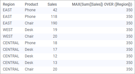
In the Expression field, type:
Max(Sum([Sales]) OVER ([Region]))
Click OK.
Response: The new column is added to the data table.
You can now use the maximum
value in comparisons in different visualizations.
Calculation details:
This is what happens within the data engine when a calculated
column is added; note that the intermediate tables are never presented
to end users.
Original data:
First the inner aggregation will be computed, and the sum
of sales per region will be:
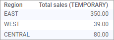
In a calculated column, the result from a calculation is
always applied to all rows of the input table, hence, the resulting sales
value for each region will be smeared over all the rows:
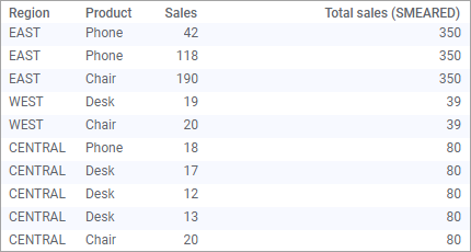
Max() will then be computed on "Total Sales (SMEARED)",
resulting in the value 350, and because we are inserting a calculated
column, that value will also be smeared over all rows. This means that
the final result will be:
When the data table is filtered, the calculated column
still shows values based on the whole data table.
In Custom Expressions
Nested aggregations may also be used in custom expressions
on axes in visualizations. The behavior is similar to the case with calculated
columns, but there are some differences. First of all, filtering is taken
into account, so all aggregations will work on the filtered subset of
the data. Also, only the outermost aggregation will use the grouping defined
by the visualization, while all the inner aggregations need OVER expressions
to split the data. All inner aggregations will be treated the same way
as calculated columns, meaning that resulting values of the inner aggregation
will be added to all rows of the outer aggregation. When there is an OVER
expression in an inner aggregation, all the categorical axes in the visualization
will automatically be intersected with (not for unaggregated visualizations),
even though this is not explicitly stated in the expression. See Calculation
details below for more information.
In this example, we want to show one bar per region in
a visualization, where the height of the bar is the sales for the best
selling product in that region. We also want to filter out the product
"Chair", assuming that it is the top product besides chairs
that is of interest.
To show sales for the best selling product per region
and filter out one product group:
Copy the green text above
that contains the data.
To add the text that you copied
as a data table in Spotfire, click Files and
data , and in the
Files and data flyout, click Other. Then
click Paste data from clipboard.
In the following steps, click
OK to confirm and import the data.
Create a bar chart.
On the category axis, use
Region.
On the value axis, use the
following expression to show the max sum per product:
Max(Sum([Sales]) OVER Intersect([Product]))
Response: A bar chart showing the values for the
best-selling product in each region.
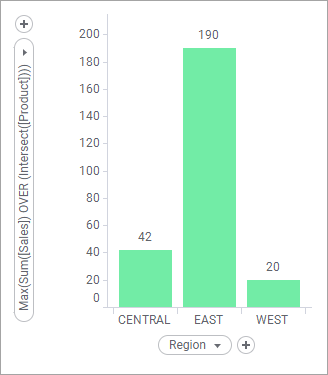
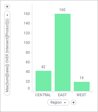
In the Filters panel, clear
the Chair check box.
Response: The bar heights are recalculated based
on the filtered data table and a new max value is shown.
Calculation details:
This is what happens within the data engine when a calculated
column is added; note that the intermediate tables are never presented
to end users.
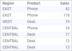
Starting with the original data, you have the following
table:
When "Chair" is filtered out, the data on which
the calculations are based in the visualization is:
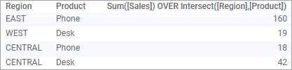
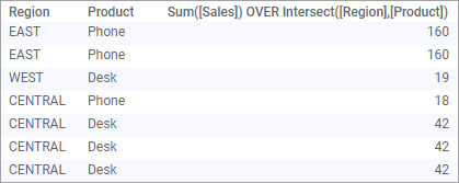
The inner aggregation will be intersected with the categorical
axis, hence, the actual expression computed will be: Sum([Sales]) OVER
Intersect([Region],[Product]), which will result in the following sales
per (region,product)-pair:
Just as for calculated columns, inner aggregations will
always be smeared to all rows before the result is passed to the outer
aggregation. This means that the following will be the input to the Max()
function:
Since this example is calculated as a custom expression
in a visualization, the outermost aggregation (Max()) will use the grouping
defined by the visualization. This means that the actual expression calculated
will be based on the filtered, smeared rows, which will result in the
following values for the bars:
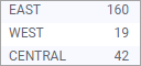
Because the Chair category was filtered out, the top remaining
category in the east region was Phone and the top category in the west
region was Desk. If the filtering is changed, the resulting top category
changes as well.
Tip: There is an expression
shortcut called "Top Category"
available, that uses nested aggregations to help you find the top category.
It has been designed to handle multiple top categories and allows you
to easily change the inner aggregation as well as the category to compare.
It uses the following expression:
UniqueConcatenate(If(Max(Sum([Sales]) OVER (Intersect([Product])))
OVER (Intersect())=Sum([Sales]) OVER (Intersect([Product])),[Product],null))