Creating a treemap
A treemap is used for displaying huge amounts of data that can be structured hierarchically (tree-structured). It presents the data using differently sized and colored rectangles.
Before you begin
Procedure
-
On the authoring bar, click
Visualization types
 to open the flyout.
Example
The data table below lists how much money different customers have spent at four different store departments. Assume you want to find the "top" male and female customer at the Toys department.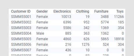
The treemap settings below give you the answer.
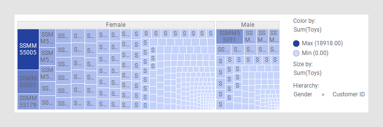
Customer ID SSMM55005 is the woman who spent most money, and SSMM55091 is the man, because these customers' rectangles are the largest in the female and male branches respectively.
Maybe these two customers are the "top" customers at the Clothing
department as well. To find out, change the column on the
Color axis to Clothing to see if these
rectangles have the darkest color.
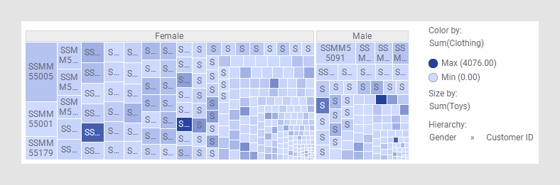
It seems other customers are more interested in clothing than the two customers who spent the most on toys!
It seems other customers are more interested in clothing than the two customers who spent the most on toys!