Slicing and marker concepts
When you visualize the data in a data table, the data is sliced into pieces, which are represented by markers in the visualization. Examples of markers are table cells, bar segments, pie sectors, map features, or line vertexes. Different marker attributes, like size, shape, color, or numerical values, are then used to indicate an aggregated value of the data underlying the marker.
The slicing and marker concepts are essential for the understanding of custom expressions, as the expressions work on the slices that have been defined in the visualization. Particularly affected are custom expressions containing the OVER statement.
Slicing the data
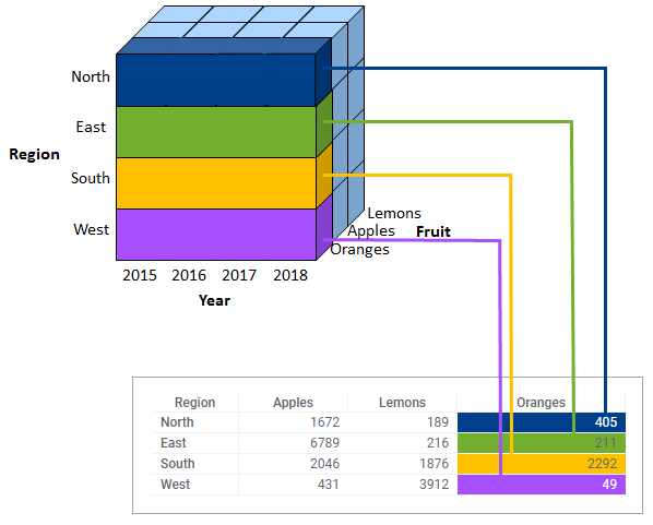
The slicing of the data into pieces is done by specifying different properties of the visualization. For example, you can slice the data on different categories on an X-axis, or slice the data by assigning different colors or shapes. What slicing properties are available depend on the type of visualization. Each time you slice the data using such a property, the data is split into smaller and smaller pieces and will be represented by a larger number of markers.
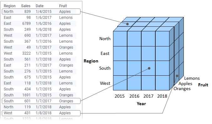
The following image shows how data slices can be represented in a visualization, a cross table. There is no split into years; the values in the cross table cells are aggregated over slices that comprise all the years.
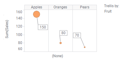
In the next example, sales data in the data table is visualized in scatter plots using different ways of slicing.

| The marker represents the sum of sales of all the fruits for all years. | The markers represent the sum of sales per fruit type. | The markers represent the sum of sales per year. |
 |
 |
 |
In fact, your choice of slicing results in a simple custom
expression: If you would right-click each of the X-axis selectors in the
scatter plots, and select
Custom Expression, you would find that the
expressions
<>,
<[Fruit]>, and
<[Year]> are automatically set in the respective
Custom Expression dialogs.
In the same way, if you would right-click the Y-axis selector, and
select
Custom Expression,
Sum([Sales]) is shown automatically in the dialog.
Aggregations like Sum are custom expressions that are pre-defined!
In the scatter plots above, the X-axis property has been used for slicing the data. However, there are also other axis properties you can use to slice by, for example, color, shape, and trellis, which is illustrated below.
 |
 |
 |
To conclude, you can slice your data in various ways. The slices are then the base for your calculations.
Markers
Markers, like the scatter plot 'symbols' and cross table cells above, are the graphical objects representing how you have sliced your data. A marker can stand for everything from all rows in your data table to a single row, depending on how you have set up your visualization, and mostly its value represents the result of an aggregation, for example, a sum as shown in the previous examples.
Custom expressions
A custom expression works in the same way as a predefined aggregation; it is evaluated on each of the markers in a visualization. It is possible though to, in an expression, take in also data from outside of the current slice using the OVER statement.