Segments color mode is available for columns in continuous scale mode. This will color the items representing values between two or more anchor points in fixed colors, as seen in the example below.
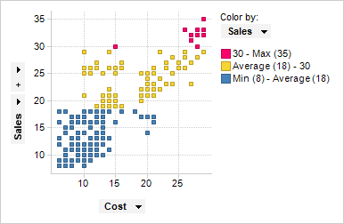
In the example, the scatter plot is colored by the column Sales, which is a column containing integer values. The color scheme has four anchor points: Min, Average, 30, and Max. The colors between these points are set to blue, yellow, and red respectively. This means that items representing values between the Min value (8) and the average value (18) are colored blue, items representing values between average and 30 are colored yellow, and items representing values greater than 30 are colored red.
Note: An anchor point will get its color from the segment below it on the scale. In the example above, this means that an item representing the value 30 will be yellow.
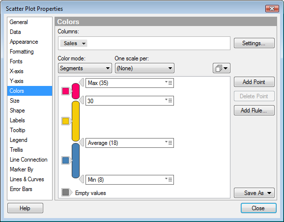
The example below shows the Colors page of the Visualization Properties for the color mode Segments.
Changing the color of segments
To change the color of a segment, click on the color box to the left of that segment. A color selector will appear, and you can select a different color.
Adding anchor points to the color scheme
To add an anchor point where you want a boundary between two segments, you can either click on the Add Point button, or double-click in the color scheme area. To specify the exact placement of the added point, select one of the options in the menu beside the anchor point. The example below shows the available options in the menu. See Details on Point/Value Menu for descriptions of all the options in this menu.
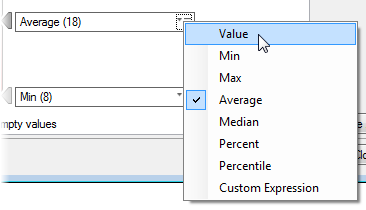
Most of the options in the menu will add an anchor point that is relative to the current color scale. For example, if you select Average, the position of the anchor point will be adjusted automatically when you filter the data, so that it stays at average for the new range of values.
If you select Value, you can enter an absolute value for the anchor point in the field. Keep in mind that this means that the value can end up outside the range of values if you filter out data or select another column to color by. When you have selected Value from the menu, you can also adjust the position of a point by dragging it vertically.
Select the last menu option to open the Custom Expression dialog, where you can define a custom expression to set the anchor point. See Custom Expressions for Coloring to learn more about this. To get a basic understanding of custom expressions, see Custom Expressions Introduction.
Adding rules to the color scheme
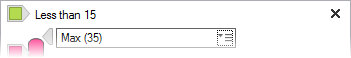
You can also add rules to the color scheme in Segments mode. A rule functions as an exception to the rest of the color scheme. To add a rule, click on the Add Rule... button to the right of the color scheme area. This will open a dialog where you can define the rule. The rule will be added at the top of the color scheme, as seen in the example below, where a rule stating that all values below 15 should be green.
If the color scheme includes more than one rule, the rules are prioritized from top to bottom. You can change the order of the rules by using drag-and-drop. To learn more about rules in color schemes, see Color Rules Overview.
Deleting points and rules
To delete a point, select it in the color scheme and click the Delete Point button. You can also right-click on the point and select Delete Point from the menu.
To delete a rule, click on the x to the right of the rule, or right-click on the rule and select Delete Rule from the menu.
Resetting the color scheme
To reset the color scheme to its initial state, right-click in the color scheme area to open the menu, and select Reset Color Scheme. The color scheme will be reset to the default state for the selected column. Any added rules will be removed.
Note: A color scheme in Segments color mode may appear as if the coloring is categorical. However, because the column used to color by is in continuous scale mode, the coloring is also considered continuous. This means that if you are using multiple scales, it is not possible to set individual scaling per color. For lines and curves, this means that you cannot set them to one line or curve per color.
For a description of the rest of the Colors page in the Visualization Properties dialog, see the corresponding help section for each visualization type.
See also: