The data panel provides a structured list of all available data columns in a data table, that is, an overview of your data. It can be the starting point for configuring the visualizations, because from the panel, you can drag and drop columns to drop targets in the middle of the visualizations and to the visualization axes. In addition, filters are associated with the columns, so you can filter the data from the panel.
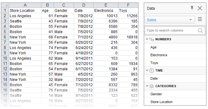
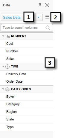
The columns are organized into categories by default to make them easy to locate in the list. For example, loading the Microsoft Excel file below results in the data panel to the right. Columns that contain numerical data suitable to aggregate are gathered in the NUMBERS section, columns related to time in the TIME section, and columns useful for splitting the data in the CATEGORIES section. If more than one data table is available in the analysis, you first select, in the drop-down menu at the top of the data panel, which data table to display.
Selecting columns on an axis
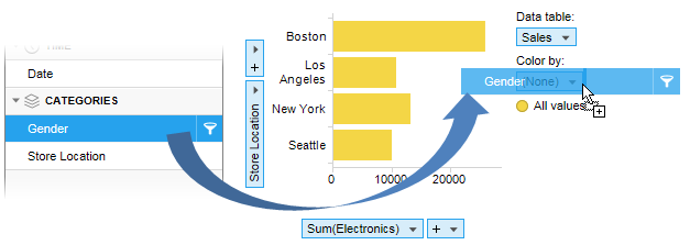
You can drag a column from the data panel to a visualization and drop it on any of the column selectors indicated with a blue color or on a drop target. The visualization will immediately reflect the new setting.
Note: More than one column can be selected on an axis. You can drag another column from the panel and drop it on the drop-down menu next to the first selected column on the axis.
If a hierarchy filter has been created, it is possible to drag the entire hierarchy or any of its sub-levels to an axis.
Filtering data in columns
Depending on whether you are working with in-memory or in-database data, you get access to the filters in the data panel in slightly different ways.
For in-memory
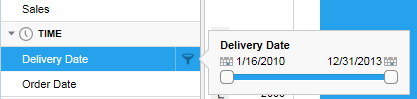
data, filters are created automatically. Hover with the cursor over
a column in the panel, and click the Show filter button  that appears. Use the opened
filter to limit the data directly.
that appears. Use the opened
filter to limit the data directly.
For in-database
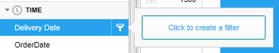
data, the filters must first be created. Hover with the cursor over
a column, click the Show filter button that appears,
and click to create a filter. Use the created filter to limit the
data.
Note: Depending on the database you are
using, this may take some time.
Details about which columns have been filtered, and to which values, are displayed at the bottom of the data panel. If you want to modify what has been filtered in a filter, you can open the filter from here by simply clicking it.
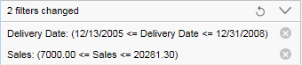
Above, the expanded view is shown. To collapse the filter
details, click the  button.
Filtering can be reset. Click the  button to reset separate filters, and the
  button to
reset all filters.
button to
reset all filters.
Filtering can also be handled using the filters panel, which offers more filtering options.
Data Panel Views
The sections in the data panel differ slightly depending on the data source and the data content. Some examples of data panels are described below.
In-Memory Data and In-Database Relational Data from a Single Table
Data in in-memory data tables, or in-database data that has a single source table from a relational database, is simply displayed as a list of the categorized columns in the selected data table. The columns are categorized in any of the following sections: NUMBERS, CURRENCY, TIME, LOCATION (available after geocoding has been applied in a map chart), CATEGORIES, IMAGES, and BINARY.
Number |
Section |
Description |
1 |
Data table selector |
[Only available if more than one data table have been added to the analysis.] Lists all data tables in the analysis. Choose a different data table to view the columns in that data table instead. |
2 |
Column list menu |
Allows you to select whether or not to show the columns in a categorized way. The menu also lets you specify the sort order of the columns in the list. If 'No sorting' is selected, then the columns are shown in the original source order. |
3 |
Columns |
Lists all columns available in the selected data table. If the columns are shown 'Categorized', then columns of similar type are grouped together. |
Note: Using the right-click menu in the Columns field, you can easily specify that a column contains geocoding information, that is, information that can be used to position data on a map.
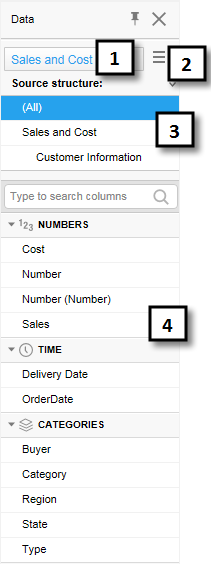
In-Database Relational Data from Joined Tables
If data tables from in-db databases have been joined with relations in the Views in Connection dialog, they can be treated as a single, virtual data table within Spotfire. In this case, there will be an additional field showing the source structure in the data panel as seen below. If no relations have been defined, each data table in the external data connection will be a separate data table within Spotfire as shown above.
Number |
Section |
Description |
1 |
Data table selector |
[Only available if more than one data table have been added to the analysis.] Lists all data tables in the analysis. Choose a different data table to view the columns in that data table instead. |
2 |
Column list menu |
Allows you to select whether or not to show the columns in a categorized way. The menu also lets you specify the sort order of the columns in the list. If 'No sorting' is selected, then the columns are shown in the original source order. |
3 |
Source structure |
[Only available if the selected data table in Spotfire is built from more than one tables from the original database in a virtual join view.] Lists the underlying source structure from the database so that you can see which columns come from which original database table. |
4 |
Columns |
Lists all columns available in the selected data table. If the columns are shown 'Categorized', then columns of similar type are grouped together. |
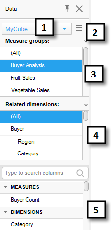
Microsoft SQL Server Analysis Services Cube Data
When you are working with Microsoft SQL Server Analysis Services cube data you will see more fields in the data panel than for the relational data tables:
Number |
Section |
Description |
1 |
Data table selector |
[Only available if more than one data table have been added to the analysis.] Lists all data tables in the analysis. Choose a different data table to view the columns in that data table instead. |
2 |
Column list menu |
Allows you to select whether or not to show the columns in a categorized way. The menu also lets you specify the sort order of the columns in the list. If 'No sorting' is selected, then the columns are shown in the original source order. |
3 |
Measure groups |
Lists all measure groups in the cube. If there are measures that do not belong to a specific measure group, they can be located through the virtual group '(Other measures)'. |
4 |
Related dimensions |
Lists all dimensions within the cube that are related to the selected measure group of the selected data table. |
5 |
Columns |
Lists all measures, attribute hierarchies and user hierarchies available in the selected data table, measure group and related dimension. If the columns are shown 'Categorized', then the different types of columns are grouped in MEASURES and DIMENSIONS sections. See Working With Microsoft SQL Server Analysis Services for more information. |
Note: When working with in-db cube data it is not possible to create filters for measures or sets, only for dimension columns. This is because the cube calculates the measures in the context of the selected dimensions.
See also: