Map charts allow you to position your data in a context, often geographical, using different layers. The layers can be either data layers, such as marker layers or feature layers, or reference layers such as map layers, Web Map Service layers (WMS) or image layers.
When transforming locations on the three-dimensional earth onto a two-dimensional plane, the result is expressed using coordinate reference systems. Depending on which model has been used for the transformation, the values of the coordinates differ from system to system. The geographical locations in a data layer to be added are expressed using a certain coordinate reference system. Also the appearance of the map itself, on top of which layers should be added, is determined by a specific coordinate reference system. These two systems are combined to perform the data positioning. For more information, see What are Coordinate Reference Systems?
If multiple data layers are included in the map chart, you must always specify which layer should be the interactive layer. The interactive layer is the only layer in which you can mark items, but you can easily switch the interactive layer using the Layers control. The layers control can also be used to hide or show the different layers.
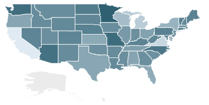
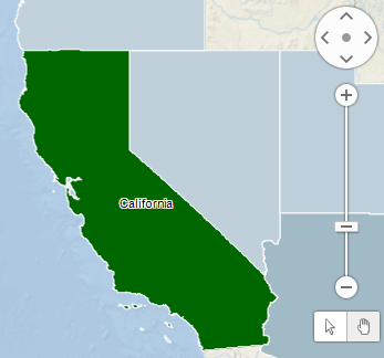
Feature layers contain map features or shapes of the type polygon, line, or point. A feature layer can be used either as a data layer or as a reference layer only displaying items of visual interest. Below is an example of a map chart with an interactive feature layer showing shapes, where each shape represents a state in the United States. Each shape in the map is a separate item, and you can interact with those items the same way you do with items in any other visualization.
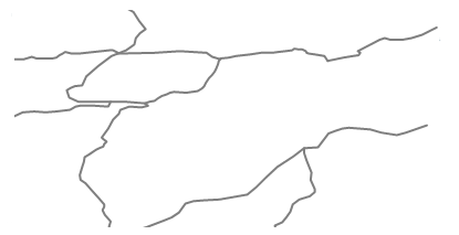
As mentioned above, the shapes in the feature layer can be one of three geometry types: polygons, lines, or points. When polygons are used, as in the example above, the shapes constitute different areas in the map, and these areas will be filled with color. How to color the shapes is defined in the Colors page of the layer settings, or in the legend. When lines or points are used, the interactive shapes are the actual lines or points. The color you define in the Colors will be the color of the lines or points. Examples of when maps with lines as interactive shapes could be useful are maps showing highways or a street grid. Below is an example of a map chart with interactive shapes, where each shape represents a highway.
Which geometry type is used in a map is defined in the map data before you load it into your analysis, and this cannot be changed in Spotfire.
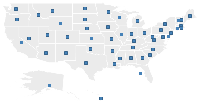
In a marker layer, markers or pies are positioned in the different areas. In the example below, the map shows the same geographical area as in the first example, and is also divided into states. But instead of the states being interactive, a marker is placed in each of the states, and you can interact with the markers just as you do with markers in other visualizations.
If the data table for markers or pies has columns containing coordinates, you can use these to position the markers or pies in their correct locations on the map, but you can also map a certain hierarchy (e.g., State, County, City) to a corresponding hierarchy in a geocoding data table.
The markers are also well suited to be displayed on an online map using a map layer or a WMS layer, see below.
Note: Since the base map is limited to latitudes of +85 to -85, markers with a latitude of 86 to 90 or -86 to -90 will not be rendered.
The map layers allow you to display your data on a tile based web map from TIBCO GeoAnalytics. Map layers are always used as a reference layer and cannot be interacted with directly. The available default maps can either be compound standard maps which include both borders, labels and roads, or you can use separate layers for each type of information and select only the information of interest.
To use a map layer as reference background in the map chart, the map chart’s coordinate reference system must be set to EPSG:3857 – WGS 84 / Pseudo-Mercator on the Appearance page of the Properties dialog.
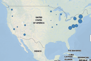
Other types of reference backgrounds are WMS layers. WMS layers are retrieved from Web Map Service, a web standard for accessing geo-referenced map images from different Geographic Information System databases (GIS) including ESRI ArcGIS and multiple public WMS servers on the Internet. Below, the background WMS layer displays weather observations.
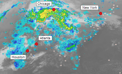
WMS layers can be provided for many different coordinate reference systems.
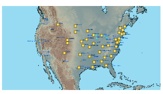
A third way to set up a map chart is to use a background image and then position markers or pies on top of that image. This works similarly to the map with markers or pies, but with the difference that you do not need to have map data in a data table in order to set it up. However, for the markers to be placed correctly in geographical positions, the data table must contain X and Y coordinates. Below is an example of a map chart where the background is a map image of a part of North America. On top of the background image are markers pointing out cities in the United States.
A map chart can be used to show other than geographical data. The example below displays different types of failures on a wafer, a semi-conductor material used to manufacture microchips.
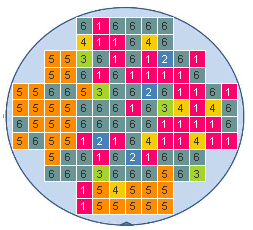
The background is an image representing the wafer. The markers in the visualization represent the chips on the wafer, and are placed on the background the same way they are placed on the actual wafer. The colors and labels indicate the six different types of manufacturing failures that have occurred on this wafer. Copying the actual layout of the wafer is a way to enhance the readability of the data. To be able to view the data this way, you need to use tiled markers. This means that all the markers have the same size, and are displayed in a grid-like layout. Go to the Shape page in the Marker Layer Settings to change to tiled markers.
More details may become visible when you zoom in the map, and you also have the option to specify at which zoom level a certain layer should become visible. See Map Chart Properties – Zoom Visibility for more information. You can zoom and pan in a map using the navigation controls to the right of the map. Click on the small arrow icon on the map chart title bar (shown on mouse over) to show or hide the navigation controls. To learn more about zooming and panning, see Zooming and Navigating in the Map Chart.
Labels can also be used in the map chart to identify and describe markers or interactive shapes.
In the example below, the map has been zoomed in, and a label with the state name has been added to the marked shape in the feature layer. Open the Labels page of the layer settings if you want to modify the labels settings for a certain layer.
All visualizations can be set up to show data limited by one or more markings in other visualizations only (details visualizations). Map charts can also be limited by one or more filterings. Another alternative is to set up a map chart without any filtering at all. For more information, see Limiting What is Shown in Visualizations.
See also: