When you combine data from different data tables in one visualization, you need to consider how the columns in the data tables match. A rule of thumb is that all the columns you are planning to group the visualization by, should exist in all the data tables. For example, columns that should define what a marker is in a scatter plot, columns you wish to set on the category axis of a bar chart, or columns you wish to trellis or color the visualization by. If your data is structured that way, setting up the visualization and matching columns will be easy. However, there are cases when it is in fact OK that some columns in the main data table do not have matches in all the data tables. And, even if the data is set up the recommended way, you may sometimes need to make a few manual adjustments. This will be explained further down in this topic.
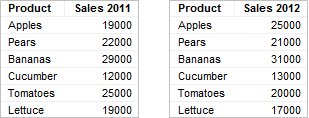
When adding multiple data tables to an analysis, Spotfire will automatically match columns with the same name and data type. For example, if you load the data tables below into Spotfire, a match will automatically be added between the columns named 'Product':
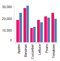
Considering the data available in those two data tables, this match is likely to be the one you want. To compare sales for 2011 and 2012, you probably want to group the visualization by the column named 'Product', like in the bar chart below, where 'Product' is used on the category axis:
If you load the data tables below into Spotfire, matches will automatically be added only between the columns named 'Region' because that is the only column with an identical name in all of the data tables.
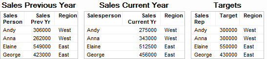
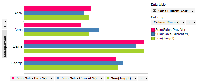
But if you want to compare the performance of the four salespersons rather than sales per region, you need to use a column containing the names of the persons on an axis that groups the visualization in some way; for instance on the category axis of a bar chart. In this case, those columns are named 'Sales Person', 'Salesperson', and 'Sales Rep' respectively, which means they are not identical and have not been matched automatically when loaded. But the columns do match, because they contain the same values, so they can indeed be used to group an axis in the visualization. To do so, the matches must be added manually. To use the data table named 'Sales Current Year' as the main data table, you need to add two matches: 'Salesperson' – 'Sales Person' and 'Salesperson' – 'Sales Rep'. As long as you will use the 'Sales Current Year' as the main data table, it is not necessary to add a match between 'Sales Person' and 'Sales Rep', but it is no harm done adding a match between them as well.
Adding Column Matches:
Load the data tables into Spotfire.
Go to Edit > Data Table Properties and open the Column Matches tab.
In the Data tables list, select the data table you are going to use as the main data table in the visualization: 'Sales Current Year'.
Click on the New... button to the right of the list showing the Current matches for the selected data table.
Response: The New Match dialog is opened.
In the Right data table drop-down list, select the 'Sales Previous Year' data table.
Comment: The data table in the Left data table drop-down list is already set to 'Sales Current Year' because this data table was selected in the Data Table Properties dialog.
In the Left matching column selector, choose 'Salesperson'.
In the Right matching column selector, choose 'Sales Person'.
Click OK to close the dialog.
Repeat steps 4-8 for the second column match, but select the 'Targets' as the Right Data Table, and 'Sales Rep' as the Right Column instead.
Response: The matches have been added to the list of Current matches for the selected data table, see below.
Click OK to close the Data Table Properties dialog.
Response: The matches have now been added to the selected data tables.
Viewing the Current Column Matches
When matches have been added, they are shown in the Column Matches tab:
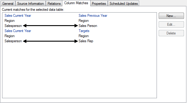
Note that column matches for the column named 'Region' had already been added automatically.
With the added matches you can now create a visualization where 'Sales Current Year' is the main data table, and the column 'Salesperson' is used on a grouping axis. For example in a bar chart, as seen below:
More Examples of Manual Matching
In the example above, the columns had to be matched manually because the column names were not the same, but it could also be the case that the values in the columns are not in the same format.
Perhaps you have two data tables which both contain a string column named 'Product'. In one data table, the values are written in lowercase (‘apples’), while in the other data table they are written with the first letter in uppercase (‘Apples’). Since the columns have the same name and data type they will be matched automatically. However, to be able to combine data from these columns in one visualization, the values in one column must be transformed so that they are written in the same way in both columns.
By adding an extra transformation step rather than converting the actual column values you will still be able to use the original value names in the visualization.
Editing Matches to Transform String Values:
Go to Edit > Data Table Properties and open the Column Matches tab.
In the Data tables list, select the data table of interest.
Select the match between the two columns named 'Product' in the Current matches for the selected data table.
Click Edit....
Response: The Edit Match dialog is opened.
Make sure the columns named 'Product' are selected in the Left matching column and Right matching column selectors.
Response: The Sample value under the left and right
matching column shows the first value in the selected column (provided
it is not in-db data).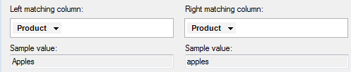
Comment: What you select here is what will be seen on the axes in a visualization.
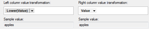
Open the column selector for the column containing values in uppercase (e.g., under Left column value transformation), and select Methods to open the pop-up menu.
Comment: The transformations are always applied on the value that comes out after any methods have been applied in the column matching step above. This is why the Left and Right column transformation lists show the name 'Value' rather than a column name.
Select Lower.
Response: In the Sample value
fields you can now see that the values are written as ‘apples’ in
both columns.
Comment: The transformations are transparent to what is shown in the visualizations, which means that even if you apply the transformation Lower(Value) you will not have to see this in the visualizations, but can use 'Apples' with a capital A on the axes.
Optionally, click Preview to see a preview of the first 100 distinct values and make sure that all values match.
Comment: The preview is the only way you can control whether values from in-database sources match, since automatic samples are disabled for in-db data in order to keep the stress on the external system to a minimum.
Click OK to close the dialog.
Click OK to close the Data Table Properties dialog.
Response: The values in the columns are now in the same format and can be combined in one visualization.
The transformation step is always done in-memory, independent of the original source of the data, which makes it possible to perform changes that the original data source may not support. For example, some in-database sources do not allow you to switch data type of a column, but since the transformation step is done in-memory you can create matches with in-database data of different data types this way. It is also useful for in-database data where there are no row methods in the system (for example, OLAP cubes).
However, there are also cases when you need to apply methods on the columns directly, rather than using a transformation, namely when the grouping of values is affected by the result from the method applied.
Creating Matches to Ensure Same Grouping of Values:
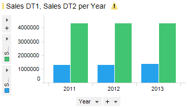
If you have two columns where date or time values are in different formats you may need to apply a method to ensure the same grouping of values is used in both tables. For example, in one data table there might be an integer column named 'Year', with values such as 2013, 2014, etc., and in another data table there might be a column named 'Transaction Date', which contains values in the format DateTime.
Go to Edit > Data Table Properties and open the Column Matches tab.
In the Data tables list, select one of the data tables of interest.
Click New....
Response: The New Match dialog is opened.
Select the other data table of interest under Right data table.
Make sure the columns with the time based information are selected in the Left matching column and Right matching column selectors.
Open the column selector for the DateTime column and select Methods to open the pop-up menu.
Select Year.
Comment: To add a match between these columns,
you need to use the method Year on the 'Transaction Date' column.
This will ensure the values in the two columns will be in the same
format; 2013, 2014, etc.
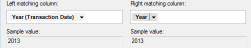
Click OK.
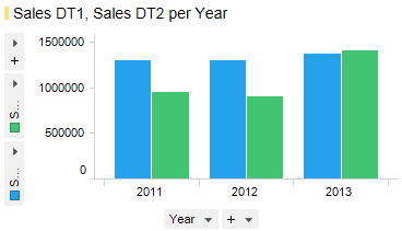
Response: Instead of showing the smeared total
values for the Transaction Date column, the visualization now shows
the sum of sales for each year for the second data table.
As mentioned above, a rule of thumb is to make sure that all the columns you want to group the visualization by exist in all the data tables that will be used in the visualization. But there are cases when the visualization will be valid even if columns that are used on a grouping axis do not have matches to columns in the other data tables. The examples below illustrate this.
The Visualization is Valid
If you know that a category is unique, you can use it on a grouping axis even if the column only exists in the main data table. The left-most data table below contains information about employees in a sales organization: their names, gender, and office location. The right-most data table contains the total sales for each person.
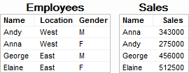
The only possible column match for the data tables is 'Name', because that is the only column that exists in both data tables. The 'Employees' data table contains only categories, while the 'Sales' data table contains the sales figures you probably want to compare. Combining these two data tables would make it possible to look at the data from location and gender perspective as well as just comparing the sales figures per person. And because each person belongs to only one gender and one office location in the 'Employees' data table, you can actually group by all the columns in that data table, provided that you select 'Employees' as the main data table, as seen in the bar chart below:
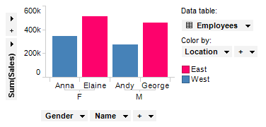
'Gender' and 'Name' define the category axis, while 'Location' defines the colors of the bars.
If you are going to group a visualization by unmatched columns, it is important to make sure the categories are unique. If the categories are not unique, you will end up with a visualization that shows incorrect data, as seen in the next example.
The Visualization is NOT Valid:
The data tables below are similar to the ones in the previous example, but the 'Employees' data table has been updated to reflect that Anna is actually working out of both offices. The 'Sales' data table does not have to be updated due to this change, because the amount Anna sold for last year has not changed, and has nothing to do with which offices she works out of.
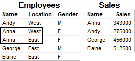
However, this change in the main data table will affect the visualization. Because the bars are colored by 'Location', and Anna appears in both 'East' and 'West', she will now appear twice; once for the East office, and once for the West office. This means that it now looks like Anna has sold for twice the amount she actually has, which is of course incorrect.
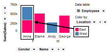
With Anna working out of two offices, 'Location' can no longer be used on a grouping axis in the visualization. However, by removing 'Location' from the color axis, you can turn the bar chart into a valid visualization again:
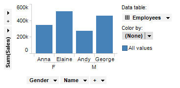
Now each person appears only once in the visualization, and while you cannot group by location, you can still group by gender.
Warnings About Missing Matches
As the example above illustrates, it is important to make sure no categories are repeated if you group the visualization by a column that is only located in the main data table. Therefore, Spotfire will display a warning when you group by columns without matches in other data tables:

You can click on the icon to see the whole message, which includes a list of all the columns without matches. The message also provides a link to the Visualization Properties, where you can review the current matches used in the visualization, and if necessary, you can add new matches there as well. When you have made sure the visualization does not show repeated categories, you can if you like, turn off future notifications about missing matches in the visualization. But if you do so, it is important to make sure no future changes of the visualization configuration introduce repeated values, because from then on, you will not be notified about this unless you turn on notifications again.
To hide warnings about possible mismatches:
Open the Visualization Properties dialog, and go to the Data page.
Scroll down to Data table matching.
Clear the check box Show notifications about mismatches.
Response: Notifications will no longer be shown in the visualization.
Comment: If a warning is already shown in the title bar of the visualization, you can open the message and click on the link Click here to review matches to come directly to the Data page in the Visualization Properties dialog, as mentioned above.
See also:
Multiple Data Tables in One Visualization