As mentioned in other topics about working with multiple data tables in one visualization, the recommended setup is that you base your visualization on a main data table where all the categories you want to group the visualization by are included. Preferably the categories you want to group by are also located in all the data tables. However, this may not always be the case, and this topic gives two examples of how you can set up useful visualizations when your data is not arranged that way.
Using Labels to Show Data from Other Data Tables
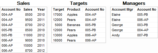
Perhaps you have the following three data tables:
And a visualization has already been created with the 'Sales' data table as the main data table:
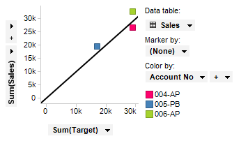
The X-axis shows sum of target, which is data that originates in the 'Targets' data table. The Y-axis shows sum of sales, which is data that comes from the 'Sales' data table (the main data table). The markers represent the different accounts, which is also data from the main data table. The visualization shows how each of the accounts have performed compared to their targets, but it might also be interesting to see which person is responsible for which account. But in the main data table there is no information about the account manager so it is not possible to group by account manager. However, the data table named 'Managers' contains information about which person is manager for which account, and it is possible to get that information into the visualization by using labels as aggregated values rather than grouping categories.
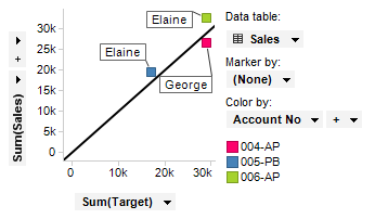
Adding the labels:
Open Visualization Properties and go to the Labels page.
Open the Label by column selector.
Select the 'Managers' data table and then the 'Account Mgr' column.
Select UniqueConcatenate as aggregation method.
Choose Show labels for > All markers.
Response: The scatter plot now displays labels with the account manager name for each of the accounts, as seen in the image below.
Adding Columns Instead of Using Multiple Data Tables in a Visualization
In the example above it was possible to add data from another data table as aggregated values rather than adding them as grouping columns. But in some cases it is a better approach to add a column from another data table to the main data table. That way you can use the column to group the visualization by. For example, if you do need to use the 'Account mgr' column on a grouping axis you can insert the column from the 'Managers' data table into the main data table instead.
Inserting the 'Account Mgr' column:
Open the Insert menu and select Columns....
Select the 'Sales' data table under Add columns to data table.
In the Insert Columns - Select Source dialog, click Select and scroll down to the From Current Analysis section, then click on the 'Managers' data table.
In the next step, match 'Account No' to 'Account No', then click Next.
In the next step, select 'Account Mgr' under Columns to add from new data.
Select Left outer (rows from current data only) as join method, then click Finish.
Response: The 'Account Mgr' column is now included in the main data table, and you can use it to group the visualization. See How to Insert Columns to learn more about inserting columns.
When the 'Account Mgr' column has been added to the main data table, you can group the visualization by that column, as seen in the visualization below:
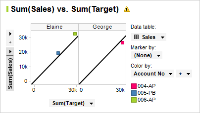
Note that you will get a warning in the visualization because the 'Account Mgr' column does not have a match in the 'Targets' data table. In this case it is actually not a problem, and you could turn the warning off. Read more about when and how you can disregard this warning in Column Matching.
See also:
Multiple Data Tables in One Visualization
Working with Multiple Data Tables in One Visualization