Plot: Variability Plot
Select the Plot: Variability plot tab of the Graph Options dialog box to access the options described here.
- Plot
- Use the Plot drop-down box to select the plot to which you want to make changes. If you have several plots in one graph, you can assign names to each plot using the Name field on the Plot: General tab of the Graph Options dialog box.
- Statistics
- Click the Statistics button to display the
Statistics dialog box for box-whisker type plots, in which you can select a variety of statistics that will be included in your graph. You can select the nonparametric Kruskal-Wallis test (see also Nonparametric Statistics) and the ANOVA F test (see, for example, General ANOVA/MANOVA). Note that if you do select statistic(s) to include in your graph, the
Add Legend dialog box will also be displayed, which is used to select where and how to attach the statistic(s) to the graph. Statistics will not be calculated for graphs that do not involve categorization within variables (e.g., for box and box and whisker plots for multiple variables without categorization, or plots from blocks of data). For variability plots, the statistics are calculated for all grouping levels and not for the levels of a specific variable.
General
- Type
- Use the options in this list box to change the type of variability plot.
- Raw data
- Select this option to plot the raw data for each (non-empty) cell of the graph. The actual data values for the last factor will be plotted separately for the groups of cases defined by the organizing factors.
- Box plot
- Select this option to create a box plot for each (non-empty) cell of the graph. In box plots, ranges of the values of the last factor are plotted separately for groups of cases defined by the organizing factors. The central tendency (e.g., median or mean) and range or variation statistics (e.g., quartiles, standard errors, or standard deviations) are computed for each group of cases. Click the More options button to display the Variability plot dialog box and further customize the box plot.
- Box plot and raw data
- Select this option to plot both box plots and raw data for the groups of cases defined by organizing factors. Click the More options button to display the Variability plot dialog box and further customize the box plot.
- Box plot and outliers/extremes
- Select this option to create a box plot for each (non-empty) cell of the graph. In addition to plotting the central tendency (e.g., median or mean) and range or variation statistics (e.g., quartiles, standard errors, or standard deviations) for each group, the outliers and extremes for each group will also be indicated on the graph. For more details, see Outliers and Extremes.
- More options
- Click this button to display the Variability plot dialog box that can be used to modify the jitter and box and whisker widths used when Box plot, Box plot and raw data, or Box plot and outliers/extremes is selected in the Type drop-down list.
- Identify last 1 or 2 factors in plot with point markers and/or colors
- You can elect to identify the last one or two organizing factors in the plot using point markers and or point colors. Use this drop-down list box to select the number of factors (one or two) to identify and the identification method to use.
- No
- Select No if you do not want to identify any of the organizing factors in the plot.
- Identify levels of last factor with point markers and colors
- Select this option if you want to plot the last organizing factor on the graph using point markers and colors. When this option is selected, the last factor will not be plotted as an organizing factor on the x-axis.
- Identify levels of last 2 factors with point markers and colors, respectively
- Select this option if you want to identify the groups of the last two organizing factors. When this option is selected, neither of the last two organizing factors will be plotted on the x-axis. Instead they will be identified in the graph with different colored point markers.
- Identify levels of last 2 factors with point colors and markers, respectively
- Select this option to identify the groups of the last two organizing factors in the graph. When this option is selected, the last two organizing factors will be identified in the graph using different point markers. This option is ideal for printing on black and white printers, because the color of the point markers does not vary.
- Factors
- Use the options under Factors to make modifications to the grouping variables used in the graph.
- Factors list box
- This box displays the factors that will be used to create the variability plot. Factors are plotted in the order shown in this list. The values of the last factor will be plotted in the graph while all other factors are used as organizing factors. To reorder the factors, select a factor and drag it to a new position. Specify the categorization method for the selected factor using the options to the right of this box (see below).
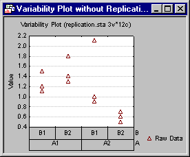
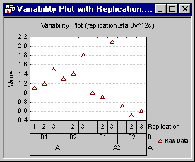
- Replication
- Select this check box to add a replication factor to the list of factors plotted in the chart. When Replication is used as an organizing factor, a sequence number will be assigned to each observation within each level of the other organizing factors. Those numbers will be used as the labels for this factor. For example, consider a data set with two factors: A and B. For each level of A*B, there are three observations. The images below show the variability plot when Replication is not plotted and when it is plotted.
- Display empty cells
- Select this check box to plot a position on the x-axis for every factor combination regardless of whether data exist for the combination. When this check box is selected, all possible factor combinations will be displayed on the x-axis. Empty cells (i.e., cells without data values) will be displayed for factor combinations that do not have data.
- Factors values format
- Select a factor in the Factors box, then click this button to display the Value Format dialog. The display format chosen in that dialog will be used to label the factor on the horizontal axis in the plot. A different value format can be specified for each factor. See also the grouping intervals options for the different ways in which the factors can be categorized.
- Grouping intervals
- Use these options to select a method of categorization for the selected factor(s). You can choose from several methods of categorization:
- Change Variable
- Click the Change Variable button to display a standard variable selection dialog box in which you can select a factor.
- Boxes and summaries (select Factor then set option)
- Use the options under Boxes and summaries (select Factor then set option) to further augment the plot by identifying various groups and/or plotting central tendencies for those groups. Note that the value used for central tendency (Mean or Median) can be specified using the Mean/median option (see below).
- Connect means/medians
- Select a factor in the Factors list box, then select this check box to connect the means or medians for the selected factor. When this check box is selected, a line will be drawn connecting the center value for each level of the selected factor.
- Put boxes around group
- Select a factor in the Factors list box, then select this check box to plot rectangles enclosing the various levels of the selected factor. This option can be applied to the first k-1 factors (where the number of factors is k). When it is applied to all of the first k-1 factors, a series of nested rectangles will be plotted until the interior most rectangles enclose the data values for each level of the kth factor within each level of the k-1 factor.
- Factor on/off
- Select a factor in the Factors list box, then select this check box to toggle the display of the selected factor in the plot. When this check box is selected, the factor will be used in the plot; when the check box is cleared, the factor will not be used.
- Show group means/medians
- Select a factor in the Factors list box, then select this check box to display the group means or medians for the selected factor. For each level of the factor, the mean or median will be displayed as a horizontal line. Use the Mean/median option to specify whether the mean or median will be displayed.
- Display vertical lines between factors
- Select a factor in the Factors list box, then select this check box to display grid lines between the levels of the selected factor.
- Orientation of labels
- This option affects the layout of the factor combination labels with respect to the x-axis. When you select Auto, Statistica uses either the Parallel, Perpendicular, or Alternate layout, whichever is appropriate for the current graph. The Perpendicular orientation of labels option positions the labels perpendicular (vertically) to the x-axis, while the Parallel option positions the labels horizontally (parallel) to the x-axis. The Alternate layout option positions the labels in an alternating pattern (one above, one below) along the axis. This option can be defined independently for each factor.
- Boxes and summaries (applies to all factors)
- The options under Boxes and summaries (applies to all factors) apply to the graph as a whole and not to a selected factor.
- Show overall mean/median
- Select this check box to display the grand mean or median (i.e., the center value for all data combined) as a horizontal line across the entire graph. Use the Mean/median option to specify whether the mean or median will be displayed.
- Means/medians
- Use this option to specify whether the middle point (plotted in the graph) will be the Mean or Median.
- Put boxes around organizing factor labels
- Select this check box to enclose the organizing factor labels in boxes.
- Wrap labels
- Select the Wrap labels check box when label orientation is set to perpendicular (see the Orientation of labels option description above) and long labels can take up too much of the graph space.
- Also plot means
- When this check box is selected, means are also plotted.
- Display only significant factors
- Select this check box to suppress the display of any factors that have only a single level.
Copyright © 2021. Cloud Software Group, Inc. All Rights Reserved.